Expected Defensive Threat Reduction (xDEF): measuring how defensive players reduce attacking passing threat with defensive activities

It’s finished! That’s my inital thought when I started writing this article and that sentiment comes from weeks of cracking my brain. I have made a shift from using data to do analysis to making some new models myself. It gives me great pleasure to innovate and develop my own models. My aim is to enhance data analysis to jump into the gap that is the lack of defensive football models. So that’s what we are going to do in this article.

Contents

  1. Why this metric?
  2. Data collection and representation
  3. Value models: xPass, xT and EPV
    3.1 Expected threat (xT)
    3.2 Expected Pass (xPass)
    3.3 Expected Possession Value (EPV)
  4. Methodology: xDef
  5. Analysis: xDEF in French Ligue 1
  6. Final thoughts
  7. Sources

1. Why this metric?

I have said this before, but when I look at a lot of the data metrics and data models, I see that they are mostly focused on the attacking side of the game. It focuses on scoring and chance creation most of the time, and if it does not — it focuses on on-ball value. It measures the actions when players have the ball. Whilst I think this is incredibly useful, I feel it gives a very unfair balance in terms of what we focus on in data analysis.

That’s why I want to look closer at a probability model that looks at the defensive side of the game. In other words, I want to measure what defensive actions do to the expected danger of the team in possession. That’s why I have spent weeks on developing a new model called xDef.

xDEF (Expected Defensive Threat Reduction): A metric quantifying the likelihood of a defensive action reducing the opponent’s scoring threat, considering spatial positioning, player actions, and subsequent play outcomes.

In this article we will further explore which data metrics and models are being used, what calculations are needed for it and how we can make it concrete/actionable for day-to-day analysis and scouting.

2.1 Data collection and representation

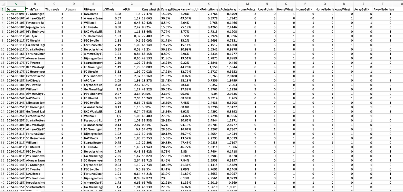
The data used in this article is a combination of already existing metrics, new metrics and newly developed models and scores. This is all done with raw event from Opta and Statsperfom and is combined with physical data from Skillcorner.

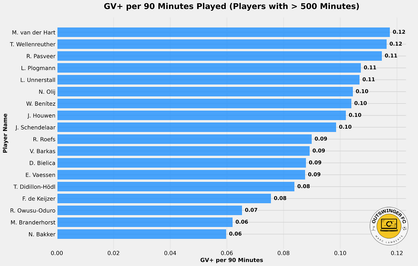
The data was last collected on Wednesday 15 January 2025 and consists of the season-level data of the French Ligue 1. For the players’ individual scores and metrics, I have chosen to only select players who have played over 500 minutes in the season so far.

3. Data models

For the creation of the new metric, we will focus on a few data models. To have an understanding what they are, I will explain them briefly and how I will use them in the rest of the research.
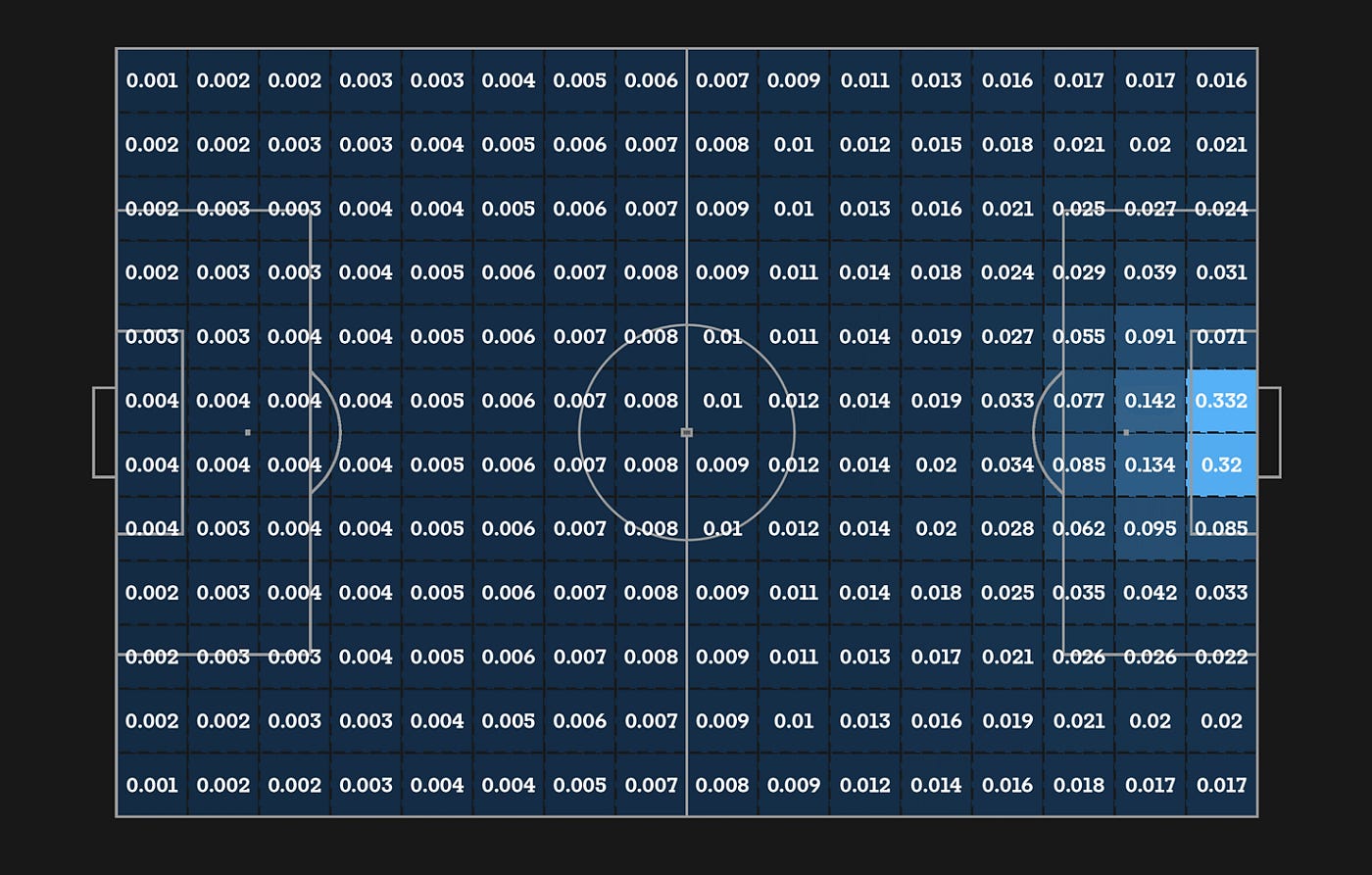
3.1 Expected threat

The basic idea behind xT is to divide the pitch into a grid, with each cell assigned a probability of an action initiated there to result in a goal in the next actions. This approach allows us to value not only parts of the pitch from which scoring directly is more likely but also those from which an assist is most likely to happen. Actions that move the ball, such as passes and dribbles (also referred to as ball carries), can then be valued based solely on their start and end points, by taking the difference in xT between the start and end cell. Basically, this term tells us which option a player is most likely to choose when in a certain cell, and how valuable those options are. The latter term is the one that allows xT to credit valuable passes that enable further actions such as key passes and shots.

Soccerment, 2021

The model was created by Karun Sing in 2018 and you can read about his terminology and explanation here:

Introducing Expected Threat (xT)

Modelling team behaviour in possession to gain a deeper understanding of buildup play.

karun.in

3.2 Expected Pass (xPass)

Just as expected goals (xG) predicts the likelihood of a shot being scored, our xP framework models the probability of a pass being completed by taking information about the pass and the current possession.

We train a model to predict the likelihood of a pass being completed or not based on its observed outcome (where 0 = incomplete, 1 = complete). In this way, 0.2 xP represents a high-risk pass (i.e. one predicted to be completed only 1 in 5 times) and 0.8 xP represents a relatively low-risk pass (i.e. predicted to be completed 4 in 5 times). — The Analyst

The Analyst, 2021

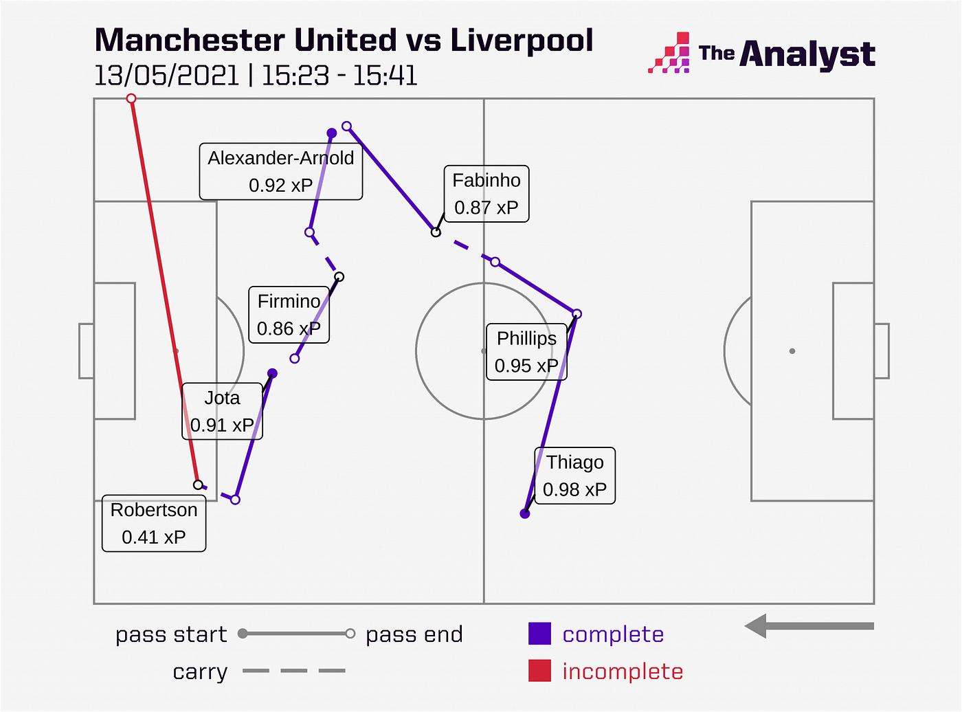
As described by The Analyst above, we can predict the likelihood of a pass being completed. This gives us an idea of how much risk a pass has and how it can contribute to an approach for attack or defence.

3.3 Expected Possession Value (EPV)

Expected Possession Value (EPV) is a sophisticated metric in sports analytics, particularly in soccer, used to quantify the potential value of a team’s possession at any given moment during a match. It estimates the likelihood of a possession resulting in a goal by analyzing various contextual factors such as the ball’s location, player positioning, and game dynamics. EPV draws on large datasets to predict the outcomes of possession sequences, offering a probabilistic view of whether the team is likely to progress the ball effectively, create scoring opportunities, or lose possession.

EPV Grid — Outswinger FC, 2025

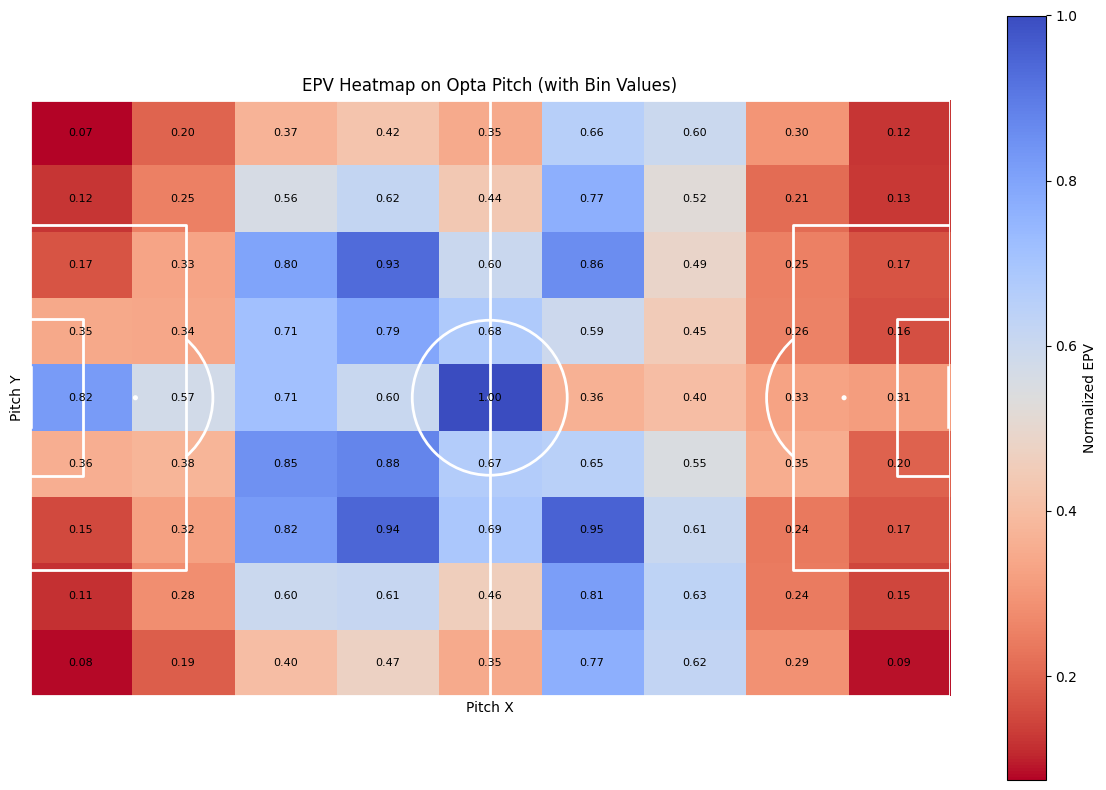
By assigning values to specific actions like passes, dribbles, or tackles, EPV measures contributions beyond traditional statistics such as goals or assists. It gives coaches and analysts deeper insights into team strategies, allowing them to optimise play and assess risks more effectively.

4. Methodology

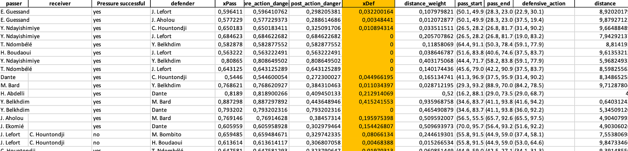
This analysis aims to match passing events with nearby defensive actions within a spatial threshold and evaluate their impact on game dynamics using metrics like expected pass success (xPass), defensive contribution (xDEF), and pre-and post-action danger levels. The analysis incorporates distance weighting to quantify the influence of proximity between events.

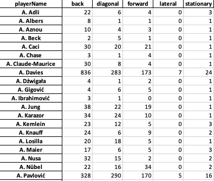
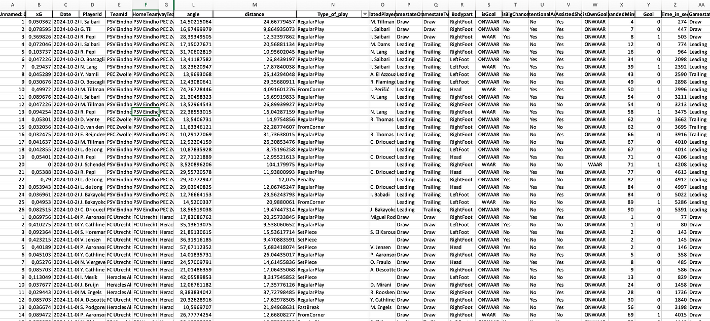
The data we select using Python from our original Excel file are the following metrics:

  • playerName
  • contestantId
  • x, y
  • endX, endY
  • outcome
  • typeId

The dataset contains passing and defensive action events with coordinates (x,y) player identifiers, and outcomes. Passes are filtered using typeId == 1. Only successful passes (outcome=1) are further analyzed. Receivers are identified by matching subsequent events (endX, endY) from a different player and team.

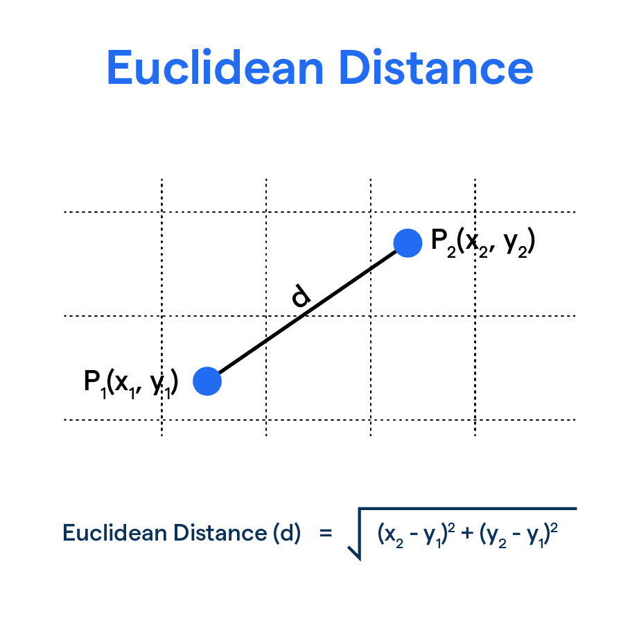
Following that I want to match defensive actions or pressures if they fall within a 10 mether threshold of the opposition. The spatial proximity is noted; For each pass, defensive actions from a different team are identified if they fall within a threshold distance of 10 meters.

After we get the data and new metrics, we go on to the next step. We are going to calculate two different metrics: pre-danger and post-danger based on EPV. The PreDanger metric incorporates the EPV of the initial pass location and adjusts it based on the distance and angle to the pass endpoint.

  • EPVstart​ is the EPV value at the starting location of the pass.
  • d is the distance between the starting and ending positions of the pass.
  • arctan⁥2 accounts for the directional change, reflecting how difficult the pass is regarding angle.

Post-action danger is adjusted based on the defensive outcome and the EPV of the pass endpoint. Defensive success reduces the PostDanger by half, while unsuccessful actions leave it unchanged.

Where:

  • EPVend​ is the EPV value at the ending location of the pass.
  • Defensive outcome (outcome=1) indicates a successful defensive intervention, halving the danger.

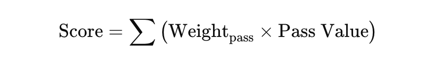
The next and final step is xDef. It can be quantified using the expected reduction in danger before and after the action, adjusted for spatial proximity. It considers pre-action danger (PreDanger), post-action danger (PostDanger, and a distance-based weight (DistanceWeight) to account for the defender’s proximity to the play.

  • PreDanger⋅xPass combines the danger level with the likelihood of the pass succeeding, offering a more nuanced starting value for defensive impact.
  • PostDanger reflects the defender’s influence, reduced further in cases of successful defensive actions.
  • DistanceWeight adjusts the overall impact based on the spatial proximity of the defensive action.

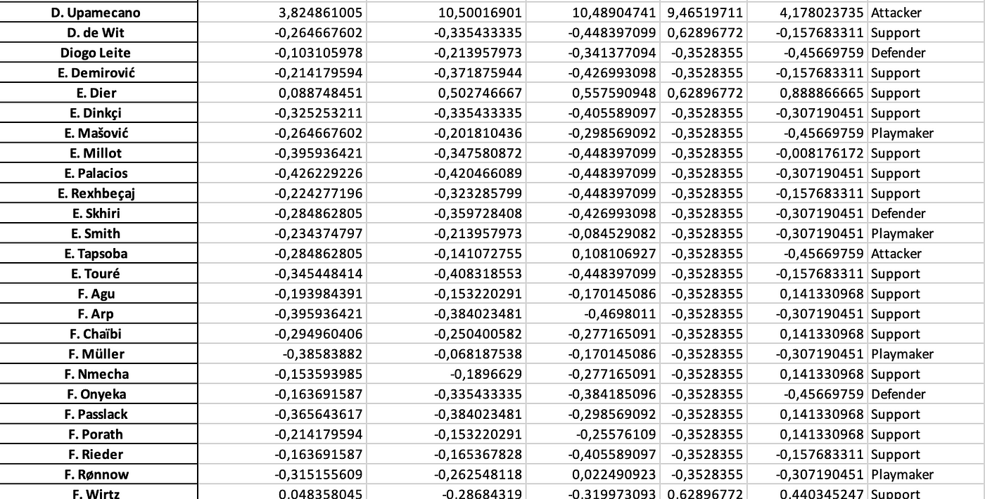
In the end we calculate all the new metrics and save them to an excel file. From that excel file we can start working on the analysis, that gives us a better idea of what xDef means for teams and players in Ligue 1.

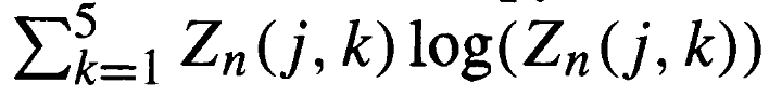
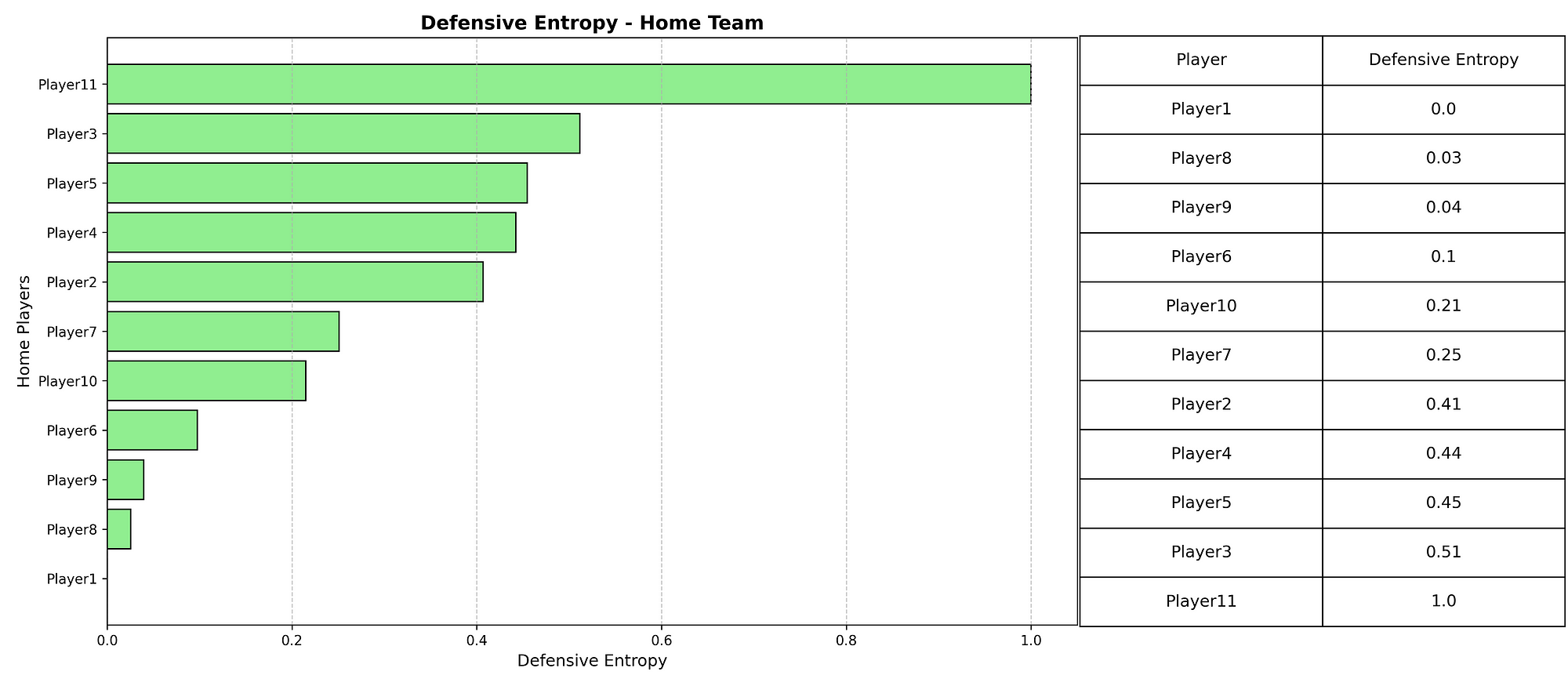
5. Analysis: Ligue 1

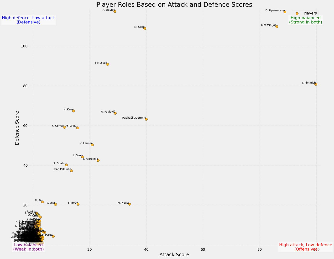
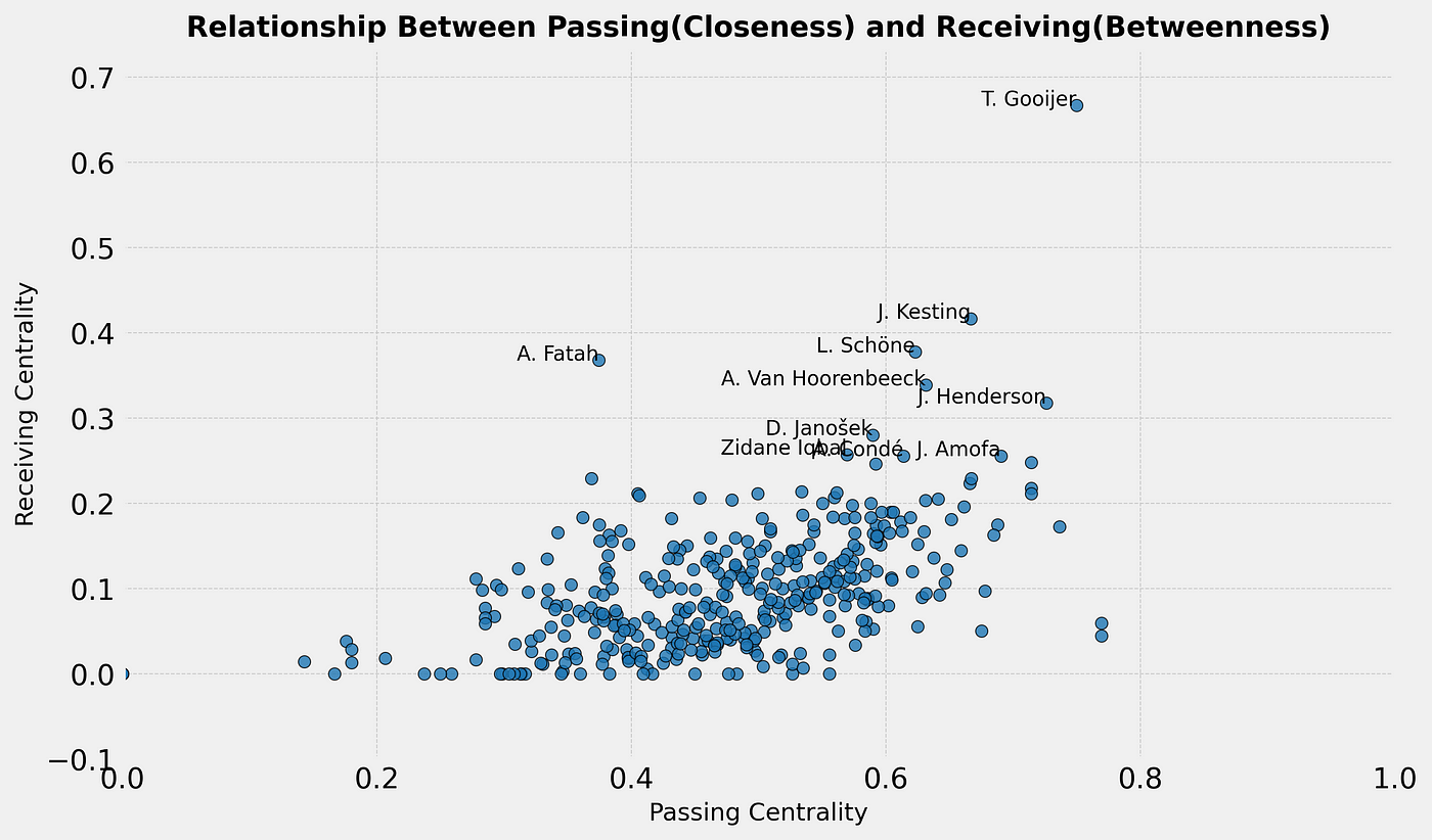
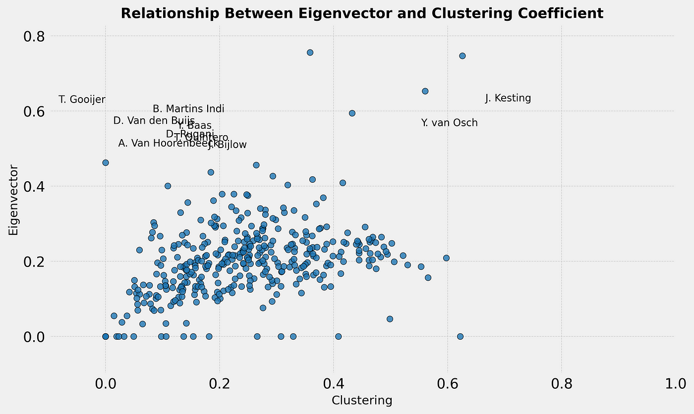
So, now we want to look at which players perform the best in terms of xDef. In the scatterplot below you can see the relation between xPass and xDef.

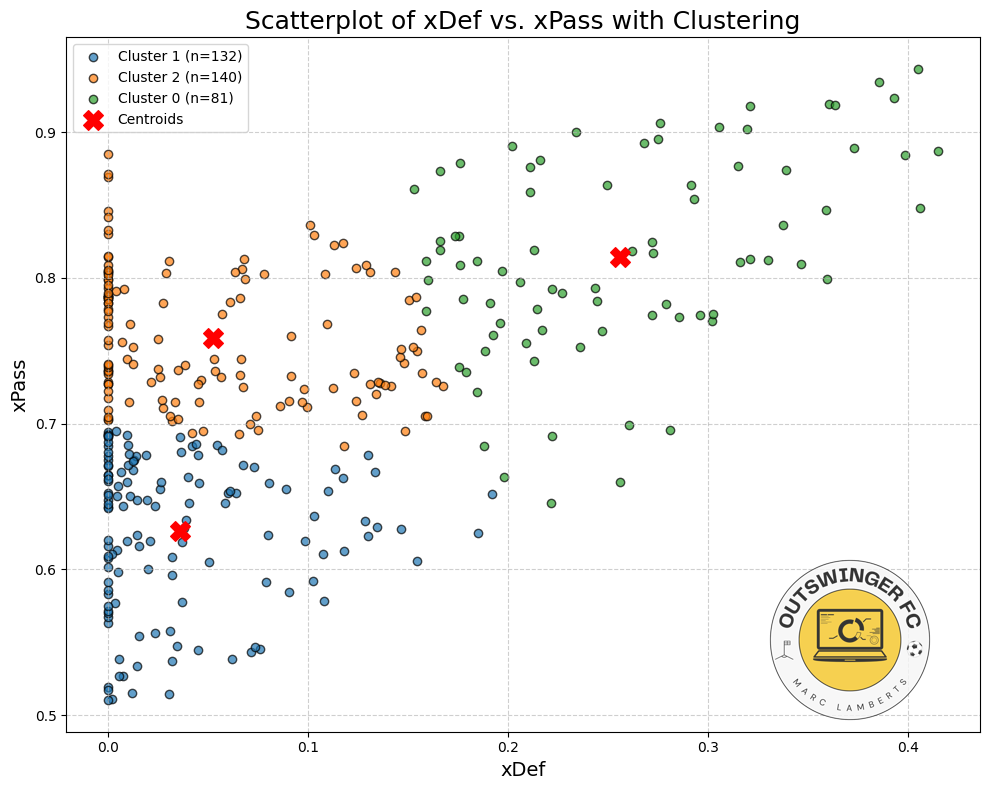
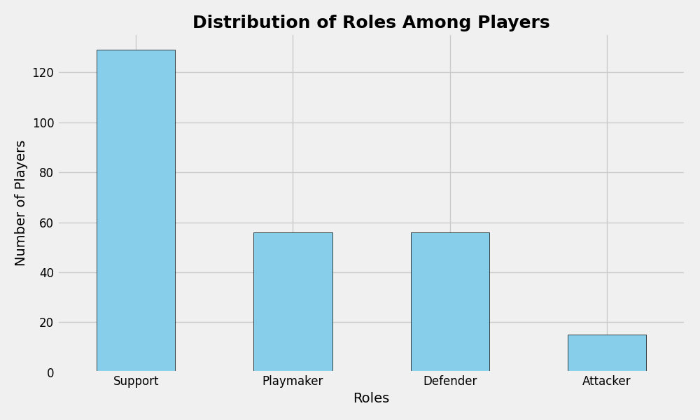
In the scatterplot above we have attempted to cluster the data and give it a meaningful insight. Most are in cluster 2, which have relatively high xPass values, but under average xDef. Meaning it is more difficult to affect the threat. After that follows cluster 1, which has under average xPass, but also under average xDef, so these don’t have great threat but also arent’ affected as much. The last cluster is cluster 0, which do have relatively average to high xPass, and also have higher xDef, signifying their defensive activity intensity and affection.

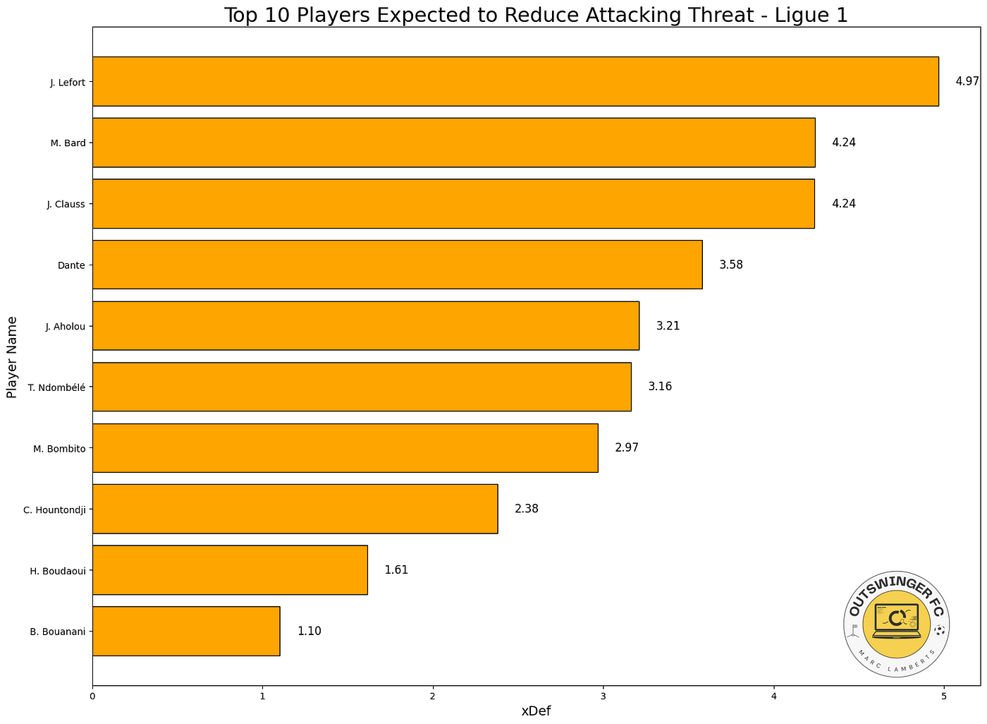
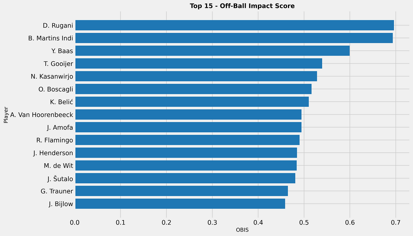
When we look at the total xDef in the season so far, these players do perform the best. The number quantifies how much a defender reduces the attacking threat of their opponents. A value of 4,97 like J. Lefort has, means that across the analysed period, the player reduced the likelihood of goals by a total of 4 (on a probability scale).

6. Final thoughts

The idea of this research was to create a model that gives values to off-the-ball defensive activities and gives probability of reducing threat. This is based on distance/pressures and defensive activity on the ball, but still lacks the spatial data from the tracking data. This will be done for a 2.0 version.

However, this metric/model gives us insight how a defensive players makes an impact in reducing attacking threat by moving into the passes of the attacking team.

7. Sources

Expected Threat (xT):

Singh, K. (2018). Introducing Expected Threat (xT). Retrieved from https://karun.in/blog/expected-threat.html
StatsBomb. (n.d.). Possession Value Models Explained. Retrieved from https://statsbomb.com/soccer-metrics/possession-value-models-explained/
Soccerment. (n.d.). Expected Threat (xT). Retrieved from https://soccerment.com/expected-threat/
Expected Possession Value (EPV):

FernĂĄndez, J., Bornn, L., & Cervone, D. (2020). A Framework for the Fine-Grained Evaluation of the Instantaneous Expected Value of Soccer Possessions. Retrieved from https://arxiv.org/abs/2011.09426
FernĂĄndez, J., Bornn, L., & Cervone, D. (2019). Decomposing the Immeasurable Sport: A Deep Learning Expected Possession Value Framework for Soccer. Retrieved from https://www.lukebornn.com/papers/fernandez_sloan_2019.pdf
xPass:

Decroos, T., Van Haaren, J., & Davis, J. (2019). Valuing On-the-Ball Actions in Soccer: A Critical Comparison of xT and VAEP. Retrieved from https://tomdecroos.github.io/reports/xt_vs_vaep.pdf
Decroos, T., Van Haaren, J., & Davis, J. (2019). Valuing On-the-Ball Actions in Soccer: A Critical Comparison of xT and VAEP. Retrieved from https://dtai.cs.kuleuven.be/sports/blog/valuing-on-the-ball-actions-in-soccer-a-critical-comparison-of-xt-and-vaep/
Defensive Actions:

Merhej, C., Beal, R., Ramchurn, S., & Matthews, T. (2021). What Happened Next? Using Deep Learning to Value Defensive Actions in Football Event-Data. Retrieved from https://arxiv.org/abs/2106.01786
StatsBomb. (n.d.). Defensive Metrics: Measuring the Intensity of a High Press. Retrieved from https://statsbomb.com/articles/soccer/defensive-metrics-measuring-the-intensity-of-a-high-press/
Expected Goals (xG) Models:

Wikipedia contributors. (2023, September 15). Expected Goals. In Wikipedia, The Free Encyclopedia. Retrieved from https://en.wikipedia.org/wiki/Expected_goals
Pollard, R., & Reep, C. (n.d.). Introducing Expected Goals: A Tutorial. Retrieved from https://soccermatics.readthedocs.io/en/latest/lesson2/introducingExpectedGoals.html

Passing roles: using pass direction data to establish tactical roles

In data departments all over elite sports and in football in particular, we create and develop metrics. To make them actionable, we categorise them into the vital parts of data called KPI. KPI are Key Performance Indicators that indicate the relevant data metrics for a specific player or team. They always look at performance, but in this article I want to look more closely at intention.

Intention is often a good way to reflect on coaching and training session. Iy assesses playing style even when the performance isn’t the best exactly. By looking at intentions we can give much more insight into players’ individual preferences in a larger collective.

In this article, we only look at passes and what their intention can tell us about playing style and tactics. In the methodology, we will speak more about it, but in essence we use passing direction to establish tactical roles within a game or a series of games.

Data

The data used in this article was retrieved on January 12th, 2025. It consists of event data is courtesy of Opta/StatsPerform. It’s raw data that is manipulated and calculated intro scores and metrics to conduct our research.

I have pulled a smaller sample size to only focus on one team. The specific team that we are going to focus on is Bayern München from the German Bundesliga, season 2024–2025 and is updated until the 10th of January 2025. I have included all players from Bayern Münched that have played in 5 or more games, to make the data more representative.

Methodology

There are a few things we need to do to get from the raw data to our desired metrics. First, we need to qualify each pass in our database and categorise them. Important for this is that we look at intention and so much to success, so the outcome doesn’t play a big role.

We have five different directions a pass can go:

  1. Forward: A pass where the ball moves predominantly in the positive vertical (y-axis) direction, i.e., toward the opponent’s goal in most contexts.
  2. Back: A pass where the ball moves predominantly in the negative vertical (y-axis) direction, i.e., toward the passer’s own goal.
  3. Lateral: A pass where the ball moves horizontally along the field, with minimal forward or backward movement.
  4. Diagonal: A pass where the ball moves both vertically and horizontally, creating a diagonal trajectory.
  5. Stationary: A pass where the ball does not move significantly or remains near the initial position.

We run the code through Python and convert our initial raw event data into the new count. It will show us the players with the pass directions they have in the database, that will look something like this:

Now we have our pass directions, but the next step is to convert those pass directions into something more tangible, something more actionable. We chose to create new metrics or roles with these given metrics.

We have four different roles:

  • Attacker
  • Playmaker
  • Support
  • Defender

Each of these roles is made by looking at pass direction and assigning weights to the calculation of the z-scores. This you can see in the code below.# Calculate z-scores for each direction
z_scores = (direction_counts – direction_counts.mean()) / direction_counts.std()

# Define weights for each direction
weights = {
‘forward’: 1.5,
‘back’: 1.0,
‘lateral’: 1.2,
‘diagonal’: 1.3,
‘stationary’: 0.8
}

# Apply weights to z-scores
for direction, weight in weights.items():
if direction in z_scores.columns:
z_scores[direction] *= weight

# Assign roles based on weighted z-scores
roles = []
for _, row in z_scores.iterrows():
role_scores = {
‘Playmaker’: row.get(‘forward’, 0) + row.get(‘diagonal’, 0),
‘Defender’: row.get(‘back’, 0) + row.get(‘lateral’, 0),
‘Support’: row.get(‘stationary’, 0) + row.get(‘lateral’, 0),
‘Attacker’: row.get(‘forward’, 0) * 1.2 + row.get(‘diagonal’, 0) * 1.1
}
roles.append(max(role_scores, key=role_scores.get))

z_scores[‘role’] = roles

Now, if we run that code — we will not only get the players with their pass directions, but we will get roles too. Roles that will give intention and the numbers will show how close they are to the perfect role. We use z-scored to calculate that.

To create a score that goes from 0–1 or 0–100, I have to make sure all the variables are of the same type of value. In this, I was looking for ways to do that and figured mathematical deviation would be best. We often think about percentile ranks, but this isn’t the best in terms of what we are looking for because we don’t want outliers to have a big effect on total numbers.

I’ve taken z-scores because I think seeing how a player is compared to the mean instead of the average will help us better in processing the quality of said player and it gives a good tool to get every data metric in the right numerical outlet to calculate our score later on.

Z-scores vs other scores. Source: Wikipedia

We are looking for the mean, which is 0 and the deviations to the negative are players that score under the mean and the deviations are players that score above the mean. The latter are the players we are going to focus on in terms of wanting to see the quality. By calculating the z-scores for every metric, we have a solid ground to calculate our score.

The third step is to calculate the CTS. 

We talk about harmonic, arithmetic and geometric means when looking to create a score, but what are they?

The difference between Arithmetic mean, Geometric mean and Harmonic Mean

As Ben describes, harmonic and arithmetic means are a good way of calculating an average mean for the metrics I’m using, but in my case, I want to look at something slightly different. The reason for that is that I want to weigh my metrics, as I think some are more important than others for the danger of the delivery.

So there are two different options for me. I either use filters and choose the harmonic mean as that’s the best way to do it, or I need to alter my complete calculation to find the mean. In this case, I’ve chosen to filter and then create the harmonic mean.

This leaves exactly what we want. Every pass direction has its z-scores and based on those intentions, we can give roles to the players which they are most likely to fit.

Analysis

Now that we have all the data we want, let’s look at the most common profiles/roles in these games:

As you can see, most of the players have a support role, followed equally by playmaker and defender, while attacker is the lowest. When we look at the roles there are two more attacking roles and two more defensive roles

The next step is to combine the roles and create a scatterplot that shows us how good a player is in the defensive and attacking metrics:

In the scatterplot above you can see how the players perform according do their attacking and defensive scores (0–100). You can also see the tendencies in the corners of the plot, showing what values are assigned to them.

What’s interesting in this case is that the players with the highest attacking score or contribution from their passing, are the defenders. It’s not surprising as they always will pass the ball up the pitch, while attackers will need to be more conservative in their passing as they are also tasked with maintaining possession.

Final thoughts

This framework provides a practical way to analyse player performance by turning pass directions and weighted metrics into clear roles like Playmaker, Attacker, Defender, and Support. It simplifies complex player behavior into easy-to-understand visuals, like scatterplots and bar charts, making it easier for coaches and analysts to see how players contribute. Plus, the flexibility of this system means it can be adapted to other sports or fine-tuned to fit specific strategies.

That said, there’s room to make it even better. The weights used are static and don’t adjust to changing game situations, and the roles might oversimplify players who excel in multiple areas. Adding more context, like player positions or game situations, could make the results even sharper. Overall, this framework is a great starting point for understanding player roles and opens up plenty of opportunities to refine and expand the analysis.

Finding similar players: Cosine similarity, Euclidean Distance & Pearson Correlation

People often ask me what gives me the most joy about working in football and I honestly can remember when I gave the same answer twice. It’s an incredibly dynamic world, and I love so many aspects of it. Sometimes it’s also that I just love everything and that’s part of my shortcomings. However, I missed writing about specific scouting topics and I decided to combine mathematical concepts with finding a particular player. Let’s look at player similarities.

Player similarities can give us an insight not only into the player of similar quality but also give us an indication of the similar playing style a player might have.

In this article, I will look at similar players to Mohammad Salah from Liverpool playing in the Premier League. Not only will I find some similar players, but I will be using three different ways of doing that:

  • Cosine Similarity
  • Euclidean Distance
  • Pearson Correlation Coefficient.

These three concepts will be explained prior to the actual analysis of this article.

Data

For this analysis, I’m using Wyscout data from the 2024–2025 season which consists of the Premier League. These have been collected on December 27th, 2024 so some of the data can be outdated as of when you are reading this article.

This can obviously be done with other data sources such as Statsperform/Opta, Statsbomb and many others, but these are the sources I’m using. I’m filtering the players for attackers who have played at least 500 minutes to make it all a bit more representative.

Cosine Similarity

Cosine similarity measures the similarity between two vectors by computing the cosine of the angle between them. It is calculated by taking the dot product of the vectors and dividing by the product of their magnitudes. The resulting value ranges from -1 to 1, though in most practical scenarios (especially in text analysis), it ranges from 0 to 1. A higher value indicates greater similarity.

Cosine similarity is scale-invariant, meaning that scaling a vector does not affect its similarity. As seen above, it is about the angle rather than the distance of the two points. It is widely used in natural language processing, information retrieval, recommendation systems, and clustering for measuring the resemblance between data points.

Euclidean Distance

The Euclidean distance is a fundamental metric in mathematics and data science that measures the straight-line distance between two points in Euclidean space. It is derived from the Pythagorean theorem, which states that the square of the hypotenuse of a right triangle equals the sum of the squares of the other two sides. The Euclidean distance is the square root of the sum of squared differences between corresponding coordinates.

This measure captures how far apart two points are, which makes it useful in various tasks such as clustering, classification, and anomaly detection. Unlike some other distance metrics, Euclidean distance is sensitive to scale and does not directly account for direction.

Pearson Correlation Coefficient

The Pearson correlation coefficient is a statistical measure that quantifies the strength and direction of the linear relationship between two continuous variables. Mathematically, it is defined as the ratio of the covariance of the two variables to the product of their standard deviations.

Its value ranges from -1 to +1, where -1 indicates a perfect negative linear correlation (as one variable increases, the other decreases at a proportional rate), +1 signifies a perfect positive linear correlation (both variables move together in the same direction proportionally), and 0 indicates no linear relationship. Because it captures only linear relationships, a high or low Pearson correlation does not necessarily imply a cause-and-effect relationship or any non-linear association.+——————-+——————————–+———–+—————–+—————————+
| Metric | Definition | Range | Scale | Key Usage |
| | | | Sensitivity | |
+—————————————————————————————————————+
| Cosine Similarity | Cosine of angle between vectors | -1 to +1 | Scale-invariant | Text analysis, |
| | | | | recommendations |
+—————————————————————————————————————+
| Euclidean Distance| Straight-line distance | 0 to +∞ | Scale-sensitive | Clustering, |
| | in n-dimensional space | | | nearest-neighbor |
+—————————————————————————————————————+
| Pearson | Measures linear | -1 to +1 | Scale-invariant | Stats, data science |
| Correlation | relationship | | | |
+——————-+———————————-+———–+—————–+—————————+

In the table above you see the three different metrics compared to each other. I wanted to show and compare these different ways of looking at similarities as it will lead to different results in actually finding similar players. Let’s have a closer look.

Similar players

As said above, we will look at the Premier League to find similar players for Mohammad Salah based on playing style and intention. Using the three different methods we get these results:

The first things that we can conclude from this is that there are different ways of calculating similarity and these numbers are different. The similarities in Cosine Similarity are bigger in the distance between players, while with Pearson Correlation the distances are smaller but there are less big similarities. The Euclidean distance works with different ways of counting similarities, so you mostly see the same players, but the similarity number is much much lower.

The second thing you can see is that it lists almost the same players, however, the ranking shifts. Haaland for example is the 7th most similar player in Cosine Similarity, not in the top 15 with Euclidean Distance and 6th with Pearscon Correlation. If you base your findings on rankings, it is important to stress that the method of calculation will manipulate the data and influence decision-making.

Goalplayer Value Added (GV+): measuring passing contribution in the build-up for goalkeepers

It has been a hot minute since we spoke about goalkeeper data did we not? Goalkeeper data is not as evolved as field players. The data that is commonly used in goalkeeper evaluation is the shot-stopping data. I can write about that here too, but other people have done that better and in more detail in other blogs or on websites. I prefer looking at data that does not look at shot-stopping, but on-ball metrics for goalkeepers. Specifically, data that deals with actions with the feet of goalkeepers.

There are numerous ways of giving value or worth to on-ball actions, but I wanted to see how much passing adds value to the build-up of a team. I want to categorise the passing length, locations and impact on build up to measure how active a goalkeeper contributes to that. In the fashion of my latest articles, I will approach this from a theoretical, data and mathematical approach.

How qualified am I to talk about goalkeeper data? I am not sure, but I have written some articles earlier about goalkeepers:

Contents

  1. Why this new metric?
  2. Data collection
  3. Methodology: Calculations
  4. Analysis: GV+
  5. Final thoughts

Why this new metric?

The Goalplayer Value Added (GV+) metric provides a quantitative evaluation of a goalkeeper’s contribution to their team’s build-up play and defensive organisation, extending beyond traditional shot-stopping measures. By incorporating weighted assessments of passing, claiming, and tackling actions, GV+ offers a comprehensive analysis of a goalkeeper’s influence on ball progression and defensive interventions.

Pass contributions are evaluated based on length (short, medium, long), accuracy, and spatial context (pitch thirds and half-spaces), capturing the risk and reward of distribution. Claims are assessed by type (e.g., high or low) and location, reflecting a goalkeeper’s ability to relieve pressure and initiate counter-attacks. Tackles are weighted by positional zones to account for their defensive significance.

This metric enables detailed comparisons of goalkeepers, highlighting their role as proactive playmakers and defenders. GV+ supports data-driven scouting, performance appraisal, and tactical planning by contextualising a goalkeeper’s impact across all phases of play.

Data collection

The data used in this analysis consists of different data sources. For the player-level data I used Wyscout and Statsperform/Opta. All data is based on goalkeepers in the Eredivisie 2024–2025 with at least 500 minutes played for their club. I will use this data to showcase which goalkeepers are the best in shot-stopping using the two different data sources.

For the event data I used Statsperform/Opta and there is no minutes played filter on it, but I have only focused it on the Eredivisie 2024–2025 season. This will be used to actually make the new metric by focusing on the passing.

Methodology

So how do we go about getting this specific metric? The first step is to look at the data we need for it:

  • Passes: just the raw passes and whether they are completed or not
  • PlayerId and TeamId
  • Start location and End location of the passes

With that data we first going to calculate three different forms of passes. Short passes, which will be shorter than 5 meters. Medium passes that will be between 5 and 15 meters. Long passes that will be more than 15 meters.

The next thing we need to is to look at the locations. A short pass starting higher up the pitch can mean something different than a medium passes starting deep, so we need to make these distinctions. We will divide the pitch into 18 zones as illustrated below.

What I want for our build-up by goalkeepers, is to see where the end location of the ball is going to be. I will only focus on goalkeepers’ passes that will end in either defensive third or in the middle third as it gives a better idea of progression from build-up, rather than a long ball.

All of these options need different weights. This means we have a lot of options to weigh.

As shown in the table above, by giving weights to the passes, we can add value to each pass made. However, we don’t only add passes to our calculations that are successful. The successful passes are added as +, but the unsuccessful passes, will be listed as -. These weights will be converted into a number.

Now we have all the weights and type of passes we are going to use, we can go over to the calculations.

In this formula, we calculate the sum of all actions. The weight of the pass is quite evident, as it is one of the weights we can have given above in the table. The pass value corresponds with a score divided by the total of passes. This score is either + or -, depending on the outcome of the pass. It’s worth mentioning that the + or -, will only be added in the final score, not in the weights. Every pass has the same weight, but the outcome dictates whether it’s positive or negative.

Before we calculate the GV+, I’m going to assess the threat of the pass as well with Expected Threat. The reason I’m doing this is to see how much attacking danger a goalkeeper can add with passing.

The basic idea behind xT is to divide the pitch into a grid, with each cell assigned a probability of an action initiated there to result in a goal in the next actions. This approach allows us to value not only parts of the pitch from which scoring directly is more likely, but also those from which an assist is most likely to happen. Actions that move the ball, such as passes and dribbles (also referred to as ball carries), can then be valued based solely on their start and end points, by taking the difference in xT between the start and end cell. Basically, this term tells us which option a player is most likely to choose when in a certain cell, and how valuable those options are. The latter term is the one that allows xT to credit valuable passes that enable further actions such as key passes and shots. (Soccerment)

So before we calculate GV+, let’s see what we have now:

  1. Pass types
  2. Pass locations
  3. Weights
  4. xT

Now we have to create a score, but there are different ways of doing that. We are going to use the mean. I’ve taken z-scores because I think seeing how a player is compared to the mean instead of the average will help us better in processing the quality of said player and it gives a good tool to get every data metric in the right numerical outlet to calculate our score later on.

Z-scores vs other scores. Source: Wikipedia

We are looking for the mean, which is 0 and the deviations to the negative are players that score under the mean and the deviations are players that score above the mean. The latter are the players we are going to focus on in terms of wanting to see the quality. By calculating the z-scores for every metric, we have a solid ground to calculate our score via means.

I’m going to use the weighted mean to create the GV+. GV and xT get a weight of 1, while the weight as shown in the table before gets a weight of 2:

By doing this, I get a new score that gives me the GV+, my new metric I have been looking for. After having done that, we can start with the analysis.

Analysis

We now have all the goalkeepers with their playing minutes and how much they contribute to build-up actions. In the scatterplot below you can see how they rank.

As we can see in the scatterplot we see the correlation between minutes played and the total of GV+ a player has. That’s only logical because more passes lead to more xT or more positive outcomes. We now have to fix two things:

  1. We need to have a minimum amount of minutes for representative analysis. I will set it at 500 minutes played in the current season.
  2. I want to calculate the per 90 metric, as it gives a closer idea of how a player does per game/90 minutes and adds value for future evaluation.

As you can see in the bar graph above, we now have all goalkeepers with at least 500 minutes played in the Eredivisie 2024–2025 with the per 90 values calculated. This gives a more complete idea of how much they contribute to the build-up per 90 minutes in the games and how much their passing adds value to it.

Final thoughts

Adding value to the passes in the build-up shows that a goalkeeper can be integral to possession phases with his/her feet. Goalkeeping is more than just shot-stopping and this value shows that.

There are challenges though I would like to tackle in version 2.0 of this metric. I want to include more quality in the index to assure it’s more quality-based and less quantity-based. I would also like to see where we can make better distinctions in zones rather than only thirds. Room for thought for sure, in 2025!

From Basketball to Football: Spatial Structure of Man-Marking using Tracking Data

It might seem that I’m incredibly productive with many articles coming out of my pen — or fingers if you will- these last few months, but they all were quite on the surface of what I wanted to achieve. In the background I’ve been looking into this for the better part of 2 years: how can we effectively take data concepts or analysis from other sports and apply them to the beautiful game we call football?

In this article, I will take 2 concepts from Basketball data analytics, explore their theoretical framework and apply them to football data analytics. This is quite a wild undertaking with much room for errors and challenges, which is research in itself. My aim is not to have the perfect, waterproof, airtight analysis, but to further explore how we can learn from data analytics in other sports to enhance our own way of looking at data in football.

Contents

  1. Why this article?
  2. Data explanation and sources
  3. Introducing the topic: Defensive structure of man-marking
  4. Existing research in basketball
  5. Converting it into football data
  6. Metric I: Average attention drawn
  7. Metric II: Defensive entropy
  8. Challenges
  9. Final thoughts
  10. Sources

Why this article?

It’s safe to say that I’m a bit obsessed with off-ball data or out-of-possession data. Like I have said before, football is based on goals and the entertaining part of the game in the eyes of broadcasters and fans is often the scoring of goals. While I understand the sentiment behind it, I would love it if there was some more balance in the analytics space. Defending is a big part of the game and is reflected in tactics, but the next step is to have more defensive-minded and out-of-possession data.

In basketball, players need to be able to attack and defend which has always interested me. I would like to know if we can convert or transfer data analysis from basketball to football to see where we can learn and gain an edge in terms of defence. We often speak about man-marking and zonal marking in football, but we have next to no data on this. In basketball, they call it guarding, but they more data available on the guarding of players and whether 1 player or 2 players guard a player. That’s why I wanted to see if the latter can be applied to football.

Data explanation and sources

For this specific research, I’m not going to use my regular data providers such as Opta, StatsPerform, Statsbomb or Wyscout. I’m using a free data set from Metrica Sports that allows me to use tracking data. You can find it here: https://github.com/metrica-sports/sample-data/tree/master/data/Sample_Game_1

This dataset is completely anonymised, so we don’t know which game it or details about the players. However, it gives us a good insight in how tracking data works, how it can be utilised and gives us a platform to contintue to build our research on.

Introducing the topic: Defensive structure of man-marking

Before we look at what has been written about the spatial structure in basketball, I want to nail down the definition of man-marking. In football,, we often have zonal marking, but to make the fields level — in basketball, we almost never see pure zonal marking- we look at man-marking.

Man marking in football is a defensive strategy where each defender is assigned to closely follow and mark a specific opponent player throughout the game. The goal is to restrict the marked player’s movement, limit their influence on the game, and reduce their opportunities to receive the ball or make effective plays.

Existing research in basketball

We seek to fill a void in basketball analytics by pinging the first quantitative characterization of man-to-man defensive effectiveness in different regions of the court. To this end, we propose a model which explains shot selection (who shoots and where) as well as the expected outcome of the shots. We term these quantities shot frequency and efficiency, respectively; see National Basketball Association (2014) for a glossary for other basketball terms used throughout the paper. Despite the abundance of data, critical information for determining these defensive habits is unavailable. And, most importantly, the defensive matchups are unknown. While it is often clear to the human observer who is guarding whom, such information is absent from the data.

While in theory, we could use crowd-sourcing to learn who is guarding who
notating the data set is a subjective and labor-intensive task. Second, in o
provide meaningful spatial summaries of player ability, we must define the
court regions in a data-driven way. Thus, before we can begin modeling de
ability, we devise methods to learn these features from the available data.
Our results reveal other details of play that are not readily apparent. (
Characterizing the spatial structure of the defensive skill in professional basketball, Alexander Franks, Andrew Miller, Luke Bornn, Kirk GoldsberryThe Annals of Applied Statistics, Vol. 9, №1 (March 2015), pp. 94–121 (28 pages)

This research is the theoretical framework for what I seek to do. They found a data-driven way to measure man-marking in terms of time, shot efficiency and shot frequency in professional basketball in the NBA. The research is from 2015, but its value is still high as it has been conducted by scientists from Harvard Statistical Department.

Converting into football data

It might seem quite abstract right now and rightly so. Let’s make it into something tangible. What do we need to make it work for football? We need the following:

  • Tracking data: tracking the locations and movements of both offensive and defensive players
  • Shot data: shot frequency and expected goals numbers per player and team
  • Time: minutes played, games played, possessions
  • Event data: XY-data. These are also from the shot data, but we need more in that data frame, which I will touch upon a bit later.

Metric I: Average attention drawn

The first metric I want to talk about is the average attention drawn. What does this mean? It is the average attention a player receives from all defensive players at the point in time. We only focus on when the player is in the attacking half of the pitch because otherwise,the intention will be too broad.

We can calculate it as follows: the total amount of time guarded by each defender divided by the total amount of playing time.

Here is the first difficult thing. The difficulty of this metric lies in the following fact when we use tracking data in different sports, it gives different results. However, if you want to transfer basketball tracking data into football, we need to understand and visualize what it means.

The first big challenge is that we have players in basketball that have to do a total percentage of offense and percentage of defense, which means that if one team is attacking the other team the fact is that all 10 players are in the same half of the game. This is not the same when we deal with football because, in football, we hardly ever have 11 players against 11 players in one specific half. This means it’s more difficult to track data. We are tracking data or video footage to establish if a player is man-marking. That’s the first challenge we need to solve and after that, we needto find a solution to the fact that we can measure double-marking in football via this data.

Officially this means that we need to make some alterations to our analysis by man-marking. In football, we look at the distances of the defending player to the attacking player to establish man-marking in this metric.

For example, player A defending an attacking player shorter than five meters or within 2 meters will be registered as a man-marking event. If not, it’s not marking. I’m well aware that in terms of football we also usually have the zonal marking or hybrid marking, which is a combination. I will leave this out of the question for this part of my research because I’m purely looking at how we can transfer basketball data analytics to football data analytics and that’s why I have chosen this approach.

A set piece goal being scored

The first step is to make the tracking data into visuals so we can visually see where the players are situated or positioned on the pitch at specific times in the game. Here you can see a set piece goal by the HomeTeam, who play in red. Blue is the away team and they are defending.

Positions of Home team and Away team at 1 second played in the game.

What follows is that we pick out a certain player that will defend/mark an attacking player to see how much time they are spending marking that player. By looking at that we can find the average attention drawn; this signifies the threat or danger a play radiates by how closely they are marked.

Average attention drawn: the time all players spend marking a specific attacking player

If we look at the home team, we see the total attention drawn by player. This means that Player9 has the most attention drawn by the away team and is marked 35,79% of the time that he was on the pitch.

Average attention drawn: the time all players spend marking a specific attacking player

When we look at the away team, we see the total attention drawn by the player. This means that Player24 has the most attention drawn by the away team and is marked 22,5% of the time that he was on the pitch.

What we can conclude from this data is that the home team has a very dangerous or threat-imposing player in Player9, but the rest of the players on both the home and away sides, are evenly divided. In the perception of the away team, Player9 is one that needs more attention.

Metric II: Defensive entropy

So let’s take that Player9, because the data leads us to believe that he is a very important, dangerous and threat-imposing player. Maybe this player beats his direct opponent every time in a 1v1 and he needs to be double-marked. How can see if that’s the case? We can illustrate that with defensive entropy.

Defensive entropy measures the uncertainty with whom a defender or defensive player is associated throughout the opposition’s possession. In other words: who is guarding who? This might be useful as it illustrates how active a defensive player is on the pitch. If the player only focuses on one specific attacking player their defensive entropy is 0. If they divide their focus equally between multiple attacking players, their defensive entropy is 1. By averaging all defensive players’ defensive entropy we get an idea of tendencies: do players double-mark a high-threat attacker or switch places with other defensive players?

Before we get there, we need to figure out how to calculate it. We can do it via the following formula:

In this formula, Zn (j, k) is the fraction of the time where defensive player j marks attacking player k. This gives us a few results.

In the visual above you can see how the players score on defensive entropy. Player11 scores the highest, but that’s the goalkeeper so we have to take him out of the results. What we can see is that most players have the tendency to rather mark 1 player than they are to mark more players or switch.

The same goes for the away team. Player24 scores the highest, but that’s the goalkeeper so we have to take him out of the results. What we can see is that most players have the tendency to rather mark 1 player than they are to mark more players or switch.

When we look at the averages for the whole team, we can see that the home side has a defensive entropy of 0,31 and the away side has a defensive entropy of 0,32. These numbers are very close to each other, but it says that the away side is slightly more inclined to double-marking or defensive switches than the home side is.

Challenges

There are two challenges that I faced and need to have a closer look at:

  1. I have looked out of possession moments in the game. However, that doesn’t mean that it’s completely representative. There is a difference in marking a player on the ball, so literally having the ball, and marking a player that plays on a team with possession. Another one is to look at the marking when the defensive player’s team has the ball but is still marking the opponent.
  2. The defensive entropy comes from basketball, but they chose to focus on 1 or 2 players. In football, it often happens that players mark more players throughout the game. This also means I have to reevaluate how I choose in the data what marking means.

Final thoughts

Defensive entropy measures a player’s defensive versatility, indicating how effectively they disrupt offensive play by marking multiple players or reacting to various threats. A higher score suggests greater engagement and adaptability. Average attention drawn reflects how much focus a defender places on opposing players, with higher values showing more involvement in defensive actions. Together, these metrics reveal a player’s defensive workload: high entropy and attention drawn suggest active engagement but can lead to overcommitment, while balanced values indicate effective positioning. Understanding these metrics helps teams optimise defensive strategies, ensuring players are engaged without being overwhelmed.

In the follow up article, we are going to look at what these man-marking tendencies mean for the quality and quantity of shots: how does it impact that? Stay tuned for 2025!

Sources

  1. Characterizing Spatial structure in defensive skills in professional basketball: https://www.jstor.org/stable/24522412
  2. Metrica sports tracking data: https://github.com/metrica-sports/sample-data/tree/master/data/Sample_Game_1

Introducing SPER: A way of rating teams based on Expected Goals Difference from Set Pieces

This year would be the year that I would immerse myself in set pieces. I know that is something I’ve said a lot and it was one of my goals this year — but life has a funny way of disrupting all plans. Now, this year I’ve done a lot on metric development and before the year closes I wanted to share one last metric development/methodology with you that concerns set pieces.

I’ve done a few things on set pieces:

But, I want to do a final one that goes further and proceeds on the thought pattern of the Individual Header Rating (IHR). I have looked at an individual level what players can contribute in terms of headers, but how do teams rate in set pieces? That’s what I’m trying to illustrate by introducing SPER. A way of rating Set Piece Expected Goals Differences between teams.

Why this metric for set piece analysis?

There isn’t a great necessity for this specific metric. One of the reasons is for me to try and make a power ranking based on expected goals for set pieces. However, with this insight we can create a way of rating team’s on their expected goals performance on set pieces and evaluate whether to rely on them.

In other words, with this metric, we can draw conclusions on how well teams are doing with their set piece xG. This can lead us to a few conclusions as to why teams need to rely on their set piece routines or to improve their open play, as to spread their win chances.

With this metric, we can combine this with the Individual Header Rating and gain meaningful analysis for set pieces, both on individual and team level.

Data collection and representation

The data used for this project comes from Opta/Statsperform and was collected on Thursday 18th of December 2024. All of the data is raw event data and from that XY-data, all the metrics have been developed, plotted, manipulated and calculated.

The data is from the Eredivisie 2024–2025 season and both contains match-level data as well as season-level data. There aren’t any filters used for value, but this is something that can be done in the next implementation of the score, as I will explain further on in this article.

This focuses on how teams are doing so that’s why the set piece xG are generated for each team and not for the individual players. We can split them for players, but it will not be as representative. The xG generated from set pieces often is the consequence of a good delivery as well, which would be nullified if we look at it from an individual angle.

There are different providers out there offering the XY-data, but I am sticking to Opta data for event data as all my research with event data has been done with Opta and therefore the continuity will improve the credibility of this work in line with my earlier work.

What is categorised as set piece?

This might seem like a very straightforward question, but one we need to talk about regardless. In the data there are different filters for our xG:

So, we need to make a distinction between different plays. We will focus on set pieces, but as you can see there are different variables:

  • SetPiece: Shot occurred from a crossed free kick
  • FromCorner: Shot occurred from a corner
  • DirectFreeKick: Shot occurred directly from a free kick
  • ThrowinSetPiece: Shot came from a throw-in set piece

These definitions come from Tom: https://github.com/tomh05/football-scores/blob/master/data/reference/opta-qualifiers.csv

I am excluding penalty. By all means it is a set piece, but the isolation of the play means that it’s such a big impact on the expected goals, that I will exclude it. It doesn’t say anything about the quality of play, but rather about the quality of kicktacking.

Methodology

There are a few steps I need to take before I get the SPER from my original raw data. The first step is to convert the shots I have into shots with an expected goal value. Which shots are listed?

  • Miss: Any shot on goal which goes wide or over the goal
  • Post: Whenever the ball hits the frame of the goal
  • Attempt saved: Shot saved — this event is for the player who made the shot.
  • Goal: all goals

We take these 4 events and convert them to shots with added value, by putting them through my own xG model that’s trained on 400.000 shots in the Eredivisie. We then get an excel/csv file like this:

This is the core we are working with, but the next step is to also calculate and generate what that means per game for each side. This will add to the xG values, but also win chance in % and the Expected Points given based on that expected goals.

So, now I have the two Excel files that form the base of my methodology and calculation. From here on, I’m going to focus on creating a new rating: SPER.

That has to happen in Python, because that’s my coding language of choice, and will need a few things.

This analysis combines match results and expected goals (xG) data using the Glicko-2 rating system to dynamically evaluate team performance. Match outcomes are determined by comparing xG values of home and away teams. A win, draw, or loss is assigned based on xG values:

Additionally, xG data for specific play types, such as “FromCorner” and “SetPiece,” is filtered and averaged for each team.

The scaling factor (0.1) ensures the adjustment is proportional and keeps outcomes between 0 and 1.

The Glicko-2 system updates team ratings after each match using adjusted outcomes. Each team has a rating (R), a rating deviation (RD), and a volatility (σ). Updates are based on the opponent’s rating and RD, incorporating the adjusted match outcome (S). The system calculates the new rating as:

This is obviously for all the technical mathematicians out there, however, this is the calculation that has been done in Python, but via code. By converting this into Python code, we get a ready to use excel that we can use in the analysis.

Analysis

With the data in the excel file, I know have ratings for every matchday for every team in the Eredivisie. It shows how well every team is doing and how they are progressing over the first half of the 2024–2025 season.

In the bargraph above you can see the final ratings for the Eredivisie with an average included. In the bargraph previous ratings are also included for every team. Feyenoord, FC Twente, AZ, PSV and Ajax are the best teams in terms of SPER. Fortuna Sittard, PEC Zwolle, NAC Breda and RKC Waalwijk are the worst.

In the line graph above, you can see how the ratings evolve over the course of the season for the top 5 teams in the Eredivisie for SPER. As we can see Feyenoord steadily becomes better, while PSV jave a more interesting trajectory with starting high and climbing again. Ajax really sinks in the last few weeks.

Final thoughts

The Glicko-2 scoring system provides a clear way to rank Eredivisie teams by combining match results and average expected goals (xG). It adjusts ratings dynamically, considering form and opponent strength, while xG adds context by reflecting goal-scoring chances. This approach gives a better understanding of team performance than traditional standings. However, its accuracy depends on reliable xG data and the chosen scaling factor for adjustments. Overall, the system is practical for tracking team progress and comparing strengths, offering useful insights for fans and analysts.

Quantifying Off-Ball Contributions in Football Using Network Analysis: The Off-Ball Impact Score (OBIS)

This might be my best and scariest project up to date. Scary because it can be full of flaws, but also best because I feel this will change something in the way we approach passing networks. Not that I think I will innovate the analytics space, but because I have been trying to find a way to create something meaningful from passing networks away from the aesthetics on social media. Because, I’m a firm believer we can create something meaningful from it and gather valuable information, you just need to know where to look and what the aim is.

In this article, I will show you a way that you can use to create off-ball value from passing networks by creating metrics from it and then going to an analysis that will lead to calculations for an impact store. That sounds very vague, but it will become more clear — I sure hope so at least lol — at the end of this article. It will have some logical steps to ensure it remains transparent at all times.

Why this development in passing network analysis?

I eluded to the fact a little bit, but the reason for this analysis is predominantly selfish. I wanted to see if I could create something meaningful from passing networks and test myself to create an off-ball value from event data. The reason for that is that I believe we have incredible data on how valuable possession/actions are with the ball, but far too few without the ball.

The next step for me is to show that with an out of the box thinking, there can open a world that offers much more metrics and paths for data analysis, beyond the aesthetically pleasing passing networks we have seen on social media — which I’m guilty of as well — which don’t add a whole lot. So, I wanted to challenge myself and see what we can extract from the passing network interconnectivity and calculations to develop new metrics and work with that.

Data collection and representation

The data used for this project comes from Opta/Statsperform and was collected on Saturday 14th of December 2024. All of the data is raw event data and from that XY-data, all the metrics have been developed, plotted, manipulated and calculated.

The data is from the Eredivisie 2024–2025 season and both contains match-level data as well as season-level data. There aren’t any filters used for value, but this is something that can be done in the next implementation of the score, as I will explain further on in this article.

There are different providers out there offering the XY-data, but I am sticking to Opta data for event data as all my research with event data has been done with Opta and therefore the continuity will improve the credibility of this work in line with my earlier work.

Passing networks: what are they?

American Soccer Analysis (ASA) said it quite clearly for me as follows:

“The passing network is simply a graphic that aims to describe how the players on a team were actually positioned during a match. Using event data (a documentation of every pass, shot, defensive action, etc. that took place during a game), the location of each player on the field is found by looking at the average x- and y-coordinates of the passes that person played during the match. Then, lines are drawn between players, where the thickness — and sometimes color — of each line signifies various attributes about the passes that took place between those players.

The most common and basic style of passing network simply shows these average player locations and lines between them, where the thickness of the line denotes the amount of passes completed between each set of players.”

In the image above, I’ve created a passnetwork on a pitch from the game AZ Alkmaar vs Ajax 2–1 (December 8th, 2024) and it shows AZ. Now this shows the combinations and directions of the passing combinations, including the average positions.

This is something we see a lot in articles and social media and data reports, but we want to add value to this. Sometimes this happens by any type of value: Expected Threat (xT), Expected Goal Chain, Goals added (G+) or On-Ball Value (OBV). This gives us more meaning and context about the networks, but in my opinion it’s quite limited in the way it tells us about value away from possession. These are possession-based values.

Methodology Part I: Creating metrics from passing networks

So in the passing network we have calculated the average positon of the 11 starters per team and what the passing combinations are. This is now visual, but we want to take a step back and see a few different things we can create into metrics:

  • In-degree centrality: The total weight of incoming edges to a player (i.e., the number of passes they received).
  • Out-degree centrality: The total weight of outgoing edges from a player (i.e., the number of passes they made).
  • Betweenness centrality: Measures how often a player lies on the shortest path between other players in the network.
  • Closeness centrality: The average shortest path from a player to all other players in the network.
  • Eigenvector centrality: Measures the influence of a player in the network, taking into account not just the number of connections they have but also the importance of the players they are connected to
  • Clustering coefficient: Measures the tendency of a player to be part of passing triangles or localized groups (i.e., whether their connections form closed loops).

These are metrics that player-based and focus on how a player is in possession and out of possession. This distinction is important to us, to have an idea where to look later as we approach out of possession metrics.

These metrics are calculated in Python by analysis — using code- the relations between players in terms of passing and their average positions.

Next to player-level data, there are so data metrics that are team-based. These are the following I’ve managed to calculate:

  • Network density: Measures the overall connectivity of the team, defined as the ratio of actual passes (edges) to the maximum possible connections.
  • Network reciprocity: Proportion of passes that are reciprocated (player A passes to B, and B passes back to A).
  • Network Assortativity: Measures if high-degree players tend to pass to other high-degree players

Analysis I: Adjust passing networks with player-receiving values

We calculate the newly developed metrics and form them into a CSV/Excel file, whatever your preference is for analysis. It will look like this:

As you can see we have the distinction between passing and receiving in general. We want to focus on betweenness, which is important: A player with high betweenness centrality is a key link in the team, acting as a bridge between other players. This highlights their importance in maintaining the flow of play.

If we look at this specific game, we can see that Clasie is the player who is most important as the key link in the team, followed by Mijnans and Penetra. It’s not weird that the two midfielders are linked so importantly, but the central defenders getting the ball so often, means something for the security and risk-averse style of the play.

We can also use any of the other metrics to illustrate how a player is doing, but you get my drift: value is there to be added.

Of course, this is on a player level, how does this translate to team-level for this specific game?

On their own these metrics mean nothing, they have to be in relation to other games that AZ has played or have to be benchmarked against the whole league. They however do tell us something about how close the average positions of the players are in relation to each other: a high density means that the team has good ball circulation and most players are connected through passes. A low density may indicate a more direct, counterattacking style with fewer connections. And, that’s something that’s valuable in the bigger picture.

Analysis II: Player comparisons

We also want to see what the relation is between passing and receiving for the key players. We will look at Betweenness and Closeness, which give value if you are closest to receive or pass the ball to the closest: are these key players equally good in both or do you find different outcomes?

If we look at the scatterplot above, we don’t see many outliers and we only see the top 10 players. However, an interesting conclusions we can draw from this is that players are more likely to score higher on passing the ball to the closest teammate, than they are to receive it from the closest teammate. Tristan Gooijer (PEC Zwolle) being the exception.

If you look one step further and compare Eigenvector centrality to Clustering Coefficient, we get some different insights. Eigenvector focuses on a key player also linking with other key players, while clustering coefficient focuses on how well a player is connected in passing triangles.

As you can see in the scatterplot above, the relations are quite different here. The most important players are more likely to be included in the passing triangles, confirming that key players will always look for each other.

Methodology Part II: Creating OBIS

Now, I want to take the next step and the last step. We want to see how we can create an off-ball value score from passing networks. We can do that as follows. We will filter the new metrics and choose those we think we will help in calculating that metric:

  • In-degree centrality: A player with high in-degree centrality is frequently targeted by teammates and serves as a passing hub or focal point.
  • Betweenness: A player with high betweenness centrality is a key link in the team, acting as a bridge between other players. This highlights their importance in maintaining the flow of play.
  • Eigenvector: A player with high eigenvector centrality is well-connected to other influential players. They amplify their team’s passing efficiency by linking with key teammates.

To make the score, I have a formula:

We have the three metrics as described above and they all have a weight. Some metrics are more important for the score than others. In this instance, In-degree has a weight of 0.5, Betweenness a weight of 0.3 and Eigenvector a weight of 0.2.

Analysis III: Off-Ball Impact Score (OBIS)

If we look at the total season so far and the OBIS, we can see that these 15 players score highest in this metric. We want to convert this into a score from 0–100 and if we do that, we get the following scores for the top 25:

Obviously,, this is a season score and we can also look at this from a individual level. And, with that I mean the match level. How do we add value to the passing network with using OBIS.

We are looking at a different game and this time it is the SC Heerenveen — PSV game that ended 1–0 for the hosts. We will focus on PSV.

In the pitch above you can see the passing network of PSV in their game against Heerenveen, but with the nodes coloured based on the OBIS they had in this particular game. In other words, which player had the most impact in not passing, but receiving the ball.

Final thoughts

OBIS is a promising metric for evaluating player performance by combining key network-based metrics like in-degree, betweenness, and eigenvector centrality. By weighting these factors and normalizing them, OBIS provides an insightful measure of player influence on the field. However, further refinement could enhance its accuracy and adaptability. Incorporating additional metrics (pass completion, defensive actions) and considering context-dependent factors (game state, opponent strength) would improve OBIS’s ability to reflect a player’s true impact. Additionally, using machine learning to fine-tune weightings and integrate spatial data could offer a more nuanced, dynamic representation of player performance.

Conservative Pass Index: measuring how risk-averse players are in their passing

Data without context is absolutely useless. Data in isolation is also useless. It might sound strange to hear these words from someone who predominantly works with data in football and focuses on metric and methodology development, but these are words I live by. Without knowing the (sub)context or watching games, it has a detrimental effect on the representation of data. Now, you might be wondering why I’m telling you this, but it has all got to do with how I approach a new metric.

In this article, I will explain a new metric I’ve developed using existing metrics: Conservative Pass Index. My articles usually focus on the methodology and mathematics behind it, but in this instance I want to grasp the semantics of it as well. We have “progressive” passes and I want to look at passes that are risk-averse or “conservative”. For me, passes that are not forward or progressive and focus on possession rather than breaking/progressing play.

Contents

  1. Why this metric?
  2. Data collection
  3. Methodology
  4. Analysis
  5. Final thoughts

Why this metric?

An unanswered question in most articles: why the hell should we use this new metric? Why is it developed? For me, it’s about defensive-minded data. The emphasis on metrics and metric development is on the aspect of creating attacking opportunities (and solely on-ball metrics, but that’s a discussion for another time) and therefore our understanding of data is heavily based on attack.

The balance between attacking and defensive metrics is off, but I want to have a metric that shows me how involved players are not in progressing the ball up the pitch, but in fact how conservative thy are in their passing. In others words, how much do they emphasise holding the ball in their own team’s possession? And, that’s how this metric came to be.

Data collection

The data I’m going to use for this specific research is match data from Wyscout. This was collected from the 2024–2025 season and focuses on the German Bundesliga. I will also put filters for minutes played (500 minutes played) and position — I want to look at central defenders, wing backs and full backs. The data was collected on Saturday, 14th of December, 2024.

The data used will be made into a new metric, which I will explain underneath.

Methodology

So how am I going to make this score? I will do this in Python, but there are 3 steps I need to take:

  1. Drop all the information I don’t need. I will keep the player name, team name, minutes played, and the metrics I use.
  2. The metrics I’m using are: Back passes per 90, Lateral passes per 90 and Short / medium passes per 90. All are per 90 minutes and not totals.
  3. I will weigh the different metrics for how much they contribute to progression: Back passes per 90 (3), Lateral passes per 90 (2), and Short / medium passes per 90 (1). The key aspect is here that conservative passesis more valuable to me when it comes closer to the own goal.
  4. I will calculate them into z-scores, which will make it easier to create a weighted total score.

To create a score that goes from 0–1 or 0–100, I have to make sure all the variables are of the same type of value. In this, I was looking for ways to do that and figured mathematical deviation would be best. Often we we think about percentile ranks, but this isn’t the best in terms of what we are looking for because we don’t want outliers to have a big effect on total numbers.

I’ve taken z-scores because I think seeing how a player is compared to the mean instead of the average will help us better in processing the quality of said player and it gives a good tool to get every data metric in the right numerical outlet to calculate our score later on.

Z-scores vs other scores. Source: Wikipedia

We are looking for the mean, which is 0 and the deviations to the negative are players that score under the mean and the deviations are players that score above the mean. The latter are the players we are going to focus on in terms of wanting to see the quality. By calculating the z-scores for every metric, we have a solid ground to calculate our score via means.

We talk about harmonic, arithmetic, and geometric means when looking to create a score, but what are they?

The difference between Arithmetic mean, Geometric mean and the Harmonic Mean

As Ben describes, harmonic and arithmetic means are a good way of calculating an average mean for the metrics I’m using, but in my case, I want to look at something slightly different. The reason for that is that I want to weigh my metrics, as I think some are more important than others for the danger of the delivery.

So there are two different options for me. I either use filters and choose the harmonic mean as that’s the best way to do it, or I need to alter my complete calculation to find the mean. I am doing the harmonic mean.

Analysis

By running the code and calculation in Python — I will get a list. Now, that’s just a very boring-looking list, so I’m turning it into a visualisation. In the image below you can see the 10 best conservative pass score (CPI) players with at least 500 minutes in defence

If we run the code and see the results we see these players who are most conservative in their passing. At first it might make sense, but there is a challenge here. I see three teams featured in here and if we look at the current table of most passes we see this:

In terms of most passes played they are also featured in the top-4, which means logically they will have more share of the passes — even if they are conservative. We need to get back to the drawing board and change the volume of passes to that of % of successs, to create something with more quality.

This looks slightly better if we cross-reference it with the eye test. More clubs are featured, and logically — central defenders should be more risk-averse and that’s the case here. Bayern München and Borussia Dortmund’s central defenders are most conservative in their passing.

Final thoughts

I like to play around with metrics and see how they can aid myself in the process of recruitment, especially in the phase where I use data quite heavily.

Conservative passing can be measured in different ways and that’s also why I think there is still work to be done on this metric. If you connect OBV, xT or xPass to these metrics — we can delve even further. Negative values can lead to more conservative thinking. Something to think about for the next update.

Correlation between shooting angles and Expected Goals (xG)

Expected goals. We have been discussing its use for years in the data analytics space, not only in football of course, but also in spaces like Ice Hockey. We look at the likelihood or probability of a shot/chance being converted into a goal by looking at different variables. One of these variables is the angle, which I want to talk about today.

One of the variables is the angle of the shot and we need to have a look at that because it also tells us something about the player’s ability to shoot from different angles and make something meaningful out of it.

Why this article?

That’s always a good question. I think it’s important to stress that everything I write here is because I think it’s interesting and has some merit in the public analytics space. However, it doesn’t need to be something that will be used when working for a professional club, so I think that’s always an important distinction to make.

I want to have a look at the correlation between expected goals (xG) and shooting angles: how much does it influence xG and can we find players that score from tighter angles more than others?

Data

The data has been collected on November 23rd, 2024. The data is from Opta and is raw event data, which I later ran through my expected goals model to get the metrics I need:

  • Players
  • Teams
  • xG
  • Angle
  • Opposition

I will focus the data on the Eredivisie 2024–2025, because that’s the league I watch the most and are most familiar with.

Methodology

To calculate the angle of a shot in football, we determine the angular range a player has to score into the goal, considering the shooter’s position and the goalposts. This angular range, referred to as the “shot angle,” is calculated geometrically using trigonometric principles.

The shot angle (θ) is defined as:

where:

  • goal_width is the horizontal width of the goal (typically 7.32 meters in standard football pitches),
  • distance_to_goalis the Euclidean distance between the shooter and the centre of the goal.

If the shooter is positioned off-centre, the angle is calculated between the shooter’s position and the goalposts:

With this calculation, we can see what the angle is for every shot taken in our database after I’ve run it through my expected goals model. We then have all the information we need to make a visualisation of the shot and the angles.

In the image above you can see the angle of the shots highlighted. The angle of the shots is obviously a number, but what does that look like in the visualisation of a shot map?

On the pitch above you can see an example of a shot with an angle of 22 degrees. It shows the distance and the shot location, which ultimately also leads (along with other variables) to an xG of 0,05.

In the pitch above you see a different example. The shot is closer to the goal and that also means the angle will be wider, ultimately giving a bigger chance of hitting the target and scoring a goal. This also means that the xG is significantly higher with 0,41.

Location and how wide an angle is, matters.

Analysis: players and good angle positioning

With this information, we can go further into the analysis. In this analysis we will use the width of the angle and measure that against the expected goals per player. To do that we will look at the average xG per shot and the average angle per shot.

If we look at the scatterplot above, we can see the top players in both metrics. This means that they have the highest xG per shot compared to their peers and have the highest width of shots when we look at the angles.

The idea is that players with higher width in terms of angle will be closer to goal and more centrally, thus improving the chances of scoring a goal. This means that the majority of their shots will be closer to gthe oal. Let’s test that with Brian Brobbey’s shot map in the Eredivisie so far.

As you can in Brobbey’s shot map (up to date until November, 23rd 2024) Most of his shots come from the centre. Within the six-yard box or within the penalty area. Brobbey is more likely to generate a higher amount of xG due to this angle being wide due to his shot location.

Final thoughts

The correlation between xG and shooting angles is quite evident. A higher/wider angle often means a higher xG, which means there’s a higher chance of scoring.

While shooting angle isn’t the sole determinant of xG, it is a critical factor. Combining angle, distance, and situational context provides a complete understanding of a player’s goal-scoring efficiency.

Measuring players’ consistent xG performances with Coefficient of Variation (CV)

In media and online scouting reports, we often look at quality. How good is a player at this and that? We look at the quality of the clubs and the leagues. However, we often overlook other important aspects of data scouting, such as consistency and availability.

Continue reading “Measuring players’ consistent xG performances with Coefficient of Variation (CV)”