

In the past year, I have been looking more and more at data related to set pieces, and corners to be more specific. It is hard to look at the defensive side of the data because it is primarily focused on attacking numbers. I want to look deeper into the defensive data and I will do that by looking at “next actions”. By doing so I will gain valuable insight into possession actions by a team.
Continue reading “Corner Possession Index: measuring a team’s possession quality after an attacking corner.”Auteur: admin
Using AutoRegressive Integrated Moving Average (ARIMA) to predict future shot locations for Liverpool in Premier League

Data helps make decisions in football, but most of the data out there helps analyse teams and players in post-match analysis. This means that we look after the events and determine performances. This gives us a scope of how players have done in a particular time period or how a team has faired against other teams.
Continue reading “Using AutoRegressive Integrated Moving Average (ARIMA) to predict future shot locations for Liverpool in Premier League”Progressive Long Pass Score: giving meaning to a long pass from the start location
I promise you that at some point, I will stop creating new metrics or presenting you with player scores. But I just love them. The reason for that is that event data allows us to play around and make our own metrics. You can tailor the data to the needs you need, but you have to stay vigilant: it’s incredibly prejudiced and subjective. Data also has to deal with narratives and that’s something I hope to give you all if you find these articles interesting to read.
Sometimes I wonder what I really love to write about. And, in all honesty, I don’t usually write about the stuff that truly fascinates me. My mind goes to the audience — you — to discuss what I think will do well for my audience. That’s a good way of approaching the market. Attacking numbers or players always do well, but I think that the attacking pieces are plenty and those of defensive data aren’t. So, that’s why I want to look at data that truly fascinates me and I enjoy defensive data.
For this article, I’m going to have a look at long passes or long balls. The aim is to create a metric via a score that judges not the length of the passes or the end location, but rather looks at the starting location. I have always been fascinated with central defenders who dribble up the pitch or defensive midfielders who distribute from deep, so with this, we can measure how they contribute to their team’s attack.
Data
The data I’m going to use for this specific research is event data from Opta. This was collected from the 2024–2025 season and focuses on the Austrian Bundesliga. I won’t make any distinction for position here, because in terms of average position it will most likely be central defenders dribbling in, defensive midfielders dropping or fullbacks/wingbacks from the half spaces.
Event data will be manipulated so it can be used as match data. This means that will go from XY data to metrics, which is more usable in this kind of visualisation like tables and scatterplots.
Methodology
The aim is to go from event data to results that are totals or per 90 metrics. I have previously made metrics via Opta event data and using standard qualifiers to determine long passes. Which will be helpful.
So what’s a long pass? That’s the first question we have to ask ourselves in this regard. We can determine a long pass from the total passes when:
- A pass is a ground pass over 45 meter
- A pass is a high pass over 25 meter
From that we get a total number of passes based on those qualifiers. But what we are going to do next is to filter those passes. I can do that in the first step already, but since I already have that information I will do it after. I will determine the start location area to make sure I’m getting the right ones.
I will calculate that through Python where I put the event data through a set of calculations. Without limitations we get this:
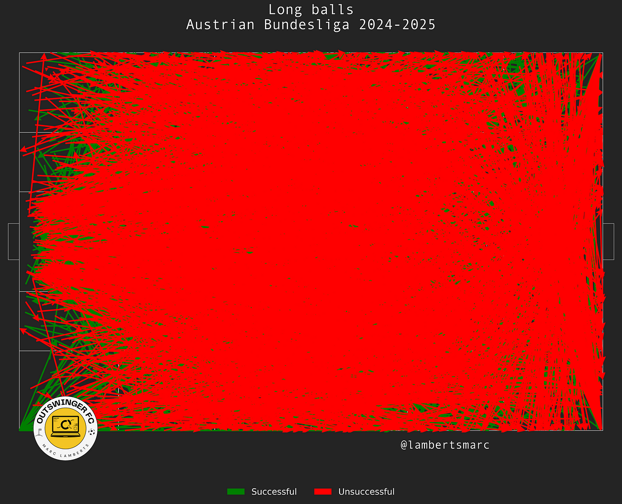
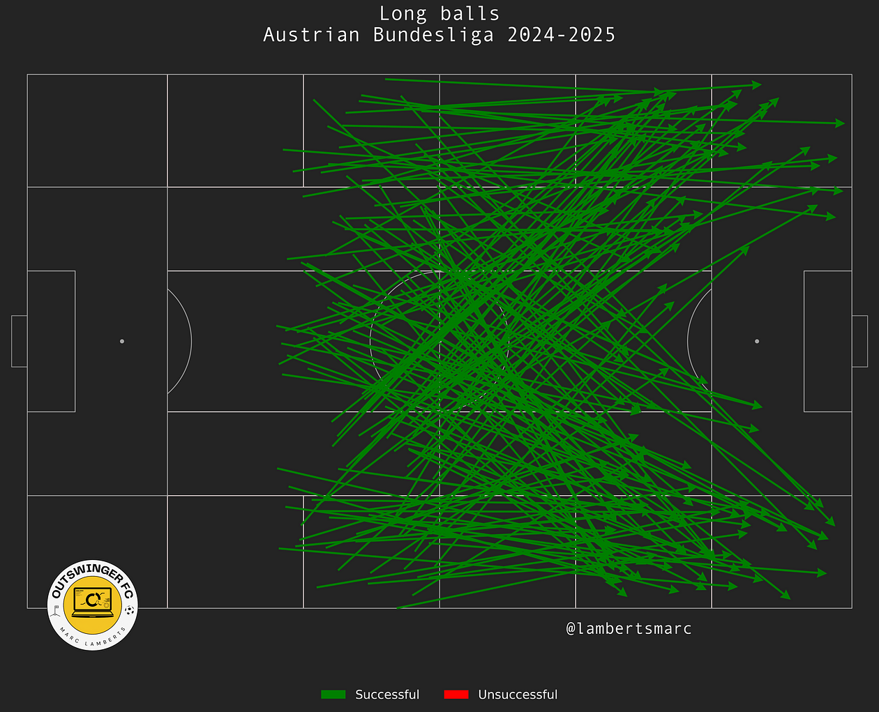
Of course this is impossible to distinguish and doesn’t give a lot of meaning to what we are trying to achieve. We want to look at start locations that are in the middle third. From the start location in the middle third, we can see the total long passes in the Austrian Bundesliga so far.
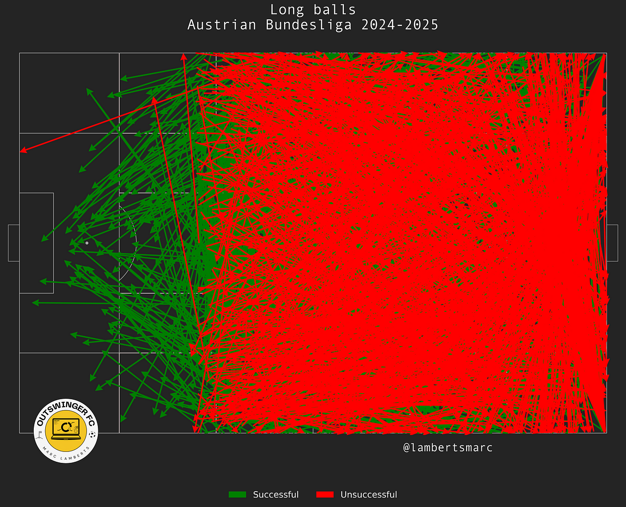
In the image above we can clearly see all passes that fit the begin location, but what we also see is that passes have that particular start location, but not the progressive end location. Many of the passes go backwards and that’s not what we want, so we have to change that.
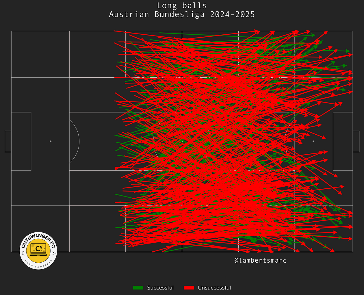
In the image above you can see the corrected version. Now all the passes go forward and beyond the half of the pitch. It already gives us a better idea of progressive long passes, but not quite yet. We still have to filter out unsuccessful passes.
Now we have all the passes that we need to make the metric and create the score to see which players are doing the best in this metric.
Progressive Long Pass Score
So first we have a look at progressive long passes and the success rate of those passes. This gives us an idea of how successful players are when conducting this kind of pass.
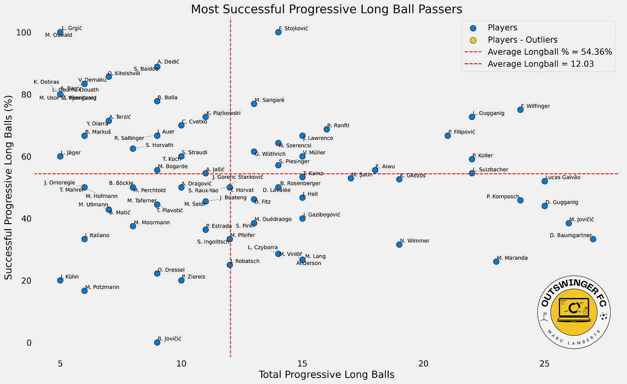
In this scatterplot we see the relation the total of progressive long balls and their successrate. I have filtered for players that 5 or more long balls to not skew the data when we are looking at metrics and scores. The next step is to convert this to a score.
We will look at the metrics and give new weights. The successrate is leading, but the weights of the total progressive long balls plays a part too. The success rate will become more important in the score when the volume of long balls is higher.
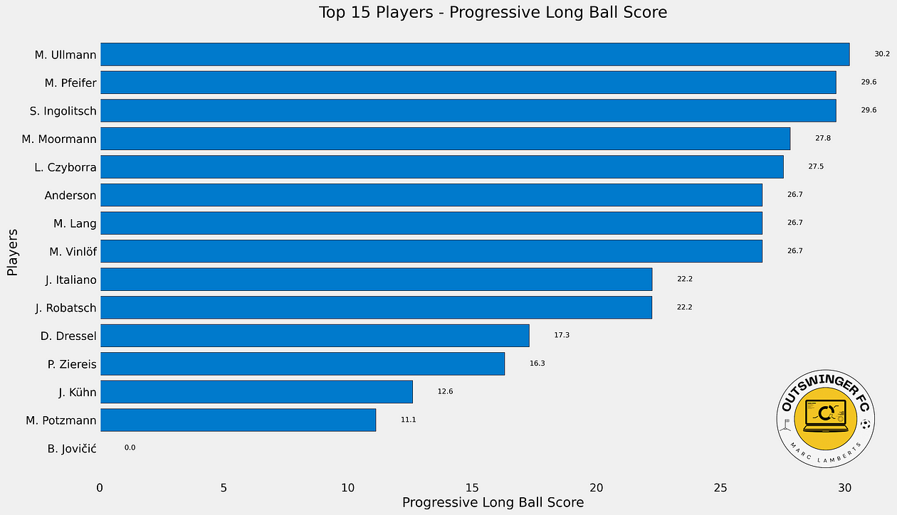
When we have created the code, we see the following score and rank for the Austrian Bundesliga in terms of Progressive Long Ball Score.
If you want to know more about the Python code, you can subscribe to my Patreon here:
https://www.patreon.com/c/outswingerfc?source=post_page—–52ffeb371fcc——————————–
I’ve included the data and python code to my Patreon 🙂
Throw-in success: generating shots through emphasis on throw-in routines

Set piece analysis is growing within club football and I very much welcome this development. When looking at set pieces you can actually divide them into 4 separate categories: corners, free kicks, throw-ins and penalty kicks. I think all categories have their own way of approaching them, but I want to focus today on throw-ins.
Throw-ins are often approached the same way as corners and free kicks are, but that’s not the way of properly analysing in my opinion. You have to work with different metrics and dynamics, and that’s why I’m relatively new to working these things out. What I can do, and will do, is look at how we can use data to see whether teams have benefited from throw-ins.
Data
To make this analysis possible we need data to generate actionable metrics. We need event data from leagues we are looking at. For this I collected event data from the Dutch Eredivisie (NL1) and the Belgian First Division A (BEL1) for the 2024/2025 season. The data was collected on September 1st, 2024.
We will look at the teams specifically and not players, so we don’t need to filter for minutes played or certain positions, which makes this part of the research less intense.
Methodology
The idea is to work with event data and use Python as a programming language to convert all those XY data into metrics we can work with. We will convert passes from throw-ins and also look at how these throw-ins are successful but also lead to shots from that particular throw-in.

In the image above, you can see all throw-ins made in the Eredivisie in the attacking half of the pitch. It doesn’t show a lot, but it shows the successful and unsuccessful throw-ins, which can give us insights into directions and progression.
The next step is to find successful throw-ins that lead to shots so we can measure their effect/impact. This means we will look at the next few actions following a throw-in to determine that a shot comes from a throw-in rather than from another action on the pitch.
Metrics
Of course, I have visualised the throw-ins as passes but essence is that we can calculate the number of throw-ins per team for those two leagues. This gives a clear image of which teams do throw-in the most — or get the opportunity to throw in the most.
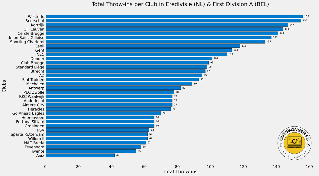
We now see a list of all teams in the top tier in Belgium and the Netherlands based on quantity. This will give us insight into how often teams have a throw-in.
The next step will be to make the conversion from throw-ins to throw-ins leading to shots, which will be the basis for analysis.
Analysis
The analysis is focused on having an idea whether a team makes the most of their throw-ins. In other words, what percentage of throw-ins will lead to a shot?
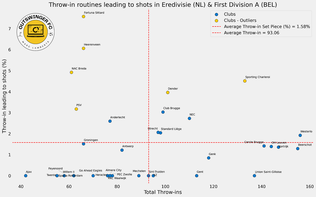
In the scatterplot above you can see a few interesting things. First of all it shows the relation between throw-ins and throw-ins leading to shots and you can see the conversion in percentages. The percentages are all under the 10%, and that’s something we really need to have a look at.
The average number of throw-ins is 93,06 and the average percentage of throw-ins leading to shots is 1,58%. In this case, we are looking for the quality and mostly looking for the clubs with the highest percentage.
So the left upper quartile is most important for that part of the analysis as it shows the clubs with the least number of throw-ins, but also with the highest percentage: their emphasis is based on getting shots from throw-ins. Now the right upper is also important, but the relation is different there with the total number of throw-ins.
I’ve also colour-coded outliers for both metrics, but most important is that they are outliers for the percentage of throw-ins leading to shots. This shows us that these clubs/teams are performing many deviations from the mean and these are the teams to have a closer look at.
I’ve written more about the use of outliers here:
https://marclamberts.medium.com/the-complexity-of-outliers-in-data-scouting-in-football-31e9fdca5171
Final thoughts
I’ve not dabbled a lot with throw-in data, but this is a very good way of making the first step into it. From here on we can find teams that are most prolific from their throw-ins and see from video if they are doing interesting things. Of course there is much to improve and to build on, but for now this gives me a good framework to use data in this part of set piece analysis.
Actionable analysis: Individual Header Rating (IHR) determines choices in blockers vs runners

In the new season 2024–2025 I want to try something new. I’ve been dabbling a lot in innovation (think of creating new metrics) and using analysis with existing data, but that’s not enough for me. It’s quite standard and I want to give more insight to what happens when you tailor your metrics whilst working for a club and make it actionable.
That’s the major issue with online content, it’s mostly present because it speaks to an audience — and I’m definitely part of that issue. I write not for myself only, but also in part because I know my audience would like the result of what I’m researching. I don’t think I can change that, but I can show you a little more about what the design of a metric means in the light of actual analysis within a club or organisation.
In this first installment I will focus on header ability. I want to create a metric that gives a rating to individual heading ability. With that rating that will change after each matchday, I can show probability of a player winning a duel. The actionable part here is that we can use that particular info when we are training and preparing for set pieces in the next game. IF we employ 3v3 runners vs blockers, we want the best winning probability in the air to maximise our delivery.
Why do we need a metric that measures ability
Football is a lot about tactics and avoiding trouble, but there are a lot of areas of the game where we have to focus on duels. It is a contact sport so we need to be aware that this will always be part of the game. To win critical battles on the pitch you need to make sure you can win little parts of it and that’s where aerial duels come into place. If you want to control the central areas of the pitch, you will have to deal with long goal kicks for example. This means there will be a battleground in those zones, so you need a strong force in the air.
I was trying to come up with ideas to look at aerial duels and came across this article about a metric designed by Statsbomb. Because, of course I was too late to actual invent a new idea.
Introducing HOPS: A New Way To Evaluate Heading Ability
It’s a very interesting concept and I wanted to recreate it, but also make it different. I want to look at aerial duels per 90, aerial duels won in % and height, but I also want to look further. I want to see if more metrics can be incorporated or see if different weights can be used for specific metrics. Recreating metrics is a great exercise for data analysis and data engineers, but more often than not you realise you are not completely satisfied with things that have been done before. That’s why I wanted to do it a bit different: I want to evaluate heading ability for individuals, with a link to probability and come with Power Ranking for Individual Set Piece Strength based on heading ability.

What do I need to make this happen?
There are several things I need to make this happen. First of all I need the full data of full season in a specific league or number of leagues. For this particular research, I’ve chosen the Eredivisie 2023–2024. This data can come from StatsBomb, Wyscout, Opta or any other data platform you are using. I’m using Wyscout data and specifically look at four specific metrics:
- Height: the influence of height on the aerial duels is not to be underestimated. There is a correlation and we will see later what that looks like.
- Aerial duels per 90: the number of aerial duels means something because it indicates how often you come in these duels and therefore your rating can constantly change.
- Aerial duels won in %: yes the number of duels is very important, but the win percentage tells us everything about quality. And, that’s where the real advantage will come from.
All the players will have played at least 900 minutes and will be excluded when they are goalkeepers. Their aerial duels are from a completely different calibre and need to be addressed in another research.
Methodology
There isn’t one specific methodology, because I want to make different things. I will be making a rating (and a score based on that rating), a probability and a power ranking based on that.
For the rating I will make sure there is a weighting for the metrics used. I will give a weight of 0,5 to the height, a weight of 1 to the numbers of duels and a weight of 1,5 to the win percentage of those duels.
After that I will use the glicko method to calculate the rating. I can also use ELO, but there is a reason I don’t. Glicko2 is more accurate in terms of predicting match outcomes or win probability and that’s essential for my process in doing this all.
Lastly, I will be making a power ranking and for all of these things I need to make a lot of calculations. These calculations will be made using Python.
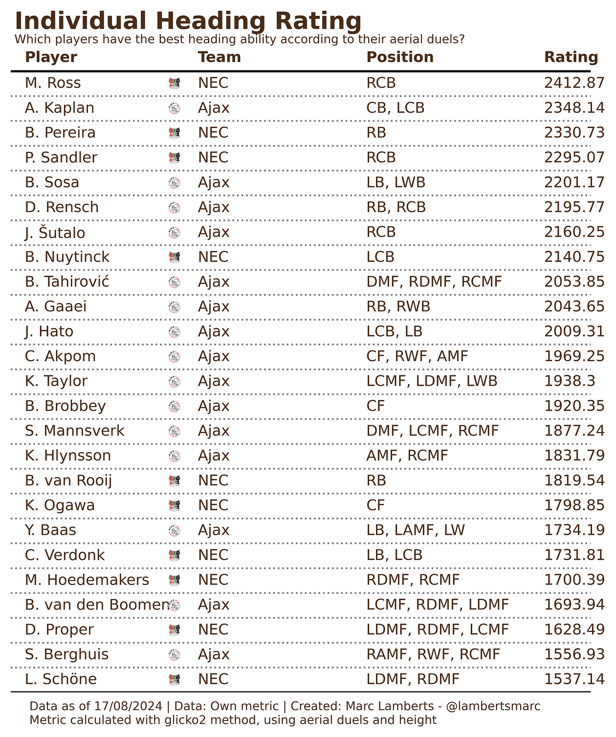
Individual Header Rating (IHR)
By using glicko calculations I can calculate a rating based on the weights I’ve described above. By doing so I get a list of the players who score highest. For this example, I will take the top 15 performers according to this rating.

When we look at the table above we see the top 25 players and their rating. The rating is based on glicko2 method, which can be compared to an ELO rating, but again, the calculations are quite different.
When we want to look at an easier comparison for players instead of a ranking, we will convert them into a score from 0–100.

As you can see in the table above we have managed to show the top 10 players and their corresponding score. In this case we can then state that these players are most likely to win their aerial duels against other opposition.
Win Probability
We we will go into changing ratings and scores in a bit, but before we can get there, we need to talk about win probability. If we think a player is going to match up with a player during the length of the game, we can look at how likely it is that the a player will win.
I want to look at two players that might come across each other in a match. In the attacking side I’m going for Luuk de Jong (81,24) who is a threat in the air for PSV. He will play against Lutsharel Geertruida (83,85) of Feyenoord, who might come across to defend him and is very strong in the air too.

Using just the score, we can conclude that the win probability for Geertruida is 54,70% against 45,30% for De Jong. That matching up can be favorable for Feyenoord and PSV might want to think about a different match up. More on that later.
New ratings
So from that probability we move on to the new ratings and effectively making a power ranking. We will continue with these two players and look at the effect of the probability being the actual result.

Geertruida had the win probability and also won the aerial duels (absolute numbers in the majority) and that means his new rating is 2211,73 from 2210,45. De Jong lost and went from 2177,66 to 2176,38. In the grand scheme of things their ratings did change, but their place on the ranking did not. Geertruida stayed at place 33 while De Jong also stayed at place 40.
The place might stay the same, but over a whole season, things can fluctuate and become different. That’s how we can have an individual power ranking based on the Individual Header Rating.
Actionable analysis
Let’s pick Ajax for this analysis. They need to play against NEC in their next game and they need to know how well their own players are doing in the air and how NEC is doing as a whole.
In team performances for this metric, Ajax scores 7th and NEC scores 16th. From this you can conclude that Ajax is better in the air as a team that NEC is. That would lead to soft conclusion that this would also work to Ajax’s benefit in defending set pieces and attacking set pieces.
Now, let’s take a closer look at the individual players.
In the top 5, NEC has 3 defenders and Ajax 2. This means that in general we can see that NEC is stronger in the air with defending than Ajax. Ajax has more players overall who do well in the air in defence, but also in midfield and attack, while NEC isn’t that great in attack in comparison.
Suggestions could be that Ajax needs to focus more on the attacking and see solutions there, because the NEC defence is tough. Their attacking however isn’t as threatening, so the worry shouldn’t be there for Ajax.
The next step is how you match up in attacking set piece to make sure you create the upper hand. Let’s for a moment assume there are runners vs blockers of 2v2. If that would mean that Ross-Pereira would defend, Ajax would do well to get their highest rating players to go against them. That would lead to a higher probability.

Ross still has a higher winning probability, but it is much closer than when Ajax employ another player like Berghuis there;
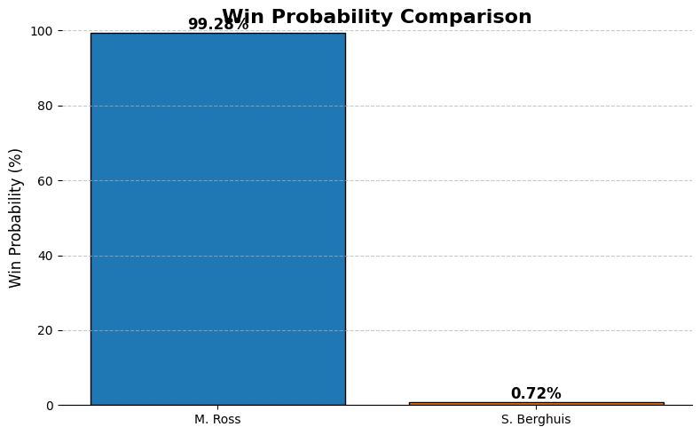
If this were the case, according to our data, it would be very easy Ross to defend Berghuis. This would also lead to a difference in ratings after the game, but that’s purely for academic purposes.
Correlation between Height and Rating

Of course, there is a relation between the height of a player and the way it’s easier to win those duels in the air. You can see that in the scatterplot above. I don’t think it’s really weird to expect these results, but what can really help in this analysis is to look at outliers — they stand out and can lead to conclusions about someone’s ability to jump or go into an aerial duel. These outliers are marked in red.
Final thoughts
I had a lot of fun creating/writing this because this is something I use to determine my suggestions for set piece positioning to teams. Of course, data is just a part of the story and should always be backed with video to explain routines.
What I really wanted to show is that when you make metrics, there should be a practical use for it when you work in analysis with teams. It should add value to the process of the staff and the players. There are so many bugs, tweaks and turns I need to look at, but it’s an example of how making a metric can help in set piece analysis. Especially when most data metrics focus on delivery and shooting.
The complexity of outliers in data scouting in football

Slowly but surely, this medium account is turning into a more meta-analysis place where I discuss methodology, coding and analysis concerning data specifically used in football. And, honestly, I love that. I always try to be innovative, but that’s not always the right thing to do. Sometimes you need to look back at your process and see if there’s something you can optimise or improve.
That’s something I’m going to do today. I’m going to look at plain outliers in the data for specific metrics and what the case of outlier analysis tells us about the quality of the data analysis. Of course, there are a few problems that arise and I think it’s really good to take a moment and express worries about that.
In this article I will focus on a few things:
- What are outliers in data?
- Homogenous and heterogenous outliers
- Data
- Methodology
- Exploratory data visualisation
- Clustering
- Challenges
- Final thoughts
What are outliers in data?
I was triggered to look deeper into this when I read this blogpost by Andrew Rowlingson (Numberstorm on X)
I want to look at how different calculations influence our way of data scouting using outliers in data, but to do that it’s important to look at what outliers are.
Outliers are data points that significantly deviate from most of the dataset, such that they are considerably distant from the central cluster of values. They can be caused by data variability, errors during experimentation or simply uncommon phenomena which occur naturally within a set of data. Statistical measures based on interquartile range (IQR) or deviations from the mean i.e. standard deviation are used to identify outliers.
In a dataset, an outlier is defined as one lying outside either 1.5 times IQR away from either the first quartile or third quartile, or three standard deviations away from the mean. These extreme figures may distort analysis and produce false statistical conclusions thereby affecting the accuracy of machine learning models.
Outliers require careful treatment since they can indicate important anomalies worth further investigation or simply result from collecting incorrect data. Depending on context, these can be eliminated, altered or algorithmically handled using certain techniques to minimize their effects. In sum, outliers form part of the crucial components used in data analysis requiring an accurate identification and proper handling to make sure results obtained are strong and dependable.
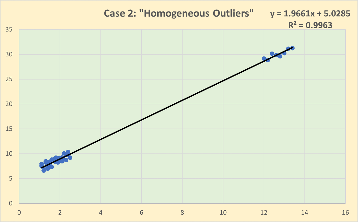
Homogeneous and heterogeneous outliers
Homogeneous outliers are data points that deviate from the overall dataset but still resemble each other. They form a group with similar characteristics, indicating that they might represent a consistent pattern or trend that is distinct from the main data cluster. For example, in a dataset of human heights, a cluster of very tall basketball players would be homogeneous outliers. These outliers might suggest a subgroup within the data that follows a different distribution but is internally consistent.
Heterogeneous outliers, on the other hand, are individual data points that stand out on their own, without any apparent pattern or similarity to other outliers. Each heterogeneous outlier is unique in its deviation from the dataset. Using the same height example, a single very tall individual in a general population dataset would be a heterogeneous outlier. These outliers might be due to data entry errors, measurement anomalies, or rare events.
What I want to do in this article is to look at the outliers as described above and see whether using different calculations of deviations has an impact on how we analyse the outliers for the data-scouting process.
Data
The data I’m using for this part of data scouting comes from Wyscout/Hudl. It was collected after the 2023/2024 season and was downloaded on August 3rd, 2024. The data is downloaded with all stats, so we can have the most complete database.
I will filter for position as I’m only interested in wingers. Next to that, I will look at strikers who have played at least 500 minutes through the season, as that gives us a big enough sample over that particular season.

Methodology
To do make sure I can make the comparison and analyse the data in a scatterplot, we need two metrics to put against the x-axis and y-axis. As we want to know the outliers per age group, we will put age on the x-axis and we already have the metric for age.
For the y-axis, we need a performance score and for that we need to calculate the score using z-scores. I have written about using z-scores here:
To calculate the z-scores I will use these attacking metrics available in the database:#Goalscoring Striker
metrics = [“xG per 90”, “Goal conversion, %”, “Received passes per 90”,
“Key passes per 90”, “xA per 90”, “Head goals per 90”,
“Aerial duels won, %”, “Touches in box per 90”, “Non-penalty goals per 90”]
# Adjust the weights for the new metrics as desired
weights = [5, 5, 3,
1, 1, 0.5,
0.5, 3, 1]
So as you can see I’m using Python code to calculate the z-scores and I’m using weighted z-scores to get a specific profile: a goalscoring striker role. In doing so I find the players most suitable for the role and see whether a player is close to the mean or has most deviations from it.
The core of this article is to explore whether the calculation of the deviation has an impact or influence on the outliers. Standard deviation and Mean Absolute Deviation.
Standard Deviation (SD)
Standard deviation is calculated by taking the square root of a value derived from comparing data points to a collective mean of a dataset. The formula is:
In terms of football, we are going to calculate the mean from the whole dataset with the mean being the most common value of the data metric of PsxG +/-. And with differences from the mean, we are calculating the deviations.
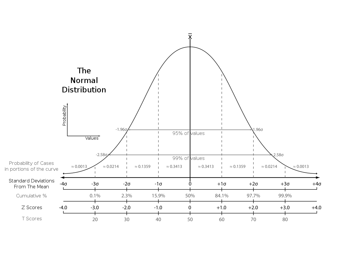
So by doing that, we can see in a more concise manner how a player comes close to the mean or deviates from it. So by using z-scores with standard deviation, it provides a more precise measure of relative position within a distribution compared to percentile ranks. A z-score of 1.5, for instance, indicates that a data point is 1.5 standard deviations above the mean, allowing for a more granular understanding of its position.
Mean Absolute Deviation
The mean absolute deviation (MAD) is a measure of variability that indicates the average distance between observations and their mean. MAD uses the original units of the data, which simplifies interpretation. Larger values signify that the data points spread out further from the average. Conversely, lower values correspond to data points bunching closer to it. The mean absolute deviation is also known as the mean deviation and average absolute deviation.

This definition of the mean absolute deviation sounds similar to the standard deviation (SD). While both measure variability, they have different calculations.
Data visualisations — Standard Deviation
Using a standard deviation we look at the best-scoring classic wingers in the Championship using the standard deviation and comparing them to the age. The outliers are calculated as being +2 from the mean and are marked in red.
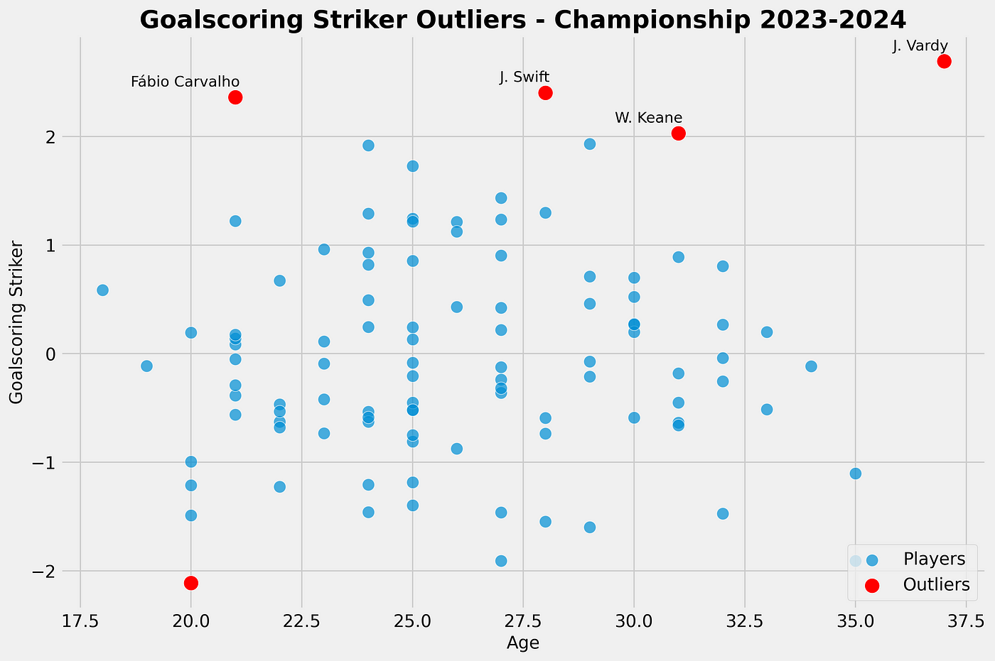
As we can see in our scatterplot, we see Carvalho, Swift, Keane and Vardy as outliers in our calculation for the goalscoring striker role score. They all score above +2 above the mean — and this is done with the calculation for Standard Deviation.
Data visualisations — Mean Absolute Deviation
Using Mean Absolute Deviation we look at the best-scoring goalscoring strikers in the Championship and compare them to their age. The outliers are calculated as being +2 from the mean and are marked in red.

As we can see in our scatterplot, we see Carvalho, Osmajic, Riis, Swift, Tufan, Keane and Vardy as outliers in our calculation for the goalscoring striker role score. They all score above +2 above the mean — and this is done with the calculation for Mean Absolute Deviation. Using this calculation we get more players (3 more) that are further away from the mean.
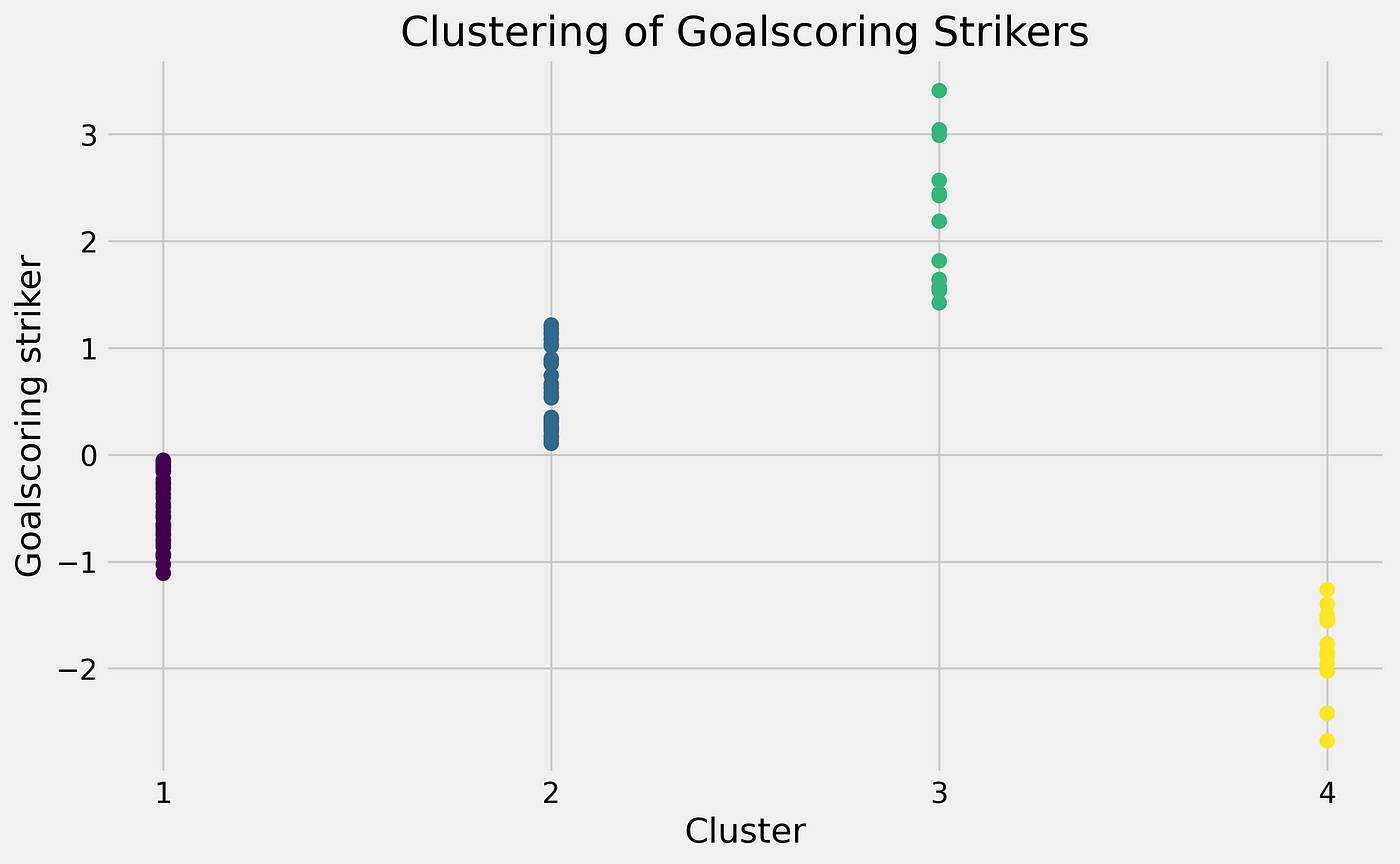
Clustering — Standard deviation
We can also use our goalscoring striker role and apply clustering to it instead of looking for pure outliers. It has similarities but it is a different method of looking for high-scoring players.

In the graph above you can see the different interesting clusters and see the deviations. For us it is interesting to look at the cluster 3, because these are the ones that positively deviate from the mean.
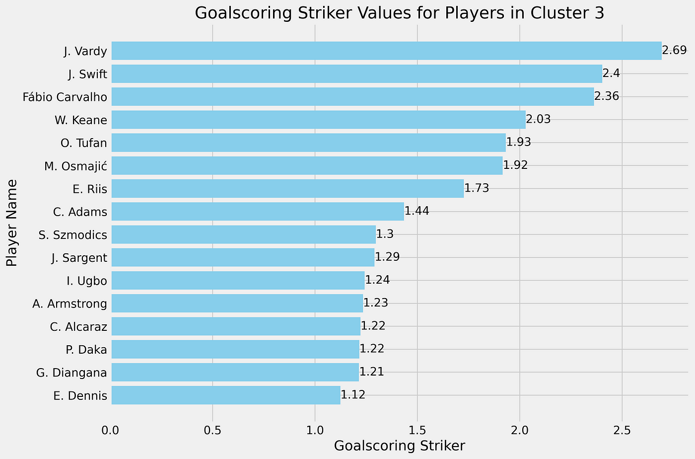
For the clustering in cluster 3, we can see that 15 players are clustered together and might interested to look at. These are obviously clustered to the score calculated with Standard Deviation. The role score varies from +1,12 to 2,69 deviations from the mean.
Clustering — Mean Absolute Deviation
In the graph above you can see the different interesting clusters and see the deviations. For us, it is interesting to look at cluster 3, because these are the ones that positively deviate from the mean.

For the clustering in cluster 3, we can see that 15 players are clustered together and might interested to look at. These are clustered to the score calculated with Mean Absolute Deviation. The role score varies from +1,42 to 3,14 deviations from the mean.
We get a longer list than from the outliers, but via clustering, we can still find interesting players to track according to our goalscoring striker score.
Challenges
One of the challenges of this is that you use different ways of calculating the deviations, but have the same approach to it in terms of outliers. The heterogeneous outliers don’t apply to this as we approach the data in the same way: homogeneous.
I think it’s very interesting that different calculations can lead to fewer or more outliers, but that only has an effect if you focus on the outliers only. You need to be aware of it.
Clustering, however, is a little bit different. We cluster the players that most deviate from the mean together. It gives us a longer list than focusing subjectively on calculating outliers via a significant barrier.
Final thoughts
Most of all this is an interesting thought process. We can use different ways of finding outliers. We can use different calculations of means, using weights on our calculations, use clustering and much more — but these things are always the product of the choices we make when working with data. We must be aware of our own prejudices and biases as to which way we choose to work with data, but different ways can lead to a good scouting process when using data.
Four things to pay attention to when you start analysing corners


Analysing corners is part of my daily routine and through the years I’ve been quite fortunate to be able to dedicate my time to it as much. Analysing set pieces can be quite daunting: Where do you start? Where do you gain knowledge? There are great resources out there, but if you want to train your eyes, you need to see what’s happening in those set pieces.
In this article, I will give four different tips and pointers when you start looking at corners and which areas of the analysis are important to understand the basics.
Corner kick
First, we look at what’s happening from the actual kick. What player is taking it? We focus on a few things:
- Foot: left of right
- Side
- Short or long
- Inswinging or outswinging

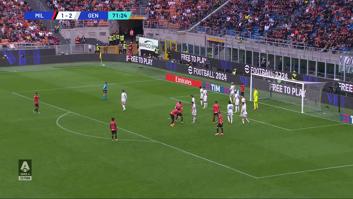
In the image above you can see a corner from Milan in their game against Genoa. The corner is taken from the left of the goal with a player who kicks the ball with his right foot. As the idea is to deliver the ball from that angle, the ball will be inswinging — towards the goal.
Why this basic step is important, has all to do with how the ball will be delivered and how teams will anticipate that. An inswinging ball will affect how a team defends or attacks.
Defensive team
Secondly, we look at what’s happening from the POV of the defensive team. We look at a few things:
- Is it a hybrid, man-marking or zonal defence?
- Coverage of the post(s)
- Zones

Two seconds later we see that the ball will be kicked and the teams are in position. The defensive team Genoa has a hybrid set-up. They have a man-marking in the front post area marking a Milan player. Furthermore, they have 5 players zonally defending the box: 2 in the front post zone, two in the goalkeeper zone and 1 in the far post zone.
They have three players deeper in the central area, as they are tasked with blocking runs of the Milan players. One player stands deep in the front post zone as he is tasked with the incoming player on the left.
This allows us to focus on what kind of defence they employ, and where they are situated. You can explore their strengths and weaknesses, which is vital for the analysis part that comes after observation.
Attacking team
In the attacking team, we look for how they position before the movement and what their aim is with the attacking corner:
- Players’ positioning
- Indication of movement
As you can see, Milan have 1 player on the front post occupying at least 1 defender. They have five players outside the six-yard box who will make a run to connect with the ball. They are against four defending players so we see a 5v4 in this area of the pitch with runners vs blockers.
Two players outside the penalty area are there for the second phase of the corner when the first contact is cleared, but they also pose the first line of rest defence in case possession of the ball is lost.
Movement
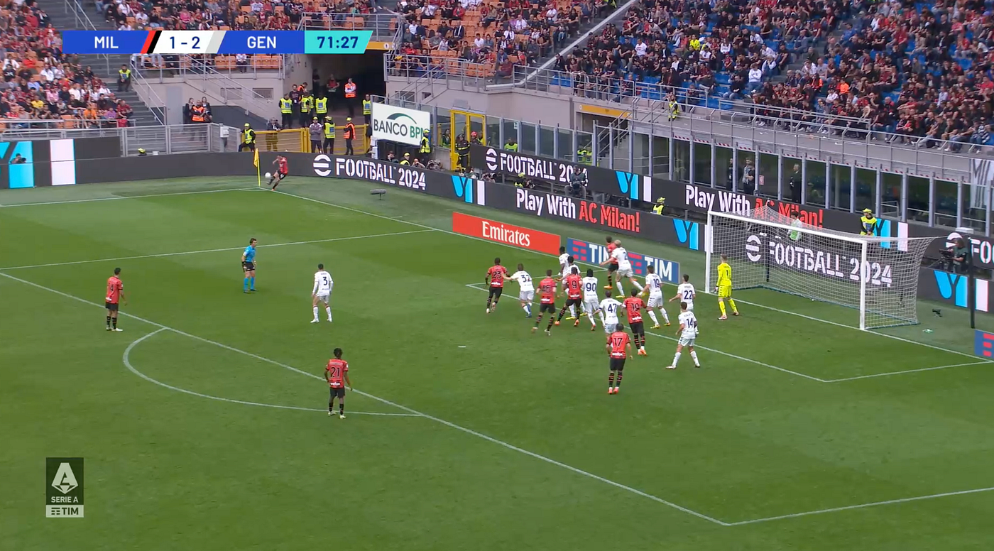
In the movement, which is the most important part — we see that of the five players, four move forward into the front post and the goalkeeper zones close to the six-yard box. This means that this area is crowded and there are players that will be relying on their individual aerial qualities to connect with the ball. The player that remains in his position (#17) has a little bit more space in case the ball goes far and he is a bit more free of his marker.
Eventually, Milan tries to make space for Gabia, who isn’t marked directly due to blocks and he can connect cleanly with the ball.
Final thoughts
If you want to look into watching corners and start analysing them, my advice would be to watch as many as possible. Watch hundreds of them and look at the things I have written above. If you look at the movements, the kicks, the defensive and attacking set-ups — you will at some point really get a grip of what it is that makes corner routines successful or unsuccessful.
League stability analysis: evaluating how shot ability changes after promotion


It’s not a surprise to most of people, but the Dutch Eredivisie is one of the most interesting leagues in Europe for different reasons. It’s a league where you can develop talent, but it’s also a league that often acts as a feeder league to the top 5 European leagues. This often constitutes the big players and the big clubs, but today I want to talk about something entirely different from that. Let’s talk about the bottom of the table.
I am an expert in the Dutch professional tiers — yes, I can say that at this point — and I have always been fascinated with how attackers perform. Not because of the number of goals, but because of how attackers perform in the lower brackets of the league. I love to explore how attackers with clubs at the bottom of the league perform and how they might continue that after relegation. The same is true for attackers in top teams in the second tier and how they will evolve — or not — in the Eredivisie after they are promoted.
In this research, I will attempt to look at the following question:
What happens to the shot ability and quality of attackers when they move leagues after promotion?
I can’t lie, I loved looking into this and finally bringing some different level of data analysis to two of my favourite leagues. It might be a bit far-fetched at times or not extremely relevant on the surface, but knowing the playing style of leagues and clubs will benefit the overall knowledge of the football culture in the Netherlands.
Table of contents
- Data collection and sources
- Methodology
- Analysis — shot locations
- Part of the total shooting
- Percentile rank radars — attackers
- Striking score
6.1 Eerste Divisie
6.2 Eredivisie - Final thoughts
1. Data collection and sources
The data used in this research comes from two data providers: Opta and Wyscout. Two different data approaches will be included in the research and the analysis:
- Raw event data which we will use for the raw plotting data, creating new metrics, input for our xG model and much more.
- Match level data is data that has been collected and provided into metrics by Opta themselves.
- Match level data from Wyscout
With the data, we can do exactly what we need for the research. There will be an expected goals module that will give us xG values, but that’s all based on Opta data and will be explained more in the methodology part of this research.
The data was collected on Friday 12th of July 2024 and consists of the event data from Opta from the 2023–2024 Eredivisie season. The match level data comes from Wyscout, as we don’t have Opta coverage for the Eerste Divisie _ i know, it’s sad.
I will pick two different players as a means of experiment. I want to see how the attackers did in the 2022–2023 season in the Eerste Divisie and how they after promotion, they did as attackers in the 2023–2024 Eredivisie. Those players are Lennart Thy from PEC Zwolle and Emil Hansson from Heracles Almelo.
Corner Threat Score: Measuring the threat a player generates from taking inswinging and…
In football, there are many things to look at from a tactical or coaching perspective and a data perspective. One of…
2. Methodology

With all that data you need to be able to make a library or a database so it’s ready to use. A vehicle to load in the data, clean it and manipulate it so it’s ready for the research to use. These are what I have used to make sure the research could have been done with the data sources available:
- Microsoft Excel: this is where all the data that was stored in a .xlsx or .csv extension was saved in. So when I opened it to look through the data and load it in my programs, I had to use Excel
- Python: this is used to load the data, manipulate it and make desirable visualisations. I use it to draw shotmaps, heatmaps and radars of data. It can handle data as well as visualise it — it’s what I use the most for this analysis
- R: my xG model is made from a database of 400.000 shots in the Dutch Eredivisie and will convert the event data of shots into shots with xG values. Expected points are also collected from this model, but it’s mostly concentrated on the xG.

What’s most important is that I have the raw data and I want to visualise different possibilities and outcomes connected to shooting data. To make sure I can analyse and visualise it, I need the aforementioned tools that will help me do so.
3. Analysis: Shot locations
Shot locations will be used to explore where a player conducts his shots from. In the shot maps below you will see the maps of the players in the Eerste Divisie and the Eredivisie next to each other.
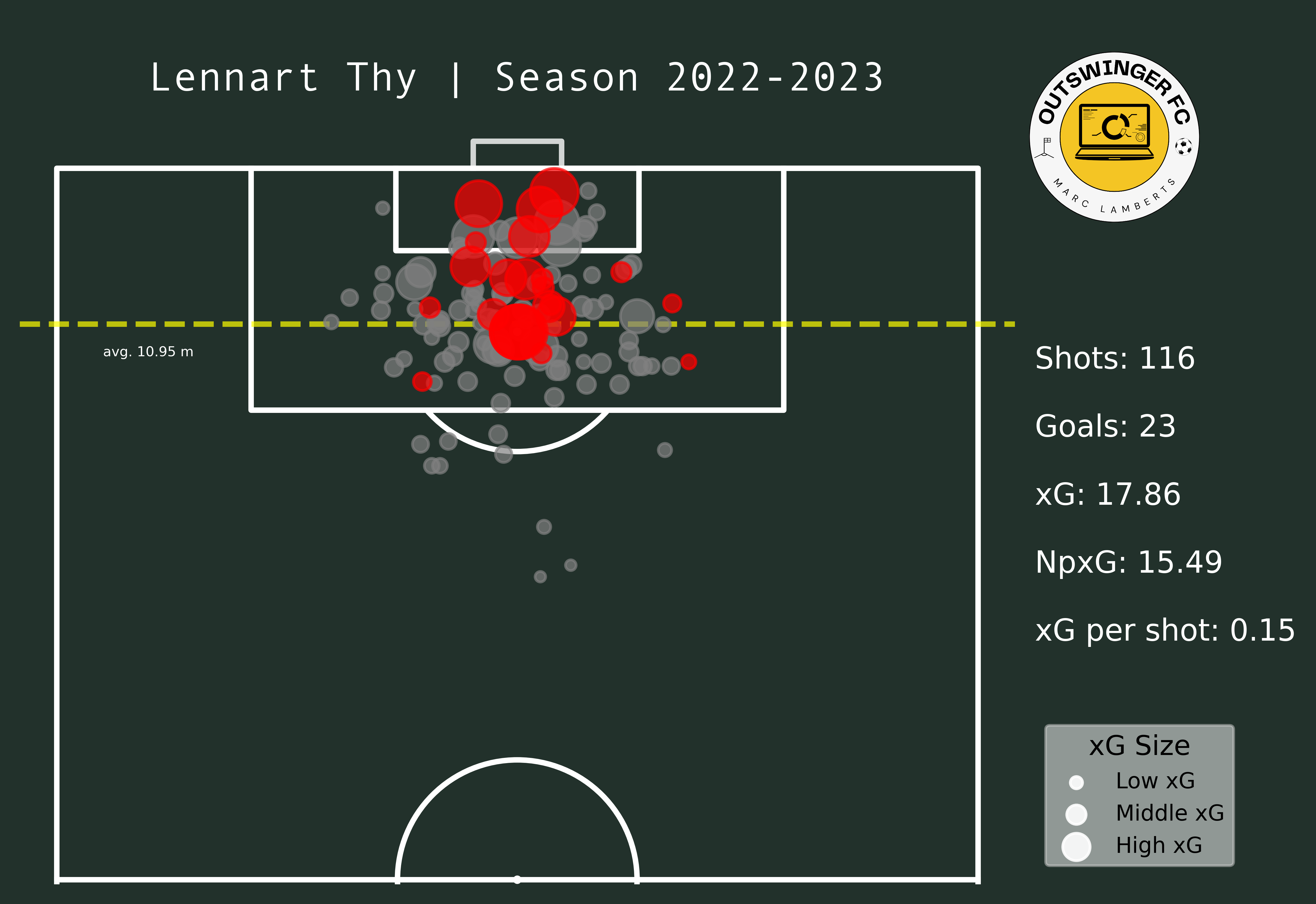
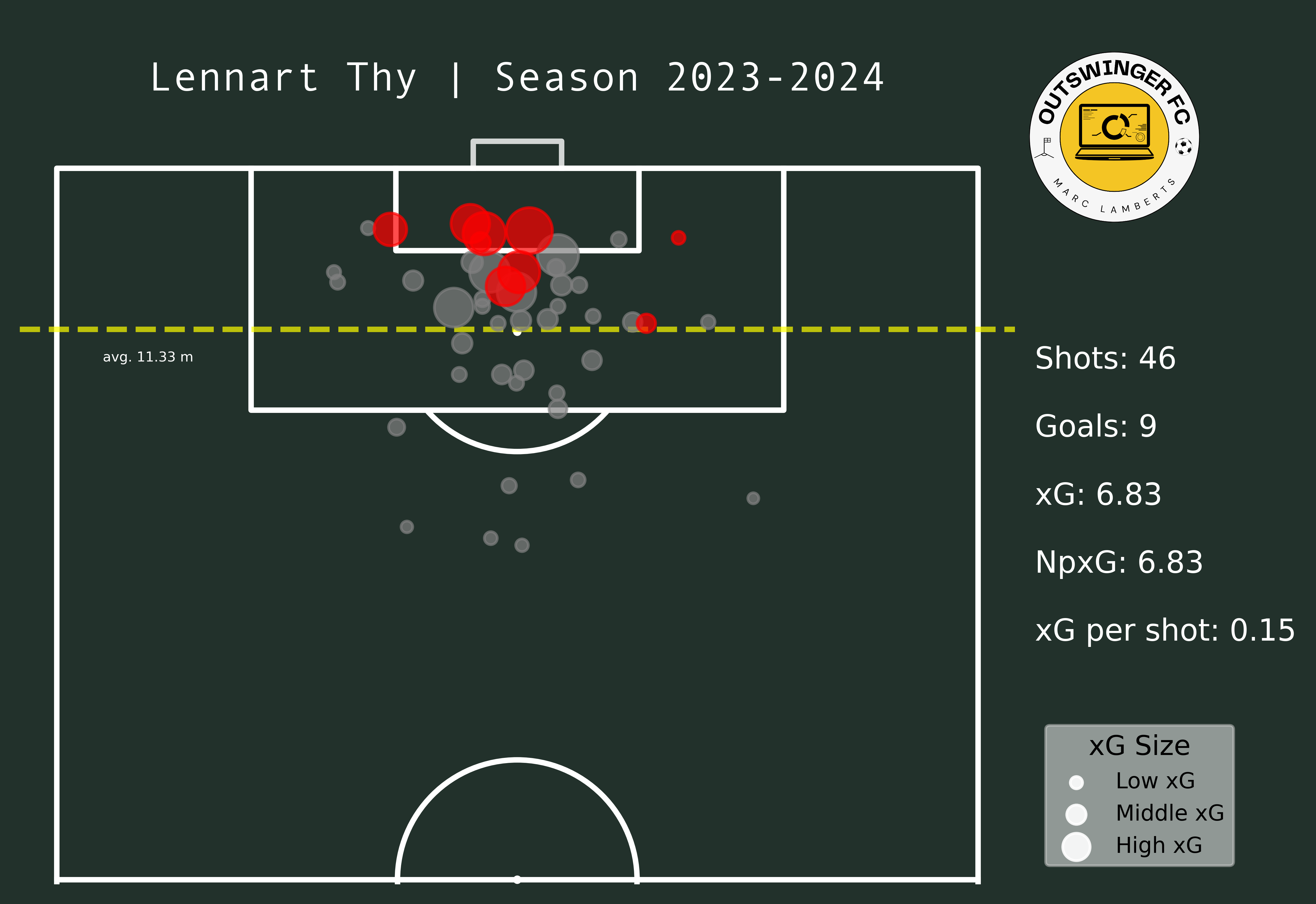
In the maps above you clearly see a difference in goals and shots, which can be expected after moving leagues. What I do think is interesting is that the average meters from goal per shot has changed from 10,95 meters to 11,33 meters — which can be an indication of shooting earlier. Having said that, however, the average xG per shot has remained even. This can mean that Thy hasn’t had that much difference in style or shooting between those different leagues.
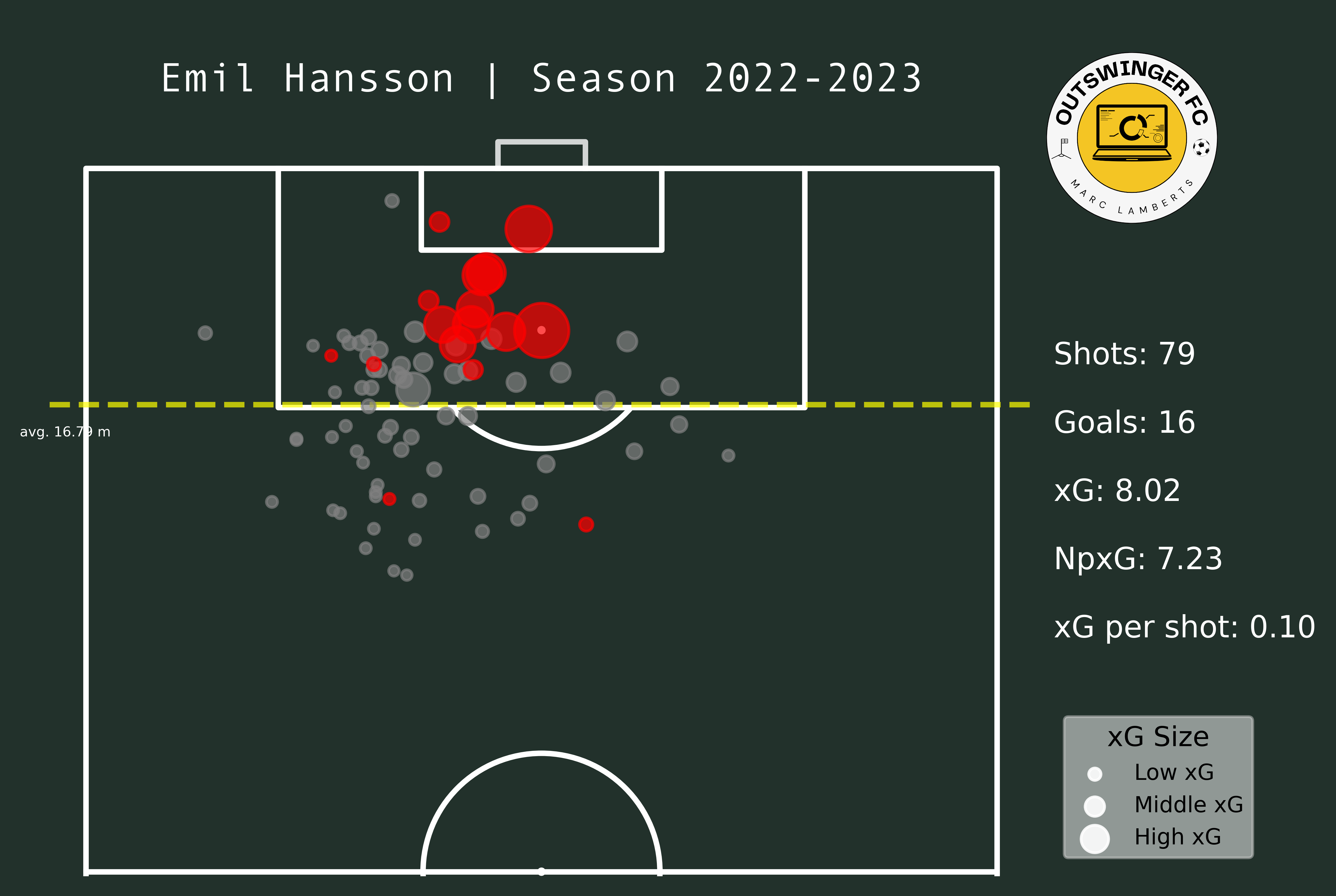
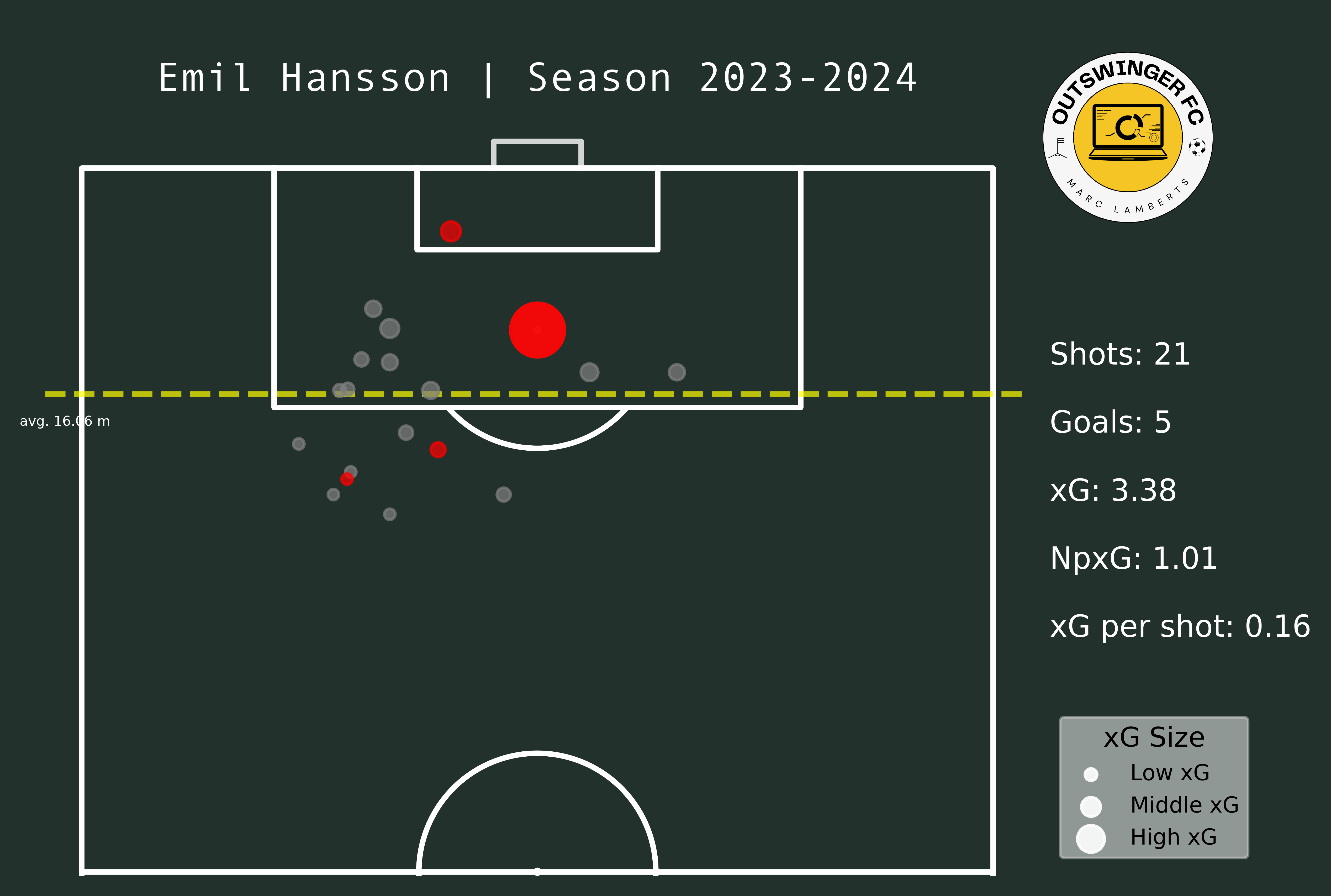
In the maps from Emil Hansson you see a difference altogether. He has significantly fewer shots than in the 22/23 season. But, he is closer to goal and has a better xG per shot than before. This can be an indication that he tries to shoot from locations that give him a better option of scoring.
4. Part of total shooting
We have seen the shot locations in the maps above, but that only tells us a part of the story. We need to see if the effect of promotion also has the effect on the attacker’s importance on the total. You would say that in a higher league, you are resorted to more defending than before and that the role of said attacker is even greater. Can we see this?
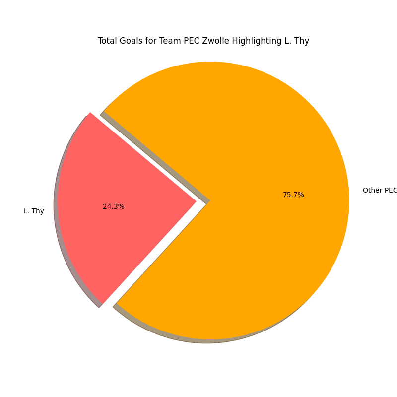
In the pie charts above we can how big the share is of Lennart Thy in the total goals scored for PEC Zwolle in the 2022–2023 Eerste Divisie and the 2023–2024 Eredivisie season. We expected that the share would be higher and it, albeit significantly smaller than we thought before. Thy has gone from 23,2% of goals scored to 24,3% goals scored in the next season, which is a growth of +1,1%.
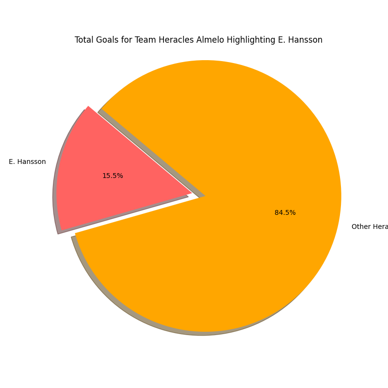

In the pie charts above we can how big the share is of Emil Hansson in the total goals scored for Heracles Almelo in the 2022–2023 Eerste Divisie and the 2023–2024 Eredivisie season. We expected that the share would be higher and it is. Hansson has gone from 15,5% of goals scored to 17,2% of goals scored in the next season, which is a growth of +1,7%.
When the teams are in the higher leagues they resort more to the defensive side of play and the emphasis on scoring goals is trusted with fewer players than in the season where they achieved promotion.
5. Percentile rank radars
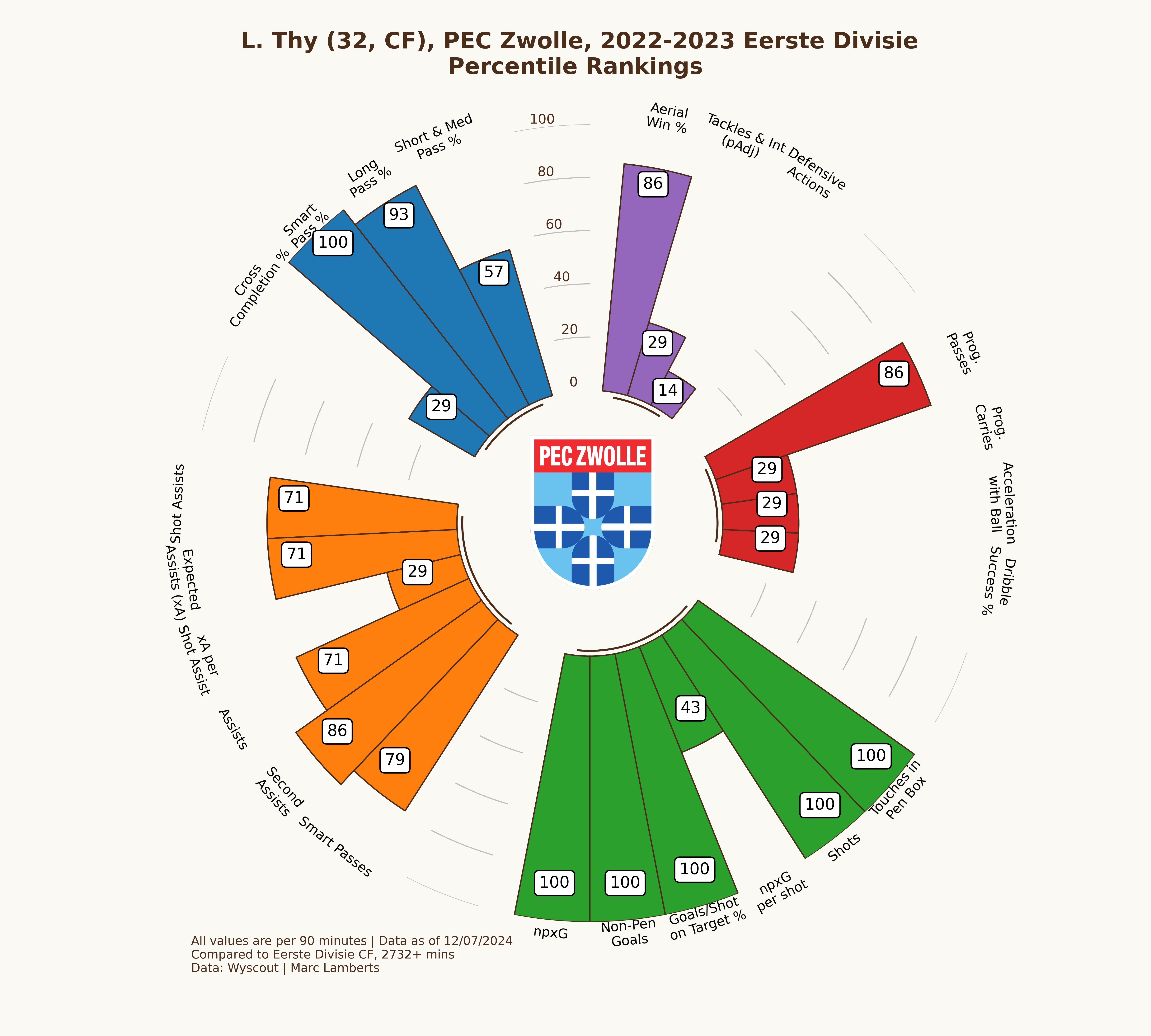
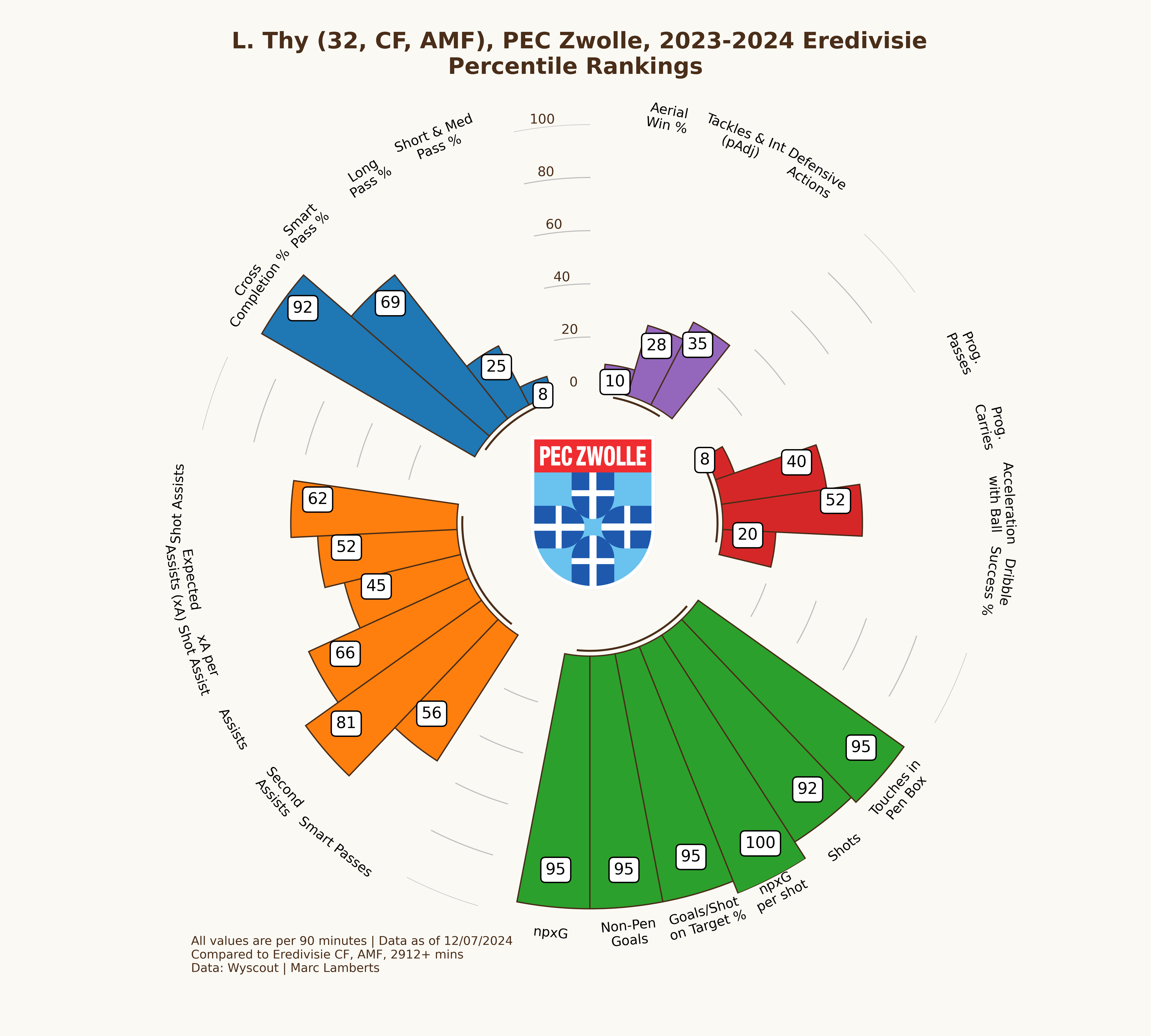
In the percentile radars above you can see two radars that look quite identical in some regards and that give me the idea that the player does very well in both leagues. However, there are some little differences: in the shooting metrics Thy really does well, but has become less impactful in aerial wins % and progressive passes. We can make the conclusion that the focus on shooting has become more important and playmaking less important.
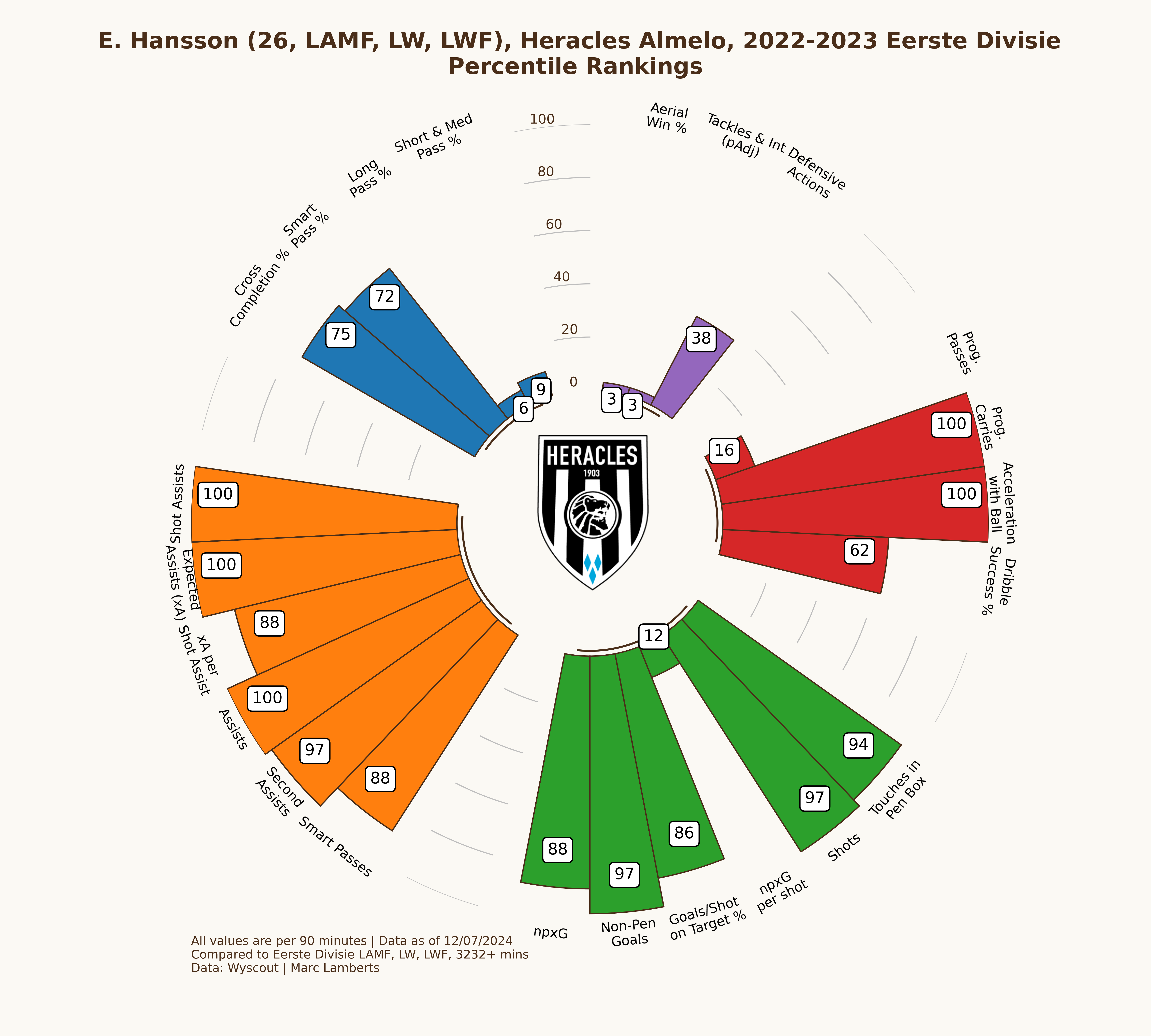
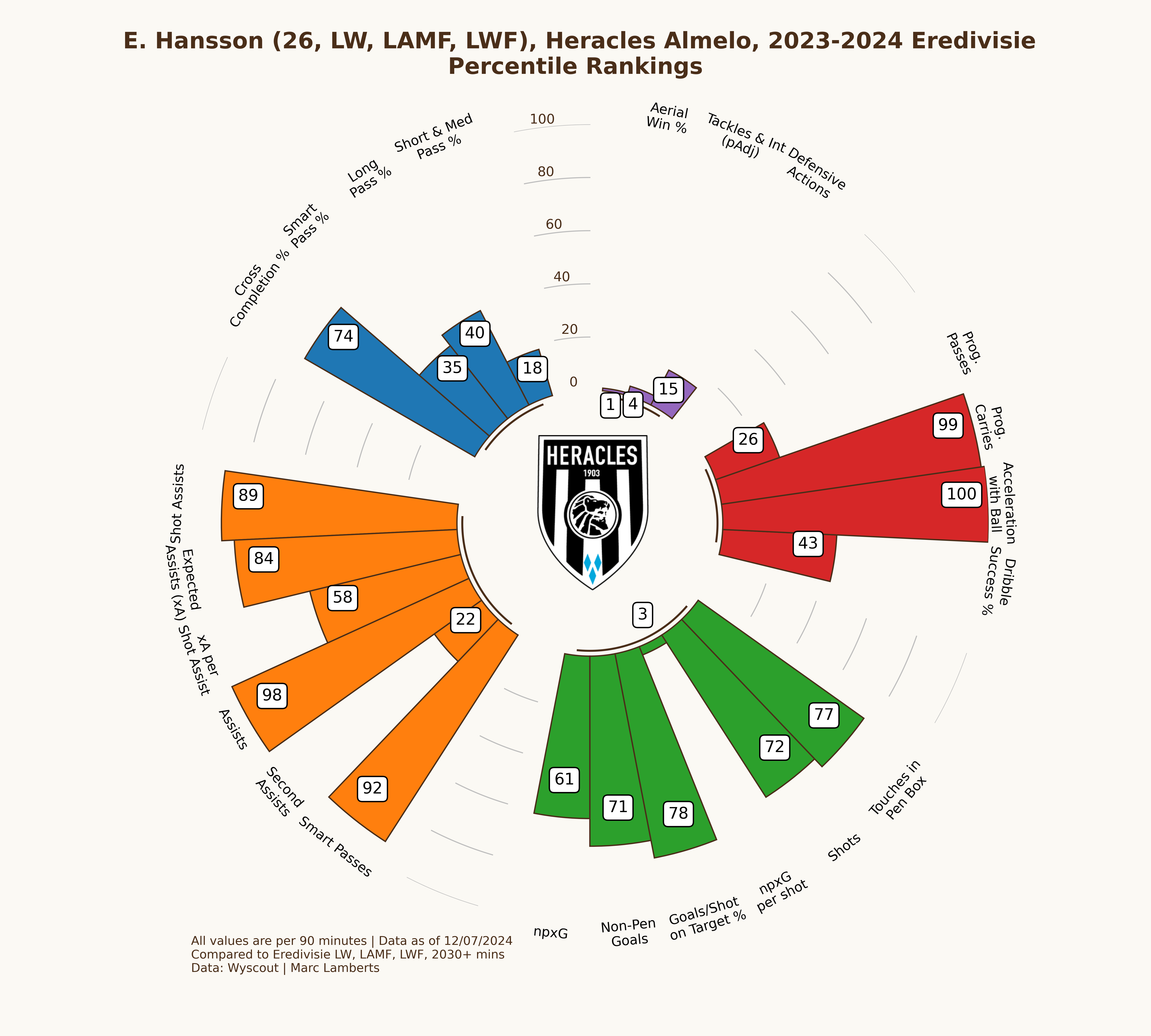
While Hansson has become more important for the team to lean on, his quality and being in the top percentiles, something has significantly changed with promotion to the Eredivisie. Especially in the shooting metrics Hansson has gone from the high 80s and 90s to the high 60s and 70s. The differences in leagues and their quality has had an effect on the performances of Hansson.
6. Striking score — CF
From percentile ranks we move on to z-scores. One of the key benefits of z-scores is that they allow for the standardization of data by transforming it into a common scale. This is particularly useful when dealing with variables that have different units of measurement or varying distributions.
By calculating the z-score of a data point, we can determine how many standard deviations it is away from the mean of the distribution. This standardized value provides a meaningful measure of how extreme or unusual a particular data point is within the context of the dataset.
Z-scores are also helpful in identifying outliers. Data points with z-scores that fall beyond a certain threshold, typically considered as 2 or 3 standard deviations from the mean, can be flagged as potential outliers. This allows analysts to identify and investigate observations that deviate significantly from the rest of the data, which may be due to measurement errors, data entry mistakes, or other factors.
With Z-Scores, we calculate the score 50, differently from the 50th percentile. While percentiles look at the middle value or median, Z-scores look at the average or mean of the dataset.
Ranking players: Percentile ranks, Z-Scores and Similarities
There has been a huge shift in the use of data in football in the last few years. It would be foolish for me to claim…
By giving weights to z-scores we can calculate a role for attackers and in doing we can see how well they are within a league. This makes for an interesting concept to see if the fit changes with a promotion to a higher league.
In this example, I will only focus on the striker position. For Lennart Thy, we can conclude that he has a goalscoring striker score of 88,14 out of 100 for the Eerste Divisie 2022–2023. A season later in the Eredivisie his score is 85,25. It seems that he fits better as the goalscoring striker in that specific Eerste Divisie season than he did for the Eredivisie season. This is a logical conclusion as it’s harder to perform in the higher league within that specific role than it is in a tier below.
7. Final thoughts
What I wanted to achieve with this little research was to look into the effect and importance of a promotion. Roles change, dependences change and also the impact of players change. In this first part of the research we have seen how players will grow in their percentage of goals, but might have a more restricted role in relation to what they had previously. Attacking players need to be there primarily for scoring goals in a division higher because you can’t afford to not take those chances.
The next article will focus less on how stable a player engages in attacking actions but will pose to create a metric that measures what promotion does to a player’s performances. To make an adjusted score to see how well a player is doing when coming from a tier lower.
Differences in shooting styles across Regionalliga — Germany’s 4th tier


“Data does tell facts and therefore always is the truth” — how often I’ve heard this, I can’t even count the number. I think this is such a weird way of looking at data, as data is a construct so if anything, it’s always subjective and prone to bias. One of the cases is how you deal with match-level generic data provided by data providers.
Read more: Differences in shooting styles across Regionalliga — Germany’s 4th tierWithin Wyscout you have a scala of different leagues that are provided with data. And, in general, I think that’s really great to have such coverage over different leagues all over the world. Now, what I have noticed is that these leagues are often categorised in terms of tiers. For example, you have Serie C in Italy (3rd tier), National League North/South in England (5th tier) and Regionalliga in Germany (4th tier) — which are all covered in the data within the same dataset, despite having different leagues. That’s why I’m going to look a little deeper into the data for the Regionalliga.
The idea is to see how shots are conducted in the different subdivisions of this tier. Not every league has the same style of play, which will also be reflected in the data — without making the distinction, the data is effectively skewed.
The leagues
There are 5 different leagues within the 4th tier we call the Regionalliga:
- Regionalliga Nord
- Regionalliga Nordost
- Regionalliga West
- Regionalliga Südwest
- Regionalliga Bayern
The first thing we will need to clarify is that we need access to all data to make something work and that our conclusion from this article needs to concise as possible. So, here we encounter the first problem: only 4/5 leagues are completely accessible in terms of data. Regionalliga Nordost has two teams available in terms of data, so we have to exclude them from what we are trying to achieve here.
That still leaves us with approximately 2000 players across four leagues that will make up the style of each division.
Method
In the method, we look at how I will gain results. The aim is to look at how the different leagues have similarities/differences. I want to look at two different things:
- The volume of shots per league by looking at the total shots.
- Expected goals per 90 and looking at the differences between the leagues.
I will use the Wyscout data and analyse these metrics, after which I will try to visualise it.
Shots
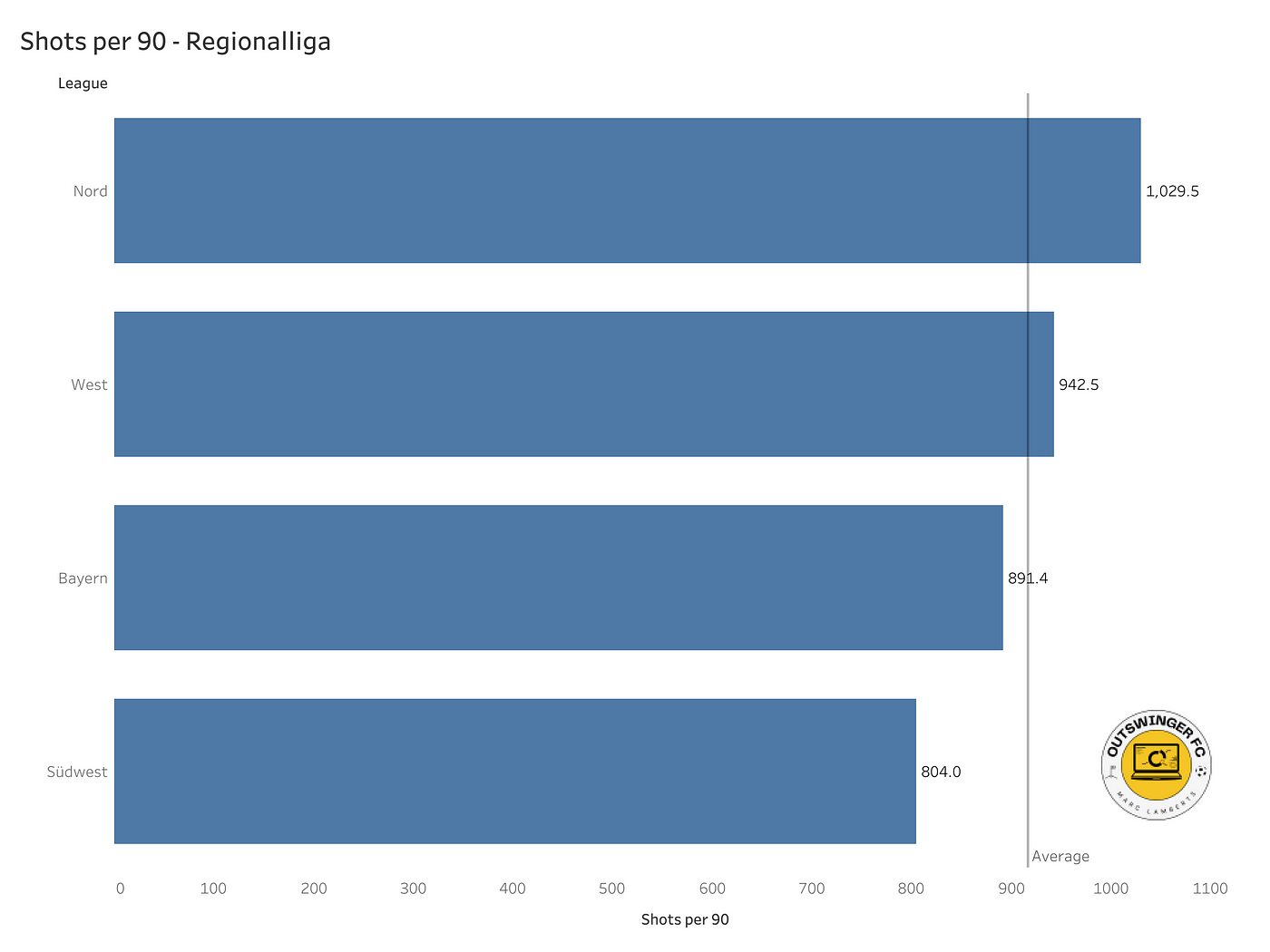
In the bar graph above you can see the four Regionalligas we are looking at and we can see the shots per 90 per league.
As we can see the volume of shots per 90 is the highest in the Regionalliga Nord and the lowest in the Regionalliga Südwest. West and Nord are above the average while Bayern and Südwest are below the average.
It’s too early to have a conclusion ready but it looks like the emphasis on more shots is prevalent in Nord and West, which could indicate they look to shoot more.
Expected goals

In the bar graph above you can see the four Regionalligas we are looking at and we can see the xG per 90 per league.
It gives us the same idea, but Regionalliga Nord is just a different league in comparison with West and Bayern. Südwest is the other outlier and we can draw a simple conclusion: there are fewer shots and as a consequence, there is also a lower xG per 90 in that specific league.
Conclusion
I think it’s very hard to draw definitive conclusions just from a few data points, but it has to trigger your mind that not all regional leagues are the same.
But, if we are looking to use these metrics for forwards, there are two quite interesting conclusions to draw:
- If you have a high number of shots and xG in Regionalliga Südwest, that means more than in the Regionalliga Nord.
- If you have low shots in Regionalliga Südwest it’s less damning than having it in Regionalliga Nord
We can of course go deeper into this, but it’s important to link the individual clubs to the league they are playing. If we want to gauge whether a match can be made to the 3. Liga for example, it’s important to look at the league the player is in. Not all 4th tiers are the same.
The idea behind the threat: Creating Pass Progression Score (PPS)

What has always fascinated me is the way we look at football players and the value we give those players. There is a pecking order of course, because in terms of the general football audience, we tend to value entertainment. Entertainment is something you can directly compare to the ones making the goals (which is good) and those conceding them (which is bad). This idea has been with me for a long time and I want to look a little deeper into this idea.
Read more: The idea behind the threat: Creating Pass Progression Score (PPS)I think I grew up with that idea too, that I valued goals more than anything else because goals eventually will make the difference between winning, drawing, or losing. However, when I started learning more and more about the game — I realised: it’s only about the output, but also the process of getting there. And, that’s what I’m doing more and more. That’s why today I want to look at creating a new metric: Pass Progression Score.
Contents
- What is Pass Progression Score?
- Why do we need it?
- Data
- Methodology
- Visualisation
- Final thoughts
What is Pass Progression Score?
Pass Progression Score is a metric that combines a few different metrics that indicate how much progression there is by a specific player by looking at the total number of passes and calculating the progressive value of it. The specifics and methodology will come later in this article.
The score will show how much a player in a specific position contributes to progression and how much of his/her total contributes to progression. This gives us an idea of progression.
Why do we need it?
Well, needing it is quite the statement, but I think it will be interesting and help gauge whether a player is a progressive passer. In recruitment processes we have to look at data over so many players and to make our lives easier with a few steps, we can create scores to look at intention. Yes, that’s right — intention. The intention of the players can help us get a better idea of the style of the player and if you are looking for a player that has a certain progressive passing profile, this is a metric that can really help you.
Data
The data we are using for this metric comes from Wyscout. Like I’ve said before, it’s not the best quality provider out there but it has the widest coverage. The data we are using is from the Belgian First Division 2023–2024 and we are only using players that have at least played 900 minutes — which is the equivalent of 9 full matches. The data was collected on June 9th, 2024.
The data will be selected and will contain only a few specific metrics, which will then be used in the calculation for the newly created metric. You can see that below.
Methodology
So how am I going to make this score? I will do this in Python, but there are 3 steps I need to take:
- Drop all the information I don’t need. I will keep the player name, team name, minutes played, and the metrics I use.
- The metrics I’m using are: Passes to the final third, Passes to the penalty area, Key passes, Through passes and Progressive passes. All are per 90 minutes and not totals.
- I will weigh the different metrics for how much they contribute to progression: Passes to final third (1), passes to penalty area (2), Key passes (1), Through passes (1), and Progressive passes (3). The key aspect is here that progression is more valuable to me when it comes closer to the opposition’s goal.
- I will calculate them into z-scores, which will make it easier to create a weighted total score.
To create a score that goes from 0–1 or 0–100, I have to make sure all the variables are of the same type of value. In this, I was looking for ways to do that and figured mathematical deviation would be best. Often we we think about percentile ranks, but this isn’t the best in terms of what we are looking for because we don’t want outliers to have a big effect on total numbers.
I’ve taken z-scores because I think seeing how a player is compared to the mean instead of the average will help us better in processing the quality of said player and it gives a good tool to get every data metric in the right numerical outlet to calculate our score later on.
Z-scores vs other scores. Source: Wikipedia
We are looking for the mean, which is 0 and the deviations to the negative are players that score under the mean and the deviations are players that score above the mean. The latter are the players we are going to focus on in terms of wanting to see the quality. By calculating the z-scores for every metric, we have a solid ground to calculate our score via means.
We talk about harmonic, arithmetic, and geometric means when looking to create a score, but what are they?
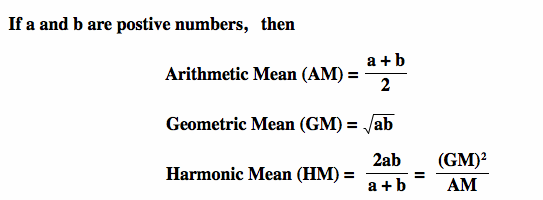
The difference between Arithmetic mean, Geometric mean and Harmonic Mean
As Ben describes, harmonic and arithmetic means are a good way of calculating an average mean for the metrics I’m using, but in my case, I want to look at something slightly different. The reason for that is that I want to weigh my metrics, as I think some are more important than others for the danger of the delivery.
So there are two different options for me. I either use filters and choose the harmonic mean as that’s the best way to do it, or I need to alter my complete calculation to find the mean. I am doing the harmonic mean.
Visualisation
By running the code and calculation in Python — I will get a list. Now, that’s just a very boring-looking list, so I’m turning it into a visualisation. In the image below you can see the 10 best progressive pass score (PPS) players with at least 900 minutes in midfield.
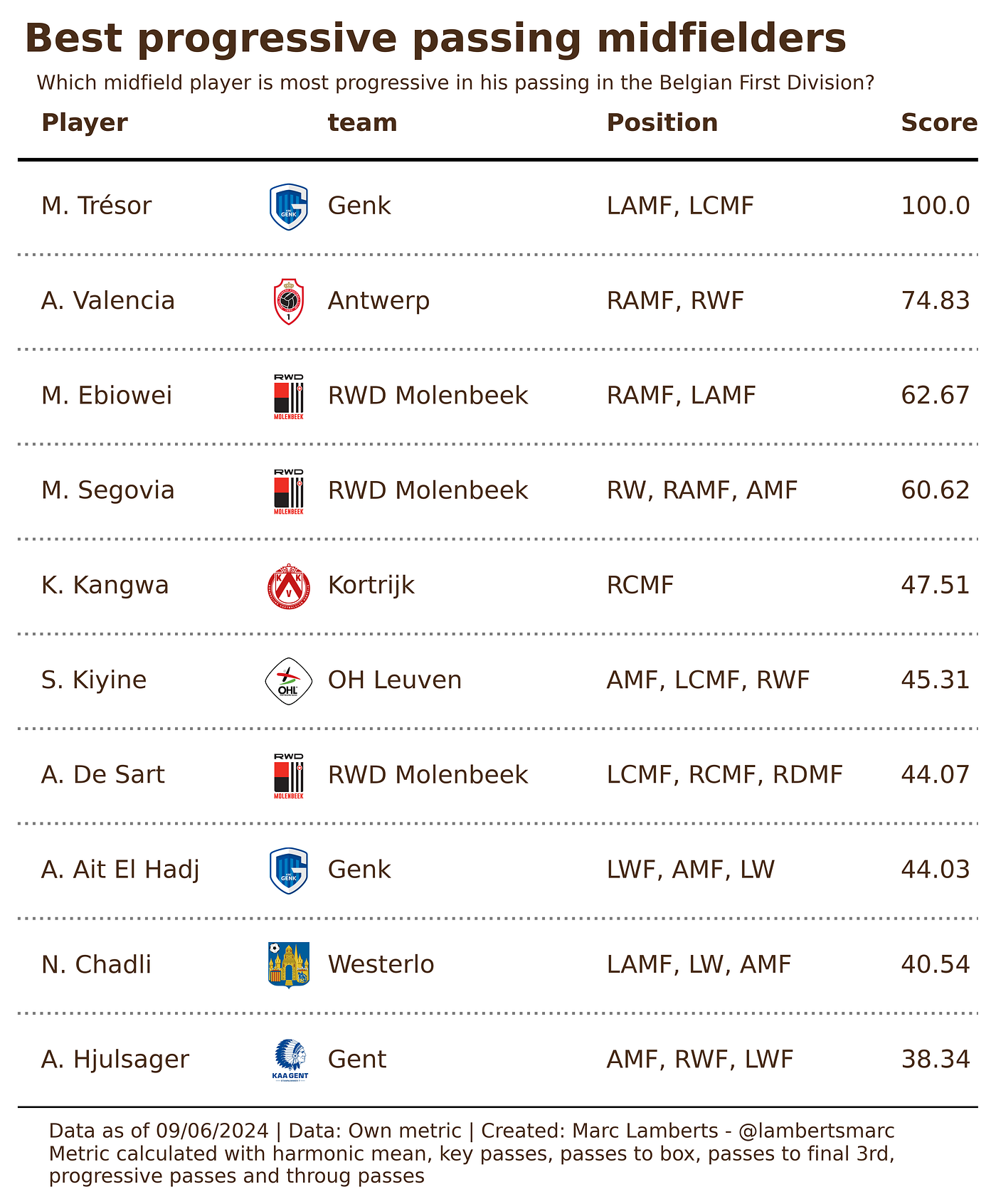
In the table above I have ranked the top 10 midfielders according to this new metric. They have a score from 0–100 and in that way we can see how well they are doing in this metric.
What is something we can conclude from this table is that Tresor scores significantly higher in this score than the others on this list, meaning that he scores far above the mean and is an excellent intentionalist in terms of progressive passing.
Final thoughts
I like to play around with metrics and see how they can aid myself in the process of recruitment, especially in the phase where I use data quite heavily.
Progression can be measured in different ways and that’s also why I think there is still work to be done on this metric. If you connect OBV, xT or xPass to these metrics — we can delve even further. In combination with the vlaue of event data, the 2.0 version of PPS will be even more meaningful.