Fluidity in Football: Quantifying Relationism Through Spatial Data

My eyes haven’t been scrolling the social media platforms as much as I used to do a few years back. Partly because I don’t have the time anymore to do so in such frequency, and partly because many of my algorithms have become a cesspool of negativity and hate. Having said that, something I tend to follow is the way how teams play. And, I think, it comes as no surprise when I say that relationism as a style of play has been wandering around many feeds.

I’m not going to pretend I’m the expert on the coaching aspect of it and how to implement it. Neither do I think this article is going to bring forth groundbreaking results or theories. My aim with this article is to use event data to identify teams that are hybrid positional-relational or have a strong dominance of relationism in their style of play. Is it something that can only be captured by the eye and by a stroke of culture/emotion? Or can we use event data to recognise patterns and find teams that play that way?

Contents

  1. Why use event data to try and capture the playing style?
  2. Theoretical Framework
  3. Data & Methodology
  4. Results
  5. Final thoughts

Why use event data to try and capture the playing style?

Football, at its essence, is a living tapestry of player interactions constantly evolving around the central object of desire: the ball. As players move and respond to one another, distinct patterns emerge in their collective actions, particularly visible in the intricate networks formed through passing sequences.

Though traditional event data captures only moments when players directly engage with the ball, these touchpoints nonetheless reveal profound relational qualities. We can measure these qualities through various lenses: the diversity of passing choices (entropy), the formation of interconnected player clusters, and the spatial coordination that emerges as players position themselves in relation to teammates.

This approach to understanding football resonates deeply with relationist philosophy. From this perspective, the game’s meaning doesn’t reside in static positions or isolated actions, but rather in the dynamic, ever-shifting relationships between players as the match unfolds. What matters is not where individual players stand, but how they move and interact relative to one another, creating a fluid system of meaning that continuously transforms throughout the ninety minutes.

Theoretical Framework

Football style through a relationist lens isn’t defined by predetermined positions but emerges organically from player interactions. This approach, which is founded on spontaneity, spatial intelligence, and fluid connectivity, stands in contrast to positional play’s structured framework of designated zones and tactical discipline.

In relational systems, players coordinate through intuitive responses to teammates, opponents, and the ball’s context. The tactical framework materialises through the play itself rather than being imposed beforehand.

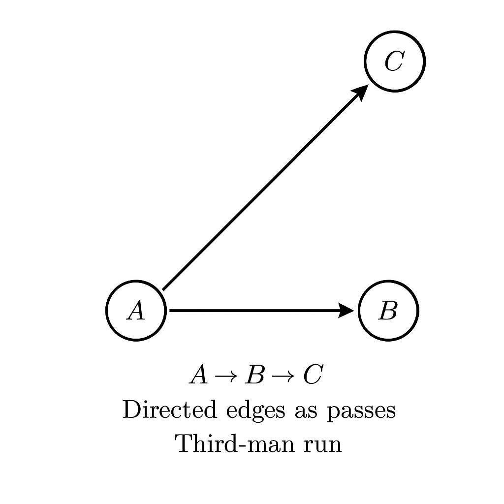
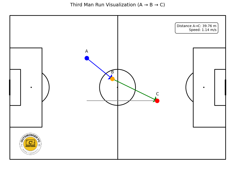
On the pitch, this manifests as continuously reforming passing triangles, compact and diverse passes, constant support near the ball, and freedom from positional constraints. Players gravitate toward the ball, creating local numerical advantages and dynamic combinations. Creative responsibility is distributed, shifting naturally with each possession phase, while team structure becomes fluid and contextual, adapting to the evolving match situation.

Analytically, traditional metrics like zone occupation or average positions presume stability and structure that relational play defies. Effective analysis requires shifting from static measurements to interaction-based indicators.

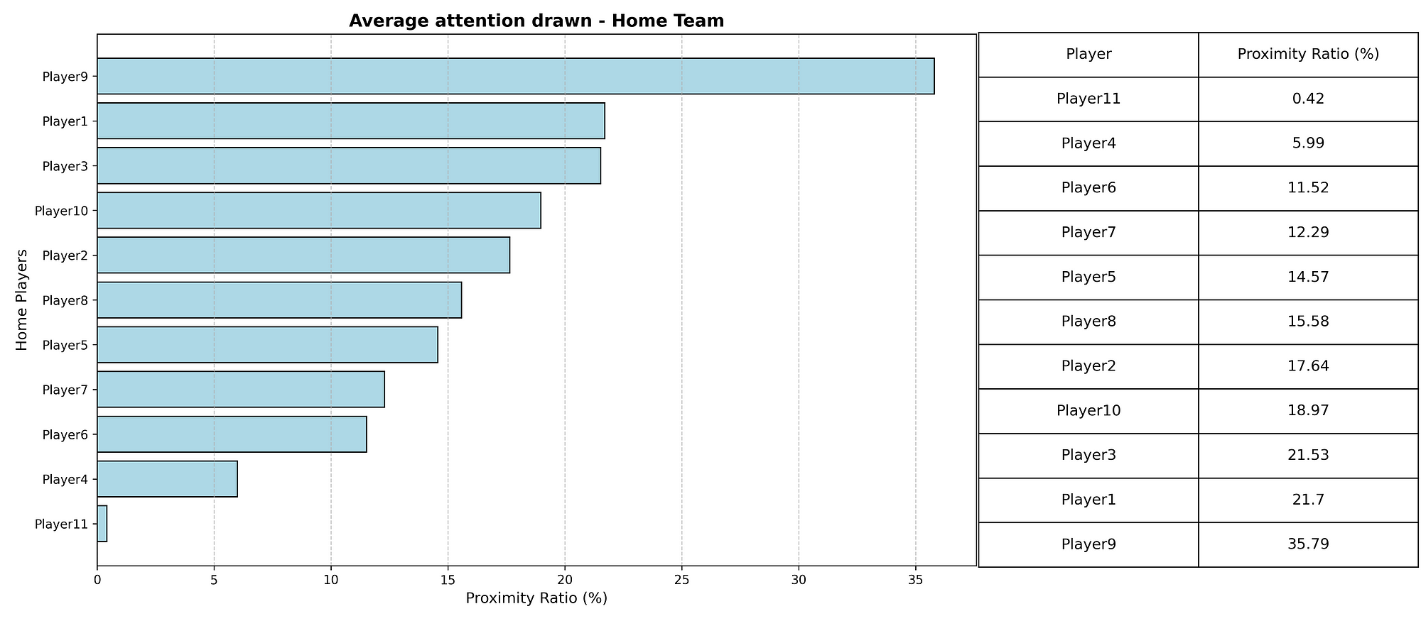
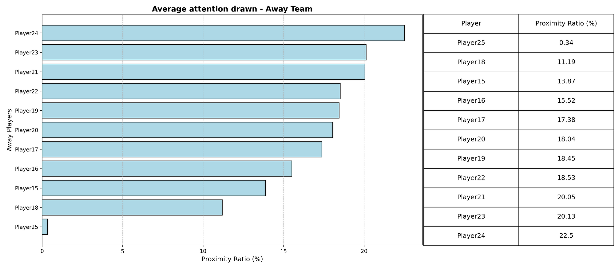
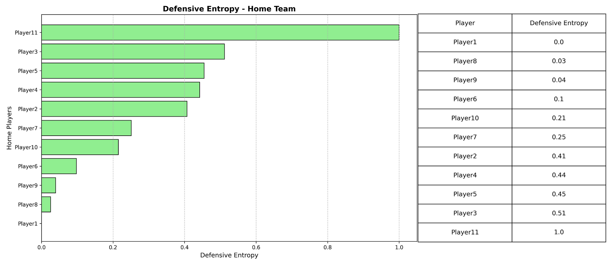
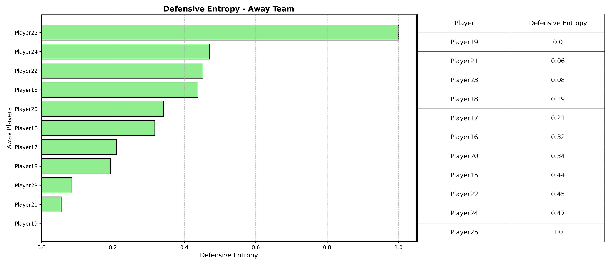
This research introduces metrics derived from event data corresponding to relational principles: clustering coefficients quantify local interaction density, pass entropy measures improvisational variety, and support the proximity index tracks teammate closeness to the ball, enabling dynamic identification of relational phases throughout matches.

Data and methodology

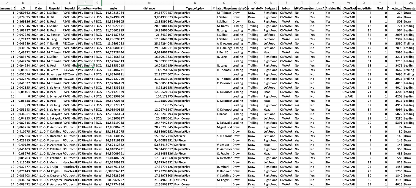
This study uses a quantitative methodology to identify and measure relational play in football through structured event data. The dataset includes match records from the 2024–25 Eredivisie Women’s league. Each event log contains details such as player and team identifiers, event type (e.g. pass, duel, shot), spatial coordinates (x and y values on a normalised 100×68 pitch), and timestamp. Only pass events are used in the analysis, since passing is the most frequent and structurally revealing action in football. The data comes from Opta/StatsPerform and was collected on May 1st, 2025, for the Dutch Eredivisie Women.

To capture long-term relational behaviour, each match is segmented into 45-minute windows. Each window is treated independently and analysed for signs of relational play using three custom-built metrics:

  1. Clustering Coefficient measures triangle formation frequency in passing networks, where players are nodes and passes are directed edges. A player’s coefficient is calculated by dividing their actual triangle involvement by their potential maximum. The team’s average value indicates local connectivity density—a fundamental characteristic of relational play.
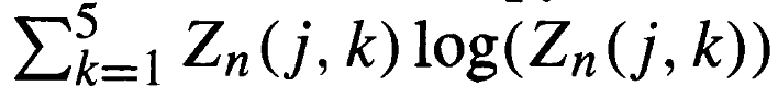
  2. Pass Entropy quantifies passing variety. By calculating the probability distribution of each player’s passes to teammates, we derive their Shannon entropy score. Higher entropy indicates more diverse passing choices, reflecting improvisational play rather than predictable patterns. The team value averages individual entropies, excluding players with minimal passing involvement.
  3. Support Proximity Index evaluates teammate availability. For each pass, we count teammates within a 15-meter radius of the passer. The average across all passes reveals how consistently the team maintains close support around the ball—a defining principle of relational football that enables spontaneous combinations and fluid progression.

To combine these three metrics into one unified measure, we normalise each one using min-max scaling so they fall between 0 and 1. The resulting Relational Index (RI) is then calculated using the formula:

RI = 0.4 × Clustering + 0.3 × Proximity + 0.3 × Entropy

These weights reflect the greater theoretical importance of triangle-based interaction (clustering), followed by support around the ball and variability in pass choices.

A window is labelled as relational if its RI exceeds 0.5. For each team in each match, we compute the percentage of their 2-minute windows that meet this criterion. This gives us the team’s Relational Time Percentage, which acts as a proxy for how often the team plays relationally during a match. When averaged across multiple matches, this percentage becomes a stable tactical signature of that team’s playing style.

Results

Applying the relational framework to matches from the 2024–25 Eredivisie Women’s league revealed that relational play, as defined by the Relational Index (RI), occurs infrequently but measurably. Using 45-minute windows and a threshold of RI > 0.5, most teams displayed relational behaviour in less than 10% of total match time.

Across all matches analysed, the league-wide average was 8.3%, with few teams exceeding 15%. Based on these distributions, the study proposes classification thresholds: below 10% as “structured,” 10–25% as “relational tendencies,” and above 25% as “highly relational.” Visual inspections of high-RI segments showed dense passing networks, triangular combinations, and compact support near the ball, consistent with tactical descriptions of relational football.

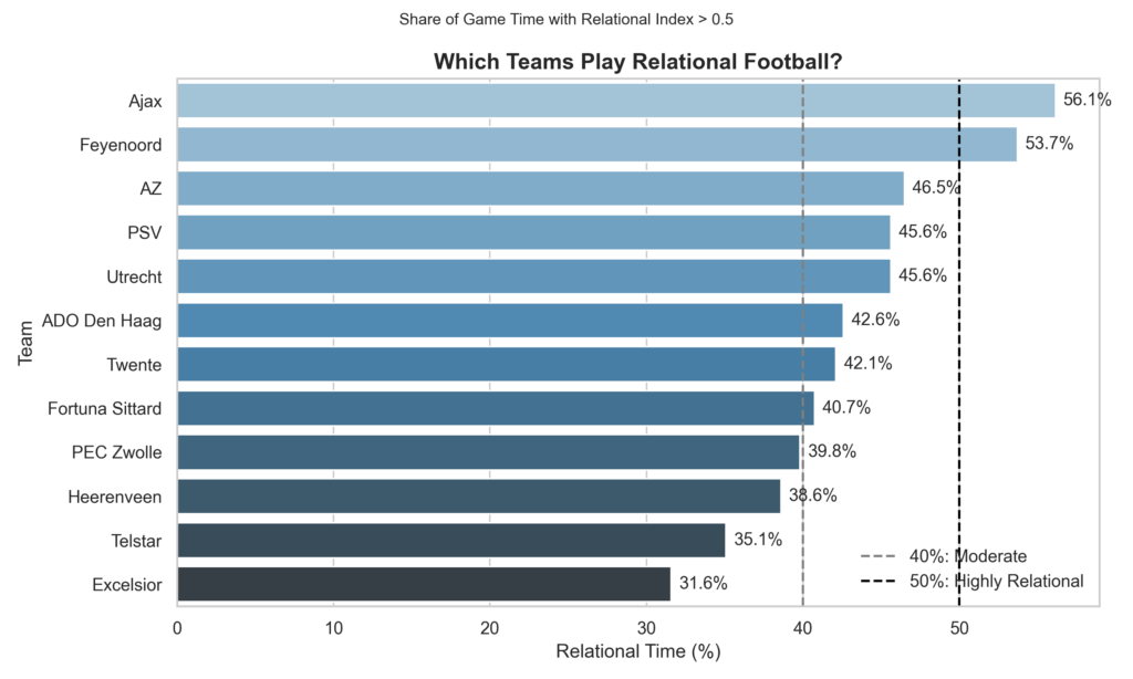
In the bar chart above we can see the Eredivisie Women 2024-2025 teams and how relational their style of play is. It measures how much of the time they have played in relational principles. I have two thresholds:

  • 40% is the threshold for moderate relationism in football and those teams can be said to play relationism in their football or a hybrid style that favours relationism
  • 50% is highly relationism. From that percentage we can say a team is truly relationism in their style of play.

Now as you can see there are quite some teams that are moderate, but truly relationism is only played – according to this data – by Ajax and Feyenoord.

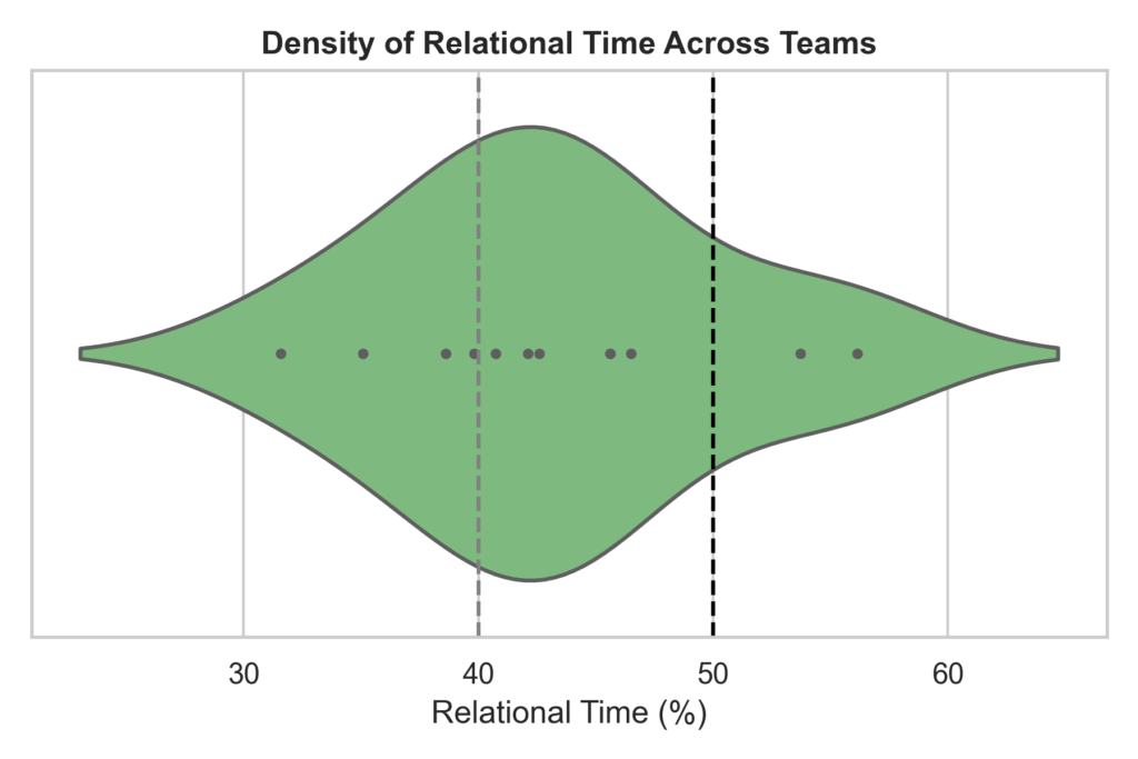
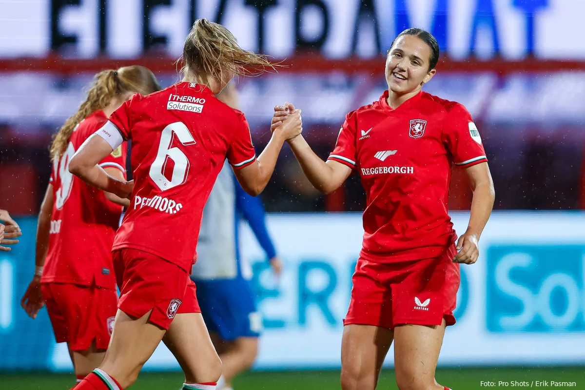
As you can see this in this violin plot, most of the time are in the moderate threshold, meaning that they have tendencies of relationism in their play, but not fully there. Now, if we look at one team we can see something different on how they play throughout the season. We are going with FC Twente, which is the best team of the season and arguably the best team of the past decade.

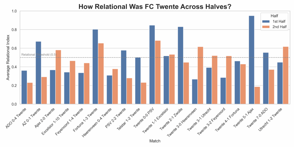
This grouped bar chart visualises FC Twente’s average Relational Index in the first and second halves of each match, using a 0.5 threshold to indicate relational play. By comparing the two bars per match, we can see whether Twente sustains, increases, or declines in relational behavior after halftime. The visualisation reveals how tactical fluidity evolves throughout matches, highlighting consistency or contrast between halves. Matches where both bars are above 0.5 suggest sustained relational intent, while large gaps may indicate halftime adjustments or fatigue. This provides insight into Twente’s game management and stylistic adherence across different phases of play.

Final thoughts

This study demonstrates that relational football—a style characterised by adaptive coordination, dense passing, and ball-near support—can be meaningfully identified using structured event data. Through a composite Relational Index, short relational phases were detected across matches, though their overall frequency was low, suggesting such play is rare or context-dependent. The model proved sensitive to fluctuations in team behaviour, offering a new lens for analysing tactical identity and match dynamics.

However, limitations include reliance on on-ball data, which excludes off-ball positioning, and the use of fixed two-minute windows that may overlook brief relational episodes. Additionally, the index’s threshold and normalisation methods, while effective, introduce subjectivity and restrict cross-match comparison. The current framework also lacks contextual variables like scoreline or pressing intensity. Despite these constraints, the findings support the claim that relational football, though abstract, leaves identifiable statistical traces, offering a scalable method for tactical profiling and a foundation for future model refinement.

Interquartile Ranges and Boxplots in Football Analysis

By writing regularly, I have concluded that I like discussing data from a sporting perspective: explaining data methodology through the lens of sport, football in particular. I have always set out to work in professional football, and I am very lucky to have reached that, but I want to keep creating, and that is why my content has become increasingly about how we use data rather than what players/teams are good/bad.

I spoke about the importance of looking at players who act differently. Well, the data behaves differently: they are outside of the average or the mean. Previously, I have spoken about outliers and anomalies; those were result-based articles. But what if we zoom in, into the methodology and look at the way we calculate those outliers or anomalies? Today, I want to talk about Interquartile Ranges in football data.

Data collection

Before I look into that, I want to shed light on the data that I am using. The data I am using focuses on the Brazilian Serie A 2025. Of course, I know that it is very early in the season and has limitations. But we can still draw meaningful insights from them.

The data comes from Opta/StatsPerform and was collected on April 22nd, 2025. The xg data comes from my model, which is generated through R. The expected goals values were generated on April 26th, 2025.

Interquartile Ranges

The interquartile range (IQR) is a key measure of statistical dispersion that describes the spread of the central 50% of a dataset. It is calculated by subtracting the first quartile (Q1) from the third quartile (Q3):

IQR = Q3 − Q1

To understand this, consider that when a dataset is ordered from smallest to largest, Q1 represents the 25th percentile (the value below which 25% of the data falls), and Q3 represents the 75th percentile (the value below which 75% of the data falls). The IQR therefore, captures the range in which the “middle half” of the data lies, excluding the extreme 25% on either end.

Interquartile Range explainer

The IQR is widely used because it is resistant to outliers. Unlike the full range (maximum minus minimum), which can be skewed by one unusually high or low value, the IQR reflects the typical spread of the data. This makes it particularly useful in datasets where anomalies or extreme values are expected, such as football statistics, where a single match can significantly distort an average.

A small IQR indicates that the data is tightly clustered around the median, suggesting consistency or low variability. A large IQR implies more variation, indicating that values are more spread out. In data analysis, comparing IQRs across different groups helps identify where variability lies and whether certain segments are more stable or volatile than others.

Box plot

A boxplot (or box-and-whisker plot) is a compact, visual summary of a dataset’s distribution, built around five key statistics: the minimum, first quartile (Q1), median (Q2), third quartile (Q3), and maximum. It is one of the most efficient ways to display the central tendency, spread, and potential outliers in a single view.

At the core of a boxplot is the box, which spans from Q1 to Q3 — the interquartile range (IQR). This box contains the middle 50% of the data. A horizontal line inside the box represents the median (Q2), showing where the center of the data lies. The whiskers extend from the box to show the range of the data that falls within 1.5 times the IQR from Q1 and Q3. Any data points outside of that range are plotted as individual dots or asterisks, and are considered outliers.

Boxplots are particularly useful for comparing distributions across multiple categories or groups. In football analytics, for example, you can use boxplots to compare metrics like interceptions, shot accuracy, or pass completion rates across different player roles or leagues. This makes it easy to identify players who consistently perform above or below the norm, assess the spread of values, and detect skewness.

An important advantage of boxplots is their resistance to distortion by extreme values, thanks to their reliance on medians and quartiles rather than means and standard deviations. However, boxplots do not reveal the full shape of a distribution (e.g., multimodality or subtle clusters), so they are best used alongside other tools when deeper analysis is needed.

Analysis

As described under the data section, I will use expected goals data from the Brazilian Serie A 2025. Using interquartile ranges, we can see which players are in the middle 50% of the selected metric.

In short, this is what we can conclude: In the 2025 Brazilian league season, Pedro Raul stood out as the top player by expected goals (xG), showing his strong attacking threat. While there is a competitive cluster behind him, his advantage highlights his key role in creating high-quality scoring opportunities.

This shows us the top performers in expected goals accumulated of the begin of the season in Brazil. But if you want to delve deeper, you can look for outliers. We do that by using the interquartile range and finding the middle 50%. If there are deviations away from that middle 50%, we can can state that they are over-/underperforming. Or, in a more extreme form: they are outliers.

I’m quite interested in their distribution: do they have many shows of low xG-value? Or rather a few with high xG-values? I want to see whether they are part of outliers or that, in general just have more high xG-values per shot.

But how can we visualise that? By looking at box plots.

Each boxplot delineates the statistical spread of shot quality, with the median value indicating the central tendency of xG per attempt, while the interquartile range (IQR) represents the middle 50% of observations, effectively illustrating the consistency of shot selection.

The median xG value serves as a primary indicator of a player’s typical shot quality, with higher values suggesting systematic access to superior scoring opportunities, often from proximal locations to the goal or advantageous tactical positions. The width of the IQR provides insight into shot selection variability — narrower distributions indicate methodological consistency in opportunity type, while broader distributions suggest greater diversity in shot characteristics.

Final thoughts

Interquartile ranges and boxplots offer robust analytical tools for examining footballers’ shot quality distributions. These methods efficiently highlight the central 50% of data, filtering outliers whilst emphasising typical performance patterns.

Boxplot visualisations concisely present multiple statistical parameters — median values, quartile ranges, and outlier identification — enabling immediate cross-player comparison. This approach reveals crucial differences in shooting behaviours, including central tendency variations, distributional width differences, and asymmetric patterns that may reflect tactical specialisation.

Despite their utility, these visualisations possess inherent limitations. They necessarily obscure underlying distributional morphology and provide no indication of sample size adequacy — a critical consideration in sports analytics where performance metric reliability depends on observation volume. A player with minimal shot attempts may produce a boxplot visually similar to one with extensive data, despite significantly reduced statistical reliability.

Calculating triangular third-man runs with event data: how reliable are the results?

Data metrics and development always feel or look innovative. About 40% of the time, they are. It is very satisfying to create something that completely suits your needs, but one question always remains: how necessary is it to do so? My reason for it is that some metrics already exist, and it isn’t always necessary for your analysis to create everything yourself. It’s very time-consuming, and that’s not something we analysts often have.

To me, there is one clear exception: you don’t have the right resources. Often, we can look at event data and create our metrics, indexes and models from there. However, sometimes we want to look at off-ball data and we need tracking data to generate positional data and off-ball runs, for example. I’m quite fortunate to work with clubs that have access to that data, but what if you don’t have that? You want to use the event data to be creative and give an indication of what is close to tracking data.

This might sound familiar to you, reading this or the concept from it. We do love pressing data, but not all providers have that, so we have a metric that measures pressing intensity: Passes Per Defensive Action (PPDA). It calculates the number of passes allowed by a team’s opponent before the pressing team makes a defensive action (like a tackle, interception, or foul) in the opponent’s defensive two-thirds of the pitch. A low PPDA means aggressive pressing, and a lower PPDA means a more passive pressing approach.

In this article, I want to calculate a way to get third-man runs data with event data. After that, I want to evaluate how sound this method is and how reliable the results are.

Contents

  1. Why this research?
  2. Data collection
  3. Methodology
  4. Calculation
  5. Analysis
  6. Checks and evaluation

Why this research

This research is twofold, actually. My main aim is to see if I can find a creative way to capture third man runs with event data. I think it will give us some off-ball data via an out-of-the-box thinking pattern. Then we can use this in terms of off-ball scouting, analysis of players and teams, and of course, we can go even further and make models of that that predict a third-man run.

The second reason is that I feel that I can do better with evaluating the things I make. Check myself, check the validity of the models and the representation of the data. If I build this more into my public work, it will lead to a better understanding of the data engineering process, which is often frustrating and takes a long time to get right.

Data collection

The data collection is almost the same as in all other projects. The data I’m using is even data from Opta/Statsperform, which means it contains the XY-values of every on-ball data as collected by this specific provider.

The data has been collected on Saturday, 12th of April 2025. The data concentrates on one league specifically, and that is the Argentinian League 2025, as I’m branching out to South American football content only on this platform.

What I also will aim to do is to create a few new metrics, which will then be my own metrics. These are my designs based on Opta/Statsperform data and will be available on my GitHub page.

Methodology

Third man runs are one of football’s most elegant attacking patterns — subtle, intelligent, and often decisive. At their core, these movements involve three players: the first (Player A) plays a pass into a teammate (Player B), who quickly connects with a third player (Player C) arriving from a different area. It’s C who truly benefits, receiving the ball in space created by the initial pass-and-move. This movement structure mirrors the concept of triadic closure from network theory, where three connected nodes form a triangle — a configuration known to create stability and flow in complex systems. In football, this triangle is a strategic weapon: it preserves possession while simultaneously generating overloads and disorganizing defensive shapes.

To detect these patterns in event data, we treat each pass as a directed edge in a dynamic graph, with time providing the sequence. The detection algorithm follows a constrained path: A→B followed by B→C, where A, B, and C are distinct teammates. The off-ball movement from A’s pass to C’s reception is measured using Euclidean distance — a direct application of spatial geometry to quantify run intensity. But there’s more at play than just movement. From an information-theoretic perspective, third man runs are low-probability, high-reward decisions. Using Shannon entropy, we can frame each player’s passing options as a probability distribution: the higher the entropy, the more unpredictable and creative the decision. Third man runs often emerge in moments of lower entropy, where players bypass obvious choices in favor of coordinated, rehearsed sequences.

Over time, these passing sequences can be modeled as a Markov chain, where each player’s action (state) depends only on the previous action in the chain. While simple possession patterns often result in high state recurrence (e.g., passing back and forth), third man runs introduce state transitions that break the chain’s memoryless monotony. This injects volatility and forward momentum into the system — qualities typically associated with higher goal probability. By combining network topology, geometric analysis, and probabilistic modeling, we build not just a detector but a lens into one of football’s most intelligent tactical tools. And with a value-scoring mechanism grounded in normalization and vector calculus, we begin to quantify what coaches have always known: the most dangerous player is often the one who never touched the ball until the moment it mattered.

Calculations

Let’s walk through how we identify and evaluate a third-man run using real match data. Imagine Player A, a midfielder, passes the ball from position (37.5, 20.2) on the pitch. Player B receives it and quickly lays it off to Player C, who arrives in space and receives the ball at (71.8, 40.3). By checking the event timestamps, we know this sequence happened over 35 seconds — enough time for Player C to make a significant off-ball movement. The key here is that Player A never passed directly to Player C; the move relies on coordination and timing, a perfect example of a third man run.

We start by calculating the Euclidean distance between A’s pass location and C’s reception point, which comes out to about 39.75 meters. Dividing that by the time difference gives us a run speed of 1.14 meters per second. We also look at how much progress the ball made toward the goal, called the vertical gain, which in this case is around 0.33 (when normalized to a standard 105-meter pitch). Each of these factors — distance, vertical gain, and speed — is normalized and plugged into a weighted scoring formula. For this example, the resulting value score is 0.468, indicating a moderately valuable third man run.

This process helps quantify the kind of off-ball intelligence that often goes unnoticed. Instead of just knowing who passed to whom, we begin to understand how space is created and exploited. With just a few lines of code and some well-defined logic, we turn tactical nuance into measurable insight — bridging the gap between data and the game’s deeper layers.

Analysis

By running the Python code, I get the results of the third-man runs and every player involved. I also calculated a score that gives value to the third man run as to how useful it is. The Excel file that came out of it looks like this:

First, let us have a look at the teams with the most third-man runs during these games we have collected:

As we can conclude from the bar graph above, Argentinos Juniors, Estudiantes and Boca Juniors have the most third-man runs. Having said that, Newell’s Old Boys, Belgrano and Deportivo Riestra have the fewest third man runs.

Of course, these are just volume numbers. Let’s compare them to the average value:

What we see is quite interesting. The majority of the teams have an average value between 0,3 and 0,5 per third-man runs. The more they participate in third man runs, the more the value is even. As you can see, the teams with the fewest have more positive and negative anomalies.

Finally, I want to find the players who are player C, as they are the ones doing the third-man run. I also want to see their value score on average, so we can see how dangerous their runs are.

As we can see, there is a similar pattern with how the value is assigned. More third man runs also means a more similar value to their peers. This is very interesting.

We can see the best players in terms of the value they give with their runs. I have selected only players with at least 5 runs to make it more representative. It’s also important to stress that the league hasn’t been concluded and the data will be different when the season is over.

Now this is a way how we create the metric and analyse it, but how valid is this data actually?

Checks and evaluation

Now I’m going to check whether this is all worth the calculation or that I need to make drastic changes

First, I will look at the feature. The composite score is based on the following: distance (50%), Vertical gain toward the goal (30%) and speed (20%). This seems like a reasonable way to use weights, but I could increase the vertical gain for the values.

Second, looking at the output, I need to ask myself the following questions:

  • Are top-scoring actions meaningful? (e.g. fast break runs, line-breaking passes)
  • Are short, back-passes scoring low?
  • Are there any nonsensical values like 0 distance or negative speed?

Following that, looking at the distribution validation:

The distribution of normalized value scores for third-man runs appears healthy overall, showing a positive skew with most scores clustered between 0.2 and 0.5. This shape aligns with expectations in football, where high-value tactical patterns — like truly effective third-man runs — should be relatively rare. The presence of a single peak at 1.0 suggests a standout moment, potentially representing a high-speed, long-distance run that created significant forward momentum. Importantly, the model avoids overinflating value, as there’s no unnatural cluster near the top end of the scale, which supports its reliability in distinguishing impactful actions from routine ones.

However, the tight cluster around the 0.2–0.3 range may point to a limited scoring spread, potentially reducing how well the metric separates moderately good actions from low-value ones. This could be a result of either low variability in the input features (like speed or vertical gain) or an overemphasis on distance within the weighted formula. If the score distribution stays compressed, it may make ranking or comparative use of the metric less insightful. Adjusting the weighting or introducing non-linear scaling to amplify score separation could help refine the index for better tactical and scouting utility.

If you liked reading this, you can always follow me on X and BlueSky.

Chess strategies in football: designing tactical passing styles based on chess ⚽️♟️

Football tactics is what originally swayed me in the direction of football analysis. I’m a sucker for patterns and causal relationship, sos when I was introduced to football tactics, I was completely emerged and sucked into the world of tactical analysis.

A few years later, I ran into a quite common problem: data vs. eyes. I have mostly focused on data lately, and that’s what I work with. In other words, right now, I work as a data engineer at a professional football club, where I don’t really focus on any aspect of video. The problem arises that for tactics, we mostly use our eyes because the data can’t tell us why something happens at a specific time on the pitch.

This got me thinking. Which sport has decision-making and tactical approaches, yet can be analysed with data? My eyes — pun intended — turned towards chess and the openings/defences you got there. In this article, I aim to translate, convert and surpass chess strategies and make them actionable for analysis.

This article will describe a few chess strategies and how we can look into them with data and create playing styles/tactics from them. The methodology will be a vital part of this analysis.

Contents

  1. Introduction: Why compare chess and football?
  2. Data representation and resources
  3. Chess strategies
  4. Defining the framework: converting chess into football tactics
  5. Methodology
  6. Analysis
  7. Challenges and difficulties
  8. Final thoughts

Introduction: Why compare chess and football?

First of all, I love comparisons with other disciplines. It gives us an idea of where we can improve from other sports and/or influence other sports. Until now, I have focused mostly on basketball and ice hockey, but there are other sports I want to have a look at: rugby, American football and baseball.

Truth be told, do I know a lot about chess? Probably not. I’m a fairly decent chess player, and I know the basic theory of strategies in chess, but you won’t find an ELO rating to be proud of you in my house. But that’s beside the point. The point is that I love chess for its tactics and strategies. It’s so prevalent in our language that we often call close-knit games: a game of chess.

My brain wanted to make a comparison between chess tactics and chess moves that can be seen in the light of certain actions and patterns in football. For that specific little research and to get the tactics, I am going to look at chess moves and relate them to passing in football. This will become slightly clearer in the rest of the article.

Data representation and sources

This remains a blog or website where I love to showcase data and what you can do with it. This article is no different.

The data I’m using for this is data gained from Opta/StatsPerform and focuses on the event data of the English Premier League 2024–2025. The data was collected on March 1st 2025.

We focus on all players and teams in the league, but for our chain events and scores, we focus on players that have played over 450 minutes or 5 games in the regular season. In that way we can make the data and, subsequently the results, more representative to work with.

Chess strategies

There are 11 strategies that I have found in chess that I found were suitable for analysis. Our analysis focuses on passing styles based on the chess strategies.

Caro-Kann Defense (Counterattacking, Defensive)

  • Moves: 1. e4 c6 2. d4 d5
  • A solid and resilient defense against 1. e4. Black delays piece development in favor of a strong pawn structure. Often leads to closed, positional battles where Black seeks long-term counterplay.

Scotch Game (Attacking)

  • Moves: 1. e4 e5 2. Nf3 Nc6 3. d4. White aggressively challenges the center early. Leads to open positions with fast piece development and tactical opportunities. White often aims for a kingside attack or central dominance.

Nimzo-Indian Defense (Counterattacking, Positional)

  • Moves: 1. d4 Nf6 2. c4 e6 3. Nc3 Bb4. Black immediately pins White’s knight on c3, controlling the center indirectly. Focuses on long-term strategic play rather than immediate counterattacks. Offers deep positional ideas, such as doubled pawns and bishop pair imbalances.

Sicilian Defense (Counterattacking, Attacking)

  • Moves: 1. e4 c5 Black avoids symmetrical pawn structures, leading to sharp, double-edged play. Common aggressive variations: Najdorf, Dragon, Sveshnikov, Scheveningen. White often plays Open Sicilian (2. Nf3 followed by d4) to create attacking chances.

King’s Indian Defense (Counterattacking)

  • Moves: 1. d4 Nf6 2. c4 g6 3. Nc3 Bg7. Black allows White to occupy the center with pawns, then strikes back with …e5 or …c5. Leads to sharp middle games where Black attacks on the kingside and White on the queenside.

Ruy-Lopez (Attacking, Positional)

  • Moves: 1. e4 e5 2. Nf3 Nc6 3. Bb5. White applies early pressure on Black’s knight, planning long-term positional gains. Leads to rich, strategic play with both attacking and defensive options. Popular variations: Closed Ruy-Lopez, Open Ruy-Lopez, Berlin Defense.

Queen’s Gambit (Attacking, Positional)

  • Moves: 1. d4 d5 2. c4. White offers a pawn to gain strong central control and initiative. If Black accepts (Queen’s Gambit Accepted), White gains rapid development. If Black declines (Queen’s Gambit Declined), a long-term strategic battle ensues.

French Defense (Defensive, Counterattacking)

  • Moves: 1. e4 e6. Black invites White to control the center but plans to challenge it with …d5. Often leads to closed, slow-paced games where maneuvering is key. White may attack on the kingside, while Black plays for counterplay in the center or queenside.

Alekhine Defense (Counterattacking)

  • Moves: 1. e4 Nf6. Black provokes White into overextending in the center, planning a counterattack. Leads to unbalanced positions with both positional and tactical play. It can transpose into hypermodern setups, where Black undermines White’s center.

GrĂźnfeld Defense (Counterattacking, Positional)

  • Moves: 1. d4 Nf6 2. c4 g6 3. Nc3 d5. Black allows White to build a strong center, then attacks it with pieces rather than pawns. Leads to open, sharp positions where Black seeks dynamic counterplay.

Pirc Defense (Defensive, Counterattacking)

  • Moves: 1. e4 d6 2. d4 Nf6 3. Nc3 g6. Black fianchettos the dark-square bishop, delaying direct confrontation in the center. Leads to flexible, maneuvering play, often followed by a counterattack. White can opt for aggressive setups like the Austrian Attack.

Defining the framework: converting chess into football tactics

A Caro-Kann Defense in chess is built on strong defensive structure and gradual counterplay, mirroring a possession-oriented style in football, where teams maintain the ball, carefully build their attacks, and avoid risky passes. On the other hand, the Scotch Game, an aggressive opening that prioritises rapid piece development and early control, aligns with high-tempo vertical passing. Teams using this style move the ball forward quickly, looking to exploit spaces between the lines and catch opponents off guard.

Some openings in chess focus on inviting pressure to counterattack, a principle widely used in football. The Sicilian Defense allows White to attack first, only for Black to strike back with powerful counterplay. This is akin to teams that play deep and absorb pressure before launching devastating transitions. Similarly, the King’s Indian Defense concedes space early before unleashing an aggressive kingside attack, where the team defended deep and then launched precise, rapid counterattacks.

Certain chess openings focus on compact positional play and indirect control, mirroring football teams that overload key areas of the pitch without necessarily dominating possession. The Nimzo-Indian Defense, for instance, does not immediately fight for central space but instead restricts the opponent’s development, where tight defensive structure and midfield control dictate the game. Likewise, the French Defense prioritizes a solid defensive structure and controlled build-up, where possession is carefully circulated before breaking forward.

Teams that thrive on wide play and overlapping full-backs resemble chess openings that emphasize control of the board’s edges. The Grünfeld Defense, which allows an opponent to take central space before striking from the flanks. In contrast, teams that bait opponents into pressing only to bypass them with quick passes follow the logic of the Alekhine Defense, which provokes aggressive moves from White and counters efficiently.

The flexibility of the Pirc Defense, an opening that adapts to an opponent’s approach before deciding on a course of action, can be likened to teams that switch between possession play and direct football depending on the game situation. The adaptability of this approach makes it unpredictable and difficult to counter.

Methodology

So now we have the strategies from chess that we are going to use for the analysis, and we know how they resemble similar football tactics already. The next step is to look at existing data and see how we can derive the appropriate metrics to design something new in football.

From the event data we need a few things to start the calculation:

  • Timestamps
  • x, y
  • playerId and playerName
  • team
  • typeId
  • outcome
  • KeyPass
  • endX, endY
  • passlength

First, individual match data is processed to extract essential passing attributes such as pass coordinates, pass lengths, and event types. For each pass, metrics like forward progression, lateral movement, and entries into the final third are computed, forming the building blocks of the tactical analysis.

Once these basic measures are derived, seven distinct metrics are calculated from the passing events: progressive passes, risk-taking passes, lateral switches, final third entries, passes made under pressure, high-value key passes, and crosses into the box. Each metric captures a specific aspect of passing behavior, reflecting how aggressively or defensively a team approaches building an attack.

For every tactical archetype — each modeled after a corresponding chess opening — a unique set of weights is assigned to these metrics. The overall strategy score for a team in a given match is then computed by multiplying each metric by its respective weight and summing the results. This weighted sum provides a single numerical value that encapsulates the team’s tendency towards a particular passing style.

Strategy Score=w1​(progressive)+w2​(risk-taking)+w3​(lateral switch)+w4​(final third)+w5​(under pressure)+w6​(high-value key)+w7​(crosses)

You can find the Python code here.

Analysis

Now, with that data we can do a lot of things. We can for example look at percentile ranks and see what the intent is of a team regarding a specific style:

We can see how well Liverpool performs in the strategies coming from chess, and that leads to a shot. This shows us that the French Defence and the Caro-Kann are two strategies wherein Liverpool scores the best in, in relation to the rest of the league.

The next thing we can do is to see how well Liverpool in this case does when we compare two different metrics/strategies.

In this scatterplot we look at two different strategies. The aim is to look at how well Liverpool scores in both metrics, but also to look at the correlation between the two metrics.

Liverpool perform in the high average for metrics, while Nottingham Forest and Manchester City are outliers for these two strategies — meaning that they create many shot above average from these two strategies.

Anothre way of visualising how well teams are creating shots from certain tactical styles adopted from chess, is a beeswarm plot.

In the visual above you can see the z-scores per strategy and where Liverpool is placed in the quantity of getting shots. As you can see they score around the mean or slight above/under the mean with small standard deviations. What’s important here is they don’t seem to be outliers in both the positive or negative way.

Challenges

  • Chess moves are clearly categorised, but football actions depend on multiple moving elements and real-time decisions.
  • Assigning numerical values to football tactics is complex because the same play can have different outcomes.
  • In football, opponents react dynamically, unlike in chess where the opponent’s possible responses are limited.
  • A single football tactic can have multiple different outcomes based on execution and opponent adaptation.
  • There is no single equivalent to chess move evaluation in football, as every play depends on multiple contextual factors.

Final thoughts

Chess and football might seem worlds apart — one is rigid and turn-based, the other a chaotic dance of movement and reaction. Chess moves have clear evaluations, while football tactics shift with every pass, press, and positioning change. Concepts like forks and gambits exist in spirit but lack the structured predictability that chess offers. And while chess follows a finite game tree, football is a web of endless possibilities, shaped by human intuition and external forces.

Bridging this gap means bringing structure to football’s fluidity. Value-based models like Expected Possession Value (EPV), VAEP, and Expected Threat (xT) can quantify decisions much like a chess engine evaluates moves. Reinforcement learning and tactical decision trees add another layer, helping teams optimize play in real-time. Football will never be as predictable as chess, but with the right models, it can become more strategic, measurable, and refined — a game of decisions, not just moments.

Space control and occupation metrics with average positions

Space and zonal control. These words and concepts are used quite often when we talk about football in a tactical sense. How do we control the spaces, zones and areas on the pitch and ensure we dominate in the game? We can capture These very interesting questions on video with telestration programs.

However, how do we make sure that we can capture this with data? The most obvious solution to that is to have a look at tracking data — and believe you me, I should write about tracking data more often — but not everyone has the opportunity to use tracking data. Furthermore, out-of-possession data is not as prevalent as we would like.

In this article, I want to use on-ball event data to create new metrics for space control and space occupation. I will do that by focusing on average positions of players while on the ball during a specific game or season.

Data

The data I’m using for this research comes from event data that is raw. That comes from Opta/StatsPerform, but this kind of data can be used from Hudl/StatsBomb, SkillCorner or any other provider that has event data.

The data was collected on Friday 14 February 2025 and focuses on Ligue 1 2024–2025. While the metrics can be created on an individual player level, I will keep my attention on the team level as it can give us some interesting insights.

Methodology

As we want to look at space control and we want to look at on-ball data, we need to make sure that we have a methodology that works for this. I honestly had to find a way that would work the best, or fail the least. First I started with looking at bins.

Yes, I’m very much aware this bin doesn’t overlay the pitch properly. However, this shows the zone control from Team A (blues) and Team B (reds). This control is based on all x and y variables and handles all on-ball touches, which might not necessarily mean that all variables are relevant.

Then I moved over to visualising average player positions.

Still, I wasn’t very convinced with how this visual looked and how it gave me control or occupation of space. There are two reasons for that:

  • Some areas are more purple, but dont’ really show if that’s a mixed-control zone or not
  • This plots all average positions for all players featured in a match. All players are needed for the total control, but without making a distinction for substitutions, it could lead to overcrowding and misleading data.

I like the idea of average positions though and I kept going back to a post I earlier wrote about Off-Ball Impact Score (OBIS)

In passing networks, the average positions of the network are calculated at the beginlocation of a pass: where does the pass begin. In terms of that, they calculate average positions where passes are made in that specific match or season. Also it makes sure that it focuses until the first substitution.

It gives us a good idea of where passes were made during that specific game on an average for specific players, as you can see in the image below.

Passing Network Heerenveen and Ajax with Expected Possession Value (EPV, Outswinger FC 2025

What if you used that logic of passing networks and calculate new things from those networks? Of course, we have done that already a little with OBIS:

  • In-degree centrality: The total weight of incoming edges to a player (i.e., the number of passes they received).
  • Out-degree centrality: The total weight of outgoing edges from a player (i.e., the number of passes they made).
  • Betweenness centrality: Measures how often a player lies on the shortest path between other players in the network.
  • Closeness centrality: The average shortest path from a player to all other players in the network.
  • Eigenvector centrality: Measures the influence of a player in the network, taking into account not just the number of connections they have but also the importance of the players they are connected to
  • Clustering coefficient: Measures the tendency of a player to be part of passing triangles or localized groups (i.e., whether their connections form closed loops).

These measure many things, but I want to focus more on control and occupation than pure off-ball impact.

In addition to the already calculated metrics, I wanted to pose some new metrics which we can calculate with average positions based on the begin location of a pass:

  • Team Control (%): The percentage of the field controlled by each team.
  • Overlap (%): The percentage of the field that is controlled by both teams.
  • Convex Hull Area: The area of the convex hull for the team (shows how compact the team is).
  • Vertical Compactness: The range (peak-to-peak) of player positions in the y (vertical) direction.
  • Horizontal Compactness: The range (peak-to-peak) of player positions in the x (horizontal) direction.
  • Player Density: The average number of players per unit area on the field.
  • Centroid X and Y: The average position (center of mass) of the team’s players.
  • Horizontal Spread: The maximum distance between players in the horizontal direction.
  • Vertical Spread: The maximum distance between players in the vertical direction.
  • Circularity: A measure of the team’s shape, with 1 being a perfect circle (indicating high compactness).

With these new metrics, we can create some new insights into space control and occupation in individual games, seasons and for individual players’ analysis.

Analysis

When we continue with our metrics, we can look at it from two ways. The first one is to look at it from an individual game perspective:

I have had a look at the game between PSG and Monaco, after which I calculated these metrics for both teams.

  • PSG had 40,06% control of the pitch, while Monaco had 40,85% control of the pitch
  • Overlap is the same in percentages
  • PSG had Convex Hull Arae of 2261,02 and Monaco of 1814,81. This means that Monaco had a smaller playing field than PSG in the game.
  • Vertical and Horizontal compactness, we see that PSV is more compact in a vertical sense, while Monaco is more compact in a horizontal sense
  • In terms of player density, there are more players per area for PSG than for Monaco
  • In terms of circularity, the high compactness is higher for PSG than for Monaco.

This is for a single game, but we can also look at all teams and focus on a complete season. We can compare them in serval ways, but the first one is via percentile ranks:

Here you can see how PSG scores in terms of all the metrics we just calculated compared to the rest of Ligue 1. what’s interesting is how high they score in player density and horizontal spread.

And this is Monaco’s percentile rank calculated. While PSG has more outliers in the high and low regions, Monaco is much more steady and consistently scores above average for every metric. What’s interesting here is that they score highest for percentages of pitch control during the games they played.

Final thoughts

Integrating average position metrics with passing data offers a deeper understanding of a team’s playing style and tactical approach. By mapping the average positions of players during a match, it becomes easier to identify areas of strength and vulnerability in possession. Teams that focus on short, quick passes tend to have more compact positioning with high-density zones in central areas, promoting controlled build-up play.

However, it does feel unfinished or incomplete. This is because we only look at the locations of passes and there are so many more types of touches to be considered. That’s something to alter for version 2.0.

Introducing Expected Shots from Cross (xCross): measuring the probability that a shot occurs from a cross

How many more expected models do we need? That’s surely a question I have asked myself numerous times while researching the article I am presenting today. I think it all depends on the angles you present your research with and how you approach the research: what’s the aim and what do you want to get out of it?

For me, it’s important to create something that adds something to a conversation about expected value models when I or others make a different model. This can be done by creating a completely new model or metric or recreating a model with enhancements. A combination of the two is also possible, of course.

In this article, I want to talk a little bit more about crosses. It is not so much about cross delivery or cross completion percentages, but what successful follow-up action does entail: shots from crosses and the expected models.

First I will talk about the data and how I have collected it, secondly about the methodology, followed by the analysis of the data and last I will give my final thoughts or conclusion.

Data

For this research, I have used raw event data from Opta/Statsperform. The event data was collected on Thursday, 30 January 2025, focusing on the 2024–2025 season of the Belgian Pro League, the first tier in Belgium football.

The data will be manipulated to have the metrics we need to make this calculation work. The players featured will have played a minimum of 500 minutes played throughout the season.

For this research, we won’t focus on any expected goal metrics, as we are not looking for the probability of a goal being scored.

Why this metric?

This is a question I ask myself every time when I set out to make a new model of metric. And sometimes I really don’t know what to answer. The fundamental question remains: do we need it? I guess that’s a question of semantics, but no — I don’t think we need it. However, I believe it can give us some interesting insights into how shots come to be.

The place where I come from is to understand what expected assists or expected goals assisted tell us. These metrics tell us something about passes with a probability of leading to a goal with the key difference between all passes and passes leading to shots. I love the idea of it, but it’s very much focused on the outcome of the shots and expected goals.

I want to do something different. Yes, the outcome will be a probability, but it focuses on the probability of a shot being taken rather than a shot ending up a goal. Furthermore, I want to look at the qualitative nature of the crosses and whethter we can asses something from the delivery taker. In other words, does the quality of the cross lead to more or less shots in similar variability.

Cross: a definition

What is a cross? If we look at the definition of Hudl, we can say the following what constituates as a cross: A ball played from the offensive flanks aimed towards a teammate in the area in front of the opponent’s goal.

In this instance a flank is the utmost 23 meters in a 68 meter wide pitch. This means that everything on the right or left that is a pass from the flank to the central area, can be considered a cross.

Credit: Glossary Wyscout

As we look to Opta/Statsperform data and are using that in our research, let’s see what their definition is: A ball played from a wide position targeting a teammate(s) in a central area within proximity to the Goal. The delivery must have an element of lateral movement from a wider position to more central area in front of Goal.

If we take some random data for crosses, we can see where crosses come from and what metrics we can pull from them. This is essential for our research into a model and we need to understand what we are working with.

In the image below you can see a pitch map with crosses visualised.

We visualise the crosses coming from open play, so we filter out the set pieces and we make a distinction between successful and unsuccessful passes. On the right side we see some calculation of the crosses which we can also use to work more with. EPV is expected possession value and xT is expected threat.

Methodology

So the thing is that I want to create a model from the crosses we visualised. The aim is to get a model that calculates probability for every cross turning into a shot. There are a few things we need to take from the event data:

  • Cross origin (location on the field)
  • Receiving player’s position (inside/outside the box, near/far post, penalty spot based on endlocation of the cross)
  • Game context (match minute, scoreline, opposition quality)

The first step involves organising the dataset by sorting events chronologically using timestamps. Then, the model identifies cross attempts (Cross == 1) and assigns a binary target variable (leads_to_shot) by checking if the next three recorded events include a shot attempt (typeId in [13, 14, 15, 16]). This ensures that the model captures sequences where a cross directly results in a shot, preventing the influence of unrelated play sequences. These include a missed shot, shot on the post, shot saved or a goal.

After defining the target variable, feature engineering is applied to improve model performance. Several factors influence the probability of a cross leading to a shot, such as the location of the cross (x, y), its target area (endX, endY), and the total time elapsed in the match (totalTime).

The dataset is then split into training (80%) and testing (20%) sets, ensuring that the distribution of positive and negative samples is preserved using stratification.

To estimate the probability that a cross leads to a shot, machine learning models are applied. A Logistic Regression model is trained to predict a probability score for each cross, making it an interpretable baseline model.

In the context of xCross, the goal of the model is to predict whether a cross will lead to a shot attempt (leads_to_shot = 1) or not (leads_to_shot = 0).

Additionally, a Random Forest Classifier is trained to capture non-linear relationships between crossing characteristics and shot generation likelihood. Both models are evaluated using accuracy, ROC AUC (Receiver Operating Characteristic — Area Under Curve), and classification reports, ensuring their ability to distinguish between successful and unsuccessful crosses in terms of shot creation.

Analysis

Now we have an excel file with the results for every cross in our dataset, containing the probability of it leading to a shot in the first three actions. Now we can start analysing the data.

First we can look at the player who have the highest xCross number in the 2024–2025 season so far.

As you can see in the bargraph above, these are the top 15 players who are most likely to give a cross that leads to a shot. When we look at Stassin, for every cross he takes, 82% of them will lead to a shot in the next 3 actions.

In the scatterplot below you can see the total number of crosses with the crosses leading to shots in the next 3 actions.

What I want to try to do is to find the correlation between shots from crosses and the probability of shots coming from crosses. That’s what we can see in the correlation matrix.

As you can see the correlation is very high with 0,99 correlation to 1 shot from xCross. There is a positive relation and that’s something we need to think on.

Final thoughts

Looking ahead, further improvements could include incorporating player movement data, defensive positioning, and match context to refine shot prediction accuracy. Testing more advanced models, such as XGBoost or deep learning, could help capture complex interactions between crossing characteristics and shot outcomes. Additionally, fine-tuning the Random Forest hyperparameters could further optimise performance. Ultimately, these refinements can provide deeper tactical insights.

Expected Defensive Threat Reduction (xDEF): measuring how defensive players reduce attacking passing threat with defensive activities

It’s finished! That’s my inital thought when I started writing this article and that sentiment comes from weeks of cracking my brain. I have made a shift from using data to do analysis to making some new models myself. It gives me great pleasure to innovate and develop my own models. My aim is to enhance data analysis to jump into the gap that is the lack of defensive football models. So that’s what we are going to do in this article.

Contents

  1. Why this metric?
  2. Data collection and representation
  3. Value models: xPass, xT and EPV
    3.1 Expected threat (xT)
    3.2 Expected Pass (xPass)
    3.3 Expected Possession Value (EPV)
  4. Methodology: xDef
  5. Analysis: xDEF in French Ligue 1
  6. Final thoughts
  7. Sources

1. Why this metric?

I have said this before, but when I look at a lot of the data metrics and data models, I see that they are mostly focused on the attacking side of the game. It focuses on scoring and chance creation most of the time, and if it does not — it focuses on on-ball value. It measures the actions when players have the ball. Whilst I think this is incredibly useful, I feel it gives a very unfair balance in terms of what we focus on in data analysis.

That’s why I want to look closer at a probability model that looks at the defensive side of the game. In other words, I want to measure what defensive actions do to the expected danger of the team in possession. That’s why I have spent weeks on developing a new model called xDef.

xDEF (Expected Defensive Threat Reduction): A metric quantifying the likelihood of a defensive action reducing the opponent’s scoring threat, considering spatial positioning, player actions, and subsequent play outcomes.

In this article we will further explore which data metrics and models are being used, what calculations are needed for it and how we can make it concrete/actionable for day-to-day analysis and scouting.

2.1 Data collection and representation

The data used in this article is a combination of already existing metrics, new metrics and newly developed models and scores. This is all done with raw event from Opta and Statsperfom and is combined with physical data from Skillcorner.

The data was last collected on Wednesday 15 January 2025 and consists of the season-level data of the French Ligue 1. For the players’ individual scores and metrics, I have chosen to only select players who have played over 500 minutes in the season so far.

3. Data models

For the creation of the new metric, we will focus on a few data models. To have an understanding what they are, I will explain them briefly and how I will use them in the rest of the research.

3.1 Expected threat

The basic idea behind xT is to divide the pitch into a grid, with each cell assigned a probability of an action initiated there to result in a goal in the next actions. This approach allows us to value not only parts of the pitch from which scoring directly is more likely but also those from which an assist is most likely to happen. Actions that move the ball, such as passes and dribbles (also referred to as ball carries), can then be valued based solely on their start and end points, by taking the difference in xT between the start and end cell. Basically, this term tells us which option a player is most likely to choose when in a certain cell, and how valuable those options are. The latter term is the one that allows xT to credit valuable passes that enable further actions such as key passes and shots.

Soccerment, 2021

The model was created by Karun Sing in 2018 and you can read about his terminology and explanation here:

Introducing Expected Threat (xT)

Modelling team behaviour in possession to gain a deeper understanding of buildup play.

karun.in

3.2 Expected Pass (xPass)

Just as expected goals (xG) predicts the likelihood of a shot being scored, our xP framework models the probability of a pass being completed by taking information about the pass and the current possession.

We train a model to predict the likelihood of a pass being completed or not based on its observed outcome (where 0 = incomplete, 1 = complete). In this way, 0.2 xP represents a high-risk pass (i.e. one predicted to be completed only 1 in 5 times) and 0.8 xP represents a relatively low-risk pass (i.e. predicted to be completed 4 in 5 times). — The Analyst

The Analyst, 2021

As described by The Analyst above, we can predict the likelihood of a pass being completed. This gives us an idea of how much risk a pass has and how it can contribute to an approach for attack or defence.

3.3 Expected Possession Value (EPV)

Expected Possession Value (EPV) is a sophisticated metric in sports analytics, particularly in soccer, used to quantify the potential value of a team’s possession at any given moment during a match. It estimates the likelihood of a possession resulting in a goal by analyzing various contextual factors such as the ball’s location, player positioning, and game dynamics. EPV draws on large datasets to predict the outcomes of possession sequences, offering a probabilistic view of whether the team is likely to progress the ball effectively, create scoring opportunities, or lose possession.

EPV Grid — Outswinger FC, 2025

By assigning values to specific actions like passes, dribbles, or tackles, EPV measures contributions beyond traditional statistics such as goals or assists. It gives coaches and analysts deeper insights into team strategies, allowing them to optimise play and assess risks more effectively.

4. Methodology

This analysis aims to match passing events with nearby defensive actions within a spatial threshold and evaluate their impact on game dynamics using metrics like expected pass success (xPass), defensive contribution (xDEF), and pre-and post-action danger levels. The analysis incorporates distance weighting to quantify the influence of proximity between events.

The data we select using Python from our original Excel file are the following metrics:

  • playerName
  • contestantId
  • x, y
  • endX, endY
  • outcome
  • typeId

The dataset contains passing and defensive action events with coordinates (x,y) player identifiers, and outcomes. Passes are filtered using typeId == 1. Only successful passes (outcome=1) are further analyzed. Receivers are identified by matching subsequent events (endX, endY) from a different player and team.

Following that I want to match defensive actions or pressures if they fall within a 10 mether threshold of the opposition. The spatial proximity is noted; For each pass, defensive actions from a different team are identified if they fall within a threshold distance of 10 meters.

After we get the data and new metrics, we go on to the next step. We are going to calculate two different metrics: pre-danger and post-danger based on EPV. The PreDanger metric incorporates the EPV of the initial pass location and adjusts it based on the distance and angle to the pass endpoint.

  • EPVstart​ is the EPV value at the starting location of the pass.
  • d is the distance between the starting and ending positions of the pass.
  • arctan⁥2 accounts for the directional change, reflecting how difficult the pass is regarding angle.

Post-action danger is adjusted based on the defensive outcome and the EPV of the pass endpoint. Defensive success reduces the PostDanger by half, while unsuccessful actions leave it unchanged.

Where:

  • EPVend​ is the EPV value at the ending location of the pass.
  • Defensive outcome (outcome=1) indicates a successful defensive intervention, halving the danger.

The next and final step is xDef. It can be quantified using the expected reduction in danger before and after the action, adjusted for spatial proximity. It considers pre-action danger (PreDanger), post-action danger (PostDanger, and a distance-based weight (DistanceWeight) to account for the defender’s proximity to the play.

  • PreDanger⋅xPass combines the danger level with the likelihood of the pass succeeding, offering a more nuanced starting value for defensive impact.
  • PostDanger reflects the defender’s influence, reduced further in cases of successful defensive actions.
  • DistanceWeight adjusts the overall impact based on the spatial proximity of the defensive action.

In the end we calculate all the new metrics and save them to an excel file. From that excel file we can start working on the analysis, that gives us a better idea of what xDef means for teams and players in Ligue 1.

5. Analysis: Ligue 1

So, now we want to look at which players perform the best in terms of xDef. In the scatterplot below you can see the relation between xPass and xDef.

In the scatterplot above we have attempted to cluster the data and give it a meaningful insight. Most are in cluster 2, which have relatively high xPass values, but under average xDef. Meaning it is more difficult to affect the threat. After that follows cluster 1, which has under average xPass, but also under average xDef, so these don’t have great threat but also arent’ affected as much. The last cluster is cluster 0, which do have relatively average to high xPass, and also have higher xDef, signifying their defensive activity intensity and affection.

When we look at the total xDef in the season so far, these players do perform the best. The number quantifies how much a defender reduces the attacking threat of their opponents. A value of 4,97 like J. Lefort has, means that across the analysed period, the player reduced the likelihood of goals by a total of 4 (on a probability scale).

6. Final thoughts

The idea of this research was to create a model that gives values to off-the-ball defensive activities and gives probability of reducing threat. This is based on distance/pressures and defensive activity on the ball, but still lacks the spatial data from the tracking data. This will be done for a 2.0 version.

However, this metric/model gives us insight how a defensive players makes an impact in reducing attacking threat by moving into the passes of the attacking team.

7. Sources

Expected Threat (xT):

Singh, K. (2018). Introducing Expected Threat (xT). Retrieved from https://karun.in/blog/expected-threat.html
StatsBomb. (n.d.). Possession Value Models Explained. Retrieved from https://statsbomb.com/soccer-metrics/possession-value-models-explained/
Soccerment. (n.d.). Expected Threat (xT). Retrieved from https://soccerment.com/expected-threat/
Expected Possession Value (EPV):

FernĂĄndez, J., Bornn, L., & Cervone, D. (2020). A Framework for the Fine-Grained Evaluation of the Instantaneous Expected Value of Soccer Possessions. Retrieved from https://arxiv.org/abs/2011.09426
FernĂĄndez, J., Bornn, L., & Cervone, D. (2019). Decomposing the Immeasurable Sport: A Deep Learning Expected Possession Value Framework for Soccer. Retrieved from https://www.lukebornn.com/papers/fernandez_sloan_2019.pdf
xPass:

Decroos, T., Van Haaren, J., & Davis, J. (2019). Valuing On-the-Ball Actions in Soccer: A Critical Comparison of xT and VAEP. Retrieved from https://tomdecroos.github.io/reports/xt_vs_vaep.pdf
Decroos, T., Van Haaren, J., & Davis, J. (2019). Valuing On-the-Ball Actions in Soccer: A Critical Comparison of xT and VAEP. Retrieved from https://dtai.cs.kuleuven.be/sports/blog/valuing-on-the-ball-actions-in-soccer-a-critical-comparison-of-xt-and-vaep/
Defensive Actions:

Merhej, C., Beal, R., Ramchurn, S., & Matthews, T. (2021). What Happened Next? Using Deep Learning to Value Defensive Actions in Football Event-Data. Retrieved from https://arxiv.org/abs/2106.01786
StatsBomb. (n.d.). Defensive Metrics: Measuring the Intensity of a High Press. Retrieved from https://statsbomb.com/articles/soccer/defensive-metrics-measuring-the-intensity-of-a-high-press/
Expected Goals (xG) Models:

Wikipedia contributors. (2023, September 15). Expected Goals. In Wikipedia, The Free Encyclopedia. Retrieved from https://en.wikipedia.org/wiki/Expected_goals
Pollard, R., & Reep, C. (n.d.). Introducing Expected Goals: A Tutorial. Retrieved from https://soccermatics.readthedocs.io/en/latest/lesson2/introducingExpectedGoals.html

From Basketball to Football: Spatial Structure of Man-Marking using Tracking Data

It might seem that I’m incredibly productive with many articles coming out of my pen — or fingers if you will- these last few months, but they all were quite on the surface of what I wanted to achieve. In the background I’ve been looking into this for the better part of 2 years: how can we effectively take data concepts or analysis from other sports and apply them to the beautiful game we call football?

In this article, I will take 2 concepts from Basketball data analytics, explore their theoretical framework and apply them to football data analytics. This is quite a wild undertaking with much room for errors and challenges, which is research in itself. My aim is not to have the perfect, waterproof, airtight analysis, but to further explore how we can learn from data analytics in other sports to enhance our own way of looking at data in football.

Contents

  1. Why this article?
  2. Data explanation and sources
  3. Introducing the topic: Defensive structure of man-marking
  4. Existing research in basketball
  5. Converting it into football data
  6. Metric I: Average attention drawn
  7. Metric II: Defensive entropy
  8. Challenges
  9. Final thoughts
  10. Sources

Why this article?

It’s safe to say that I’m a bit obsessed with off-ball data or out-of-possession data. Like I have said before, football is based on goals and the entertaining part of the game in the eyes of broadcasters and fans is often the scoring of goals. While I understand the sentiment behind it, I would love it if there was some more balance in the analytics space. Defending is a big part of the game and is reflected in tactics, but the next step is to have more defensive-minded and out-of-possession data.

In basketball, players need to be able to attack and defend which has always interested me. I would like to know if we can convert or transfer data analysis from basketball to football to see where we can learn and gain an edge in terms of defence. We often speak about man-marking and zonal marking in football, but we have next to no data on this. In basketball, they call it guarding, but they more data available on the guarding of players and whether 1 player or 2 players guard a player. That’s why I wanted to see if the latter can be applied to football.

Data explanation and sources

For this specific research, I’m not going to use my regular data providers such as Opta, StatsPerform, Statsbomb or Wyscout. I’m using a free data set from Metrica Sports that allows me to use tracking data. You can find it here: https://github.com/metrica-sports/sample-data/tree/master/data/Sample_Game_1

This dataset is completely anonymised, so we don’t know which game it or details about the players. However, it gives us a good insight in how tracking data works, how it can be utilised and gives us a platform to contintue to build our research on.

Introducing the topic: Defensive structure of man-marking

Before we look at what has been written about the spatial structure in basketball, I want to nail down the definition of man-marking. In football,, we often have zonal marking, but to make the fields level — in basketball, we almost never see pure zonal marking- we look at man-marking.

Man marking in football is a defensive strategy where each defender is assigned to closely follow and mark a specific opponent player throughout the game. The goal is to restrict the marked player’s movement, limit their influence on the game, and reduce their opportunities to receive the ball or make effective plays.

Existing research in basketball

We seek to fill a void in basketball analytics by pinging the first quantitative characterization of man-to-man defensive effectiveness in different regions of the court. To this end, we propose a model which explains shot selection (who shoots and where) as well as the expected outcome of the shots. We term these quantities shot frequency and efficiency, respectively; see National Basketball Association (2014) for a glossary for other basketball terms used throughout the paper. Despite the abundance of data, critical information for determining these defensive habits is unavailable. And, most importantly, the defensive matchups are unknown. While it is often clear to the human observer who is guarding whom, such information is absent from the data.

While in theory, we could use crowd-sourcing to learn who is guarding who
notating the data set is a subjective and labor-intensive task. Second, in o
provide meaningful spatial summaries of player ability, we must define the
court regions in a data-driven way. Thus, before we can begin modeling de
ability, we devise methods to learn these features from the available data.
Our results reveal other details of play that are not readily apparent. (
Characterizing the spatial structure of the defensive skill in professional basketball, Alexander Franks, Andrew Miller, Luke Bornn, Kirk GoldsberryThe Annals of Applied Statistics, Vol. 9, №1 (March 2015), pp. 94–121 (28 pages)

This research is the theoretical framework for what I seek to do. They found a data-driven way to measure man-marking in terms of time, shot efficiency and shot frequency in professional basketball in the NBA. The research is from 2015, but its value is still high as it has been conducted by scientists from Harvard Statistical Department.

Converting into football data

It might seem quite abstract right now and rightly so. Let’s make it into something tangible. What do we need to make it work for football? We need the following:

  • Tracking data: tracking the locations and movements of both offensive and defensive players
  • Shot data: shot frequency and expected goals numbers per player and team
  • Time: minutes played, games played, possessions
  • Event data: XY-data. These are also from the shot data, but we need more in that data frame, which I will touch upon a bit later.

Metric I: Average attention drawn

The first metric I want to talk about is the average attention drawn. What does this mean? It is the average attention a player receives from all defensive players at the point in time. We only focus on when the player is in the attacking half of the pitch because otherwise,the intention will be too broad.

We can calculate it as follows: the total amount of time guarded by each defender divided by the total amount of playing time.

Here is the first difficult thing. The difficulty of this metric lies in the following fact when we use tracking data in different sports, it gives different results. However, if you want to transfer basketball tracking data into football, we need to understand and visualize what it means.

The first big challenge is that we have players in basketball that have to do a total percentage of offense and percentage of defense, which means that if one team is attacking the other team the fact is that all 10 players are in the same half of the game. This is not the same when we deal with football because, in football, we hardly ever have 11 players against 11 players in one specific half. This means it’s more difficult to track data. We are tracking data or video footage to establish if a player is man-marking. That’s the first challenge we need to solve and after that, we needto find a solution to the fact that we can measure double-marking in football via this data.

Officially this means that we need to make some alterations to our analysis by man-marking. In football, we look at the distances of the defending player to the attacking player to establish man-marking in this metric.

For example, player A defending an attacking player shorter than five meters or within 2 meters will be registered as a man-marking event. If not, it’s not marking. I’m well aware that in terms of football we also usually have the zonal marking or hybrid marking, which is a combination. I will leave this out of the question for this part of my research because I’m purely looking at how we can transfer basketball data analytics to football data analytics and that’s why I have chosen this approach.

A set piece goal being scored

The first step is to make the tracking data into visuals so we can visually see where the players are situated or positioned on the pitch at specific times in the game. Here you can see a set piece goal by the HomeTeam, who play in red. Blue is the away team and they are defending.

Positions of Home team and Away team at 1 second played in the game.

What follows is that we pick out a certain player that will defend/mark an attacking player to see how much time they are spending marking that player. By looking at that we can find the average attention drawn; this signifies the threat or danger a play radiates by how closely they are marked.

Average attention drawn: the time all players spend marking a specific attacking player

If we look at the home team, we see the total attention drawn by player. This means that Player9 has the most attention drawn by the away team and is marked 35,79% of the time that he was on the pitch.

Average attention drawn: the time all players spend marking a specific attacking player

When we look at the away team, we see the total attention drawn by the player. This means that Player24 has the most attention drawn by the away team and is marked 22,5% of the time that he was on the pitch.

What we can conclude from this data is that the home team has a very dangerous or threat-imposing player in Player9, but the rest of the players on both the home and away sides, are evenly divided. In the perception of the away team, Player9 is one that needs more attention.

Metric II: Defensive entropy

So let’s take that Player9, because the data leads us to believe that he is a very important, dangerous and threat-imposing player. Maybe this player beats his direct opponent every time in a 1v1 and he needs to be double-marked. How can see if that’s the case? We can illustrate that with defensive entropy.

Defensive entropy measures the uncertainty with whom a defender or defensive player is associated throughout the opposition’s possession. In other words: who is guarding who? This might be useful as it illustrates how active a defensive player is on the pitch. If the player only focuses on one specific attacking player their defensive entropy is 0. If they divide their focus equally between multiple attacking players, their defensive entropy is 1. By averaging all defensive players’ defensive entropy we get an idea of tendencies: do players double-mark a high-threat attacker or switch places with other defensive players?

Before we get there, we need to figure out how to calculate it. We can do it via the following formula:

In this formula, Zn (j, k) is the fraction of the time where defensive player j marks attacking player k. This gives us a few results.

In the visual above you can see how the players score on defensive entropy. Player11 scores the highest, but that’s the goalkeeper so we have to take him out of the results. What we can see is that most players have the tendency to rather mark 1 player than they are to mark more players or switch.

The same goes for the away team. Player24 scores the highest, but that’s the goalkeeper so we have to take him out of the results. What we can see is that most players have the tendency to rather mark 1 player than they are to mark more players or switch.

When we look at the averages for the whole team, we can see that the home side has a defensive entropy of 0,31 and the away side has a defensive entropy of 0,32. These numbers are very close to each other, but it says that the away side is slightly more inclined to double-marking or defensive switches than the home side is.

Challenges

There are two challenges that I faced and need to have a closer look at:

  1. I have looked out of possession moments in the game. However, that doesn’t mean that it’s completely representative. There is a difference in marking a player on the ball, so literally having the ball, and marking a player that plays on a team with possession. Another one is to look at the marking when the defensive player’s team has the ball but is still marking the opponent.
  2. The defensive entropy comes from basketball, but they chose to focus on 1 or 2 players. In football, it often happens that players mark more players throughout the game. This also means I have to reevaluate how I choose in the data what marking means.

Final thoughts

Defensive entropy measures a player’s defensive versatility, indicating how effectively they disrupt offensive play by marking multiple players or reacting to various threats. A higher score suggests greater engagement and adaptability. Average attention drawn reflects how much focus a defender places on opposing players, with higher values showing more involvement in defensive actions. Together, these metrics reveal a player’s defensive workload: high entropy and attention drawn suggest active engagement but can lead to overcommitment, while balanced values indicate effective positioning. Understanding these metrics helps teams optimise defensive strategies, ensuring players are engaged without being overwhelmed.

In the follow up article, we are going to look at what these man-marking tendencies mean for the quality and quantity of shots: how does it impact that? Stay tuned for 2025!

Sources

  1. Characterizing Spatial structure in defensive skills in professional basketball: https://www.jstor.org/stable/24522412
  2. Metrica sports tracking data: https://github.com/metrica-sports/sample-data/tree/master/data/Sample_Game_1

Introducing SPER: A way of rating teams based on Expected Goals Difference from Set Pieces

This year would be the year that I would immerse myself in set pieces. I know that is something I’ve said a lot and it was one of my goals this year — but life has a funny way of disrupting all plans. Now, this year I’ve done a lot on metric development and before the year closes I wanted to share one last metric development/methodology with you that concerns set pieces.

I’ve done a few things on set pieces:

But, I want to do a final one that goes further and proceeds on the thought pattern of the Individual Header Rating (IHR). I have looked at an individual level what players can contribute in terms of headers, but how do teams rate in set pieces? That’s what I’m trying to illustrate by introducing SPER. A way of rating Set Piece Expected Goals Differences between teams.

Why this metric for set piece analysis?

There isn’t a great necessity for this specific metric. One of the reasons is for me to try and make a power ranking based on expected goals for set pieces. However, with this insight we can create a way of rating team’s on their expected goals performance on set pieces and evaluate whether to rely on them.

In other words, with this metric, we can draw conclusions on how well teams are doing with their set piece xG. This can lead us to a few conclusions as to why teams need to rely on their set piece routines or to improve their open play, as to spread their win chances.

With this metric, we can combine this with the Individual Header Rating and gain meaningful analysis for set pieces, both on individual and team level.

Data collection and representation

The data used for this project comes from Opta/Statsperform and was collected on Thursday 18th of December 2024. All of the data is raw event data and from that XY-data, all the metrics have been developed, plotted, manipulated and calculated.

The data is from the Eredivisie 2024–2025 season and both contains match-level data as well as season-level data. There aren’t any filters used for value, but this is something that can be done in the next implementation of the score, as I will explain further on in this article.

This focuses on how teams are doing so that’s why the set piece xG are generated for each team and not for the individual players. We can split them for players, but it will not be as representative. The xG generated from set pieces often is the consequence of a good delivery as well, which would be nullified if we look at it from an individual angle.

There are different providers out there offering the XY-data, but I am sticking to Opta data for event data as all my research with event data has been done with Opta and therefore the continuity will improve the credibility of this work in line with my earlier work.

What is categorised as set piece?

This might seem like a very straightforward question, but one we need to talk about regardless. In the data there are different filters for our xG:

So, we need to make a distinction between different plays. We will focus on set pieces, but as you can see there are different variables:

  • SetPiece: Shot occurred from a crossed free kick
  • FromCorner: Shot occurred from a corner
  • DirectFreeKick: Shot occurred directly from a free kick
  • ThrowinSetPiece: Shot came from a throw-in set piece

These definitions come from Tom: https://github.com/tomh05/football-scores/blob/master/data/reference/opta-qualifiers.csv

I am excluding penalty. By all means it is a set piece, but the isolation of the play means that it’s such a big impact on the expected goals, that I will exclude it. It doesn’t say anything about the quality of play, but rather about the quality of kicktacking.

Methodology

There are a few steps I need to take before I get the SPER from my original raw data. The first step is to convert the shots I have into shots with an expected goal value. Which shots are listed?

  • Miss: Any shot on goal which goes wide or over the goal
  • Post: Whenever the ball hits the frame of the goal
  • Attempt saved: Shot saved — this event is for the player who made the shot.
  • Goal: all goals

We take these 4 events and convert them to shots with added value, by putting them through my own xG model that’s trained on 400.000 shots in the Eredivisie. We then get an excel/csv file like this:

This is the core we are working with, but the next step is to also calculate and generate what that means per game for each side. This will add to the xG values, but also win chance in % and the Expected Points given based on that expected goals.

So, now I have the two Excel files that form the base of my methodology and calculation. From here on, I’m going to focus on creating a new rating: SPER.

That has to happen in Python, because that’s my coding language of choice, and will need a few things.

This analysis combines match results and expected goals (xG) data using the Glicko-2 rating system to dynamically evaluate team performance. Match outcomes are determined by comparing xG values of home and away teams. A win, draw, or loss is assigned based on xG values:

Additionally, xG data for specific play types, such as “FromCorner” and “SetPiece,” is filtered and averaged for each team.

The scaling factor (0.1) ensures the adjustment is proportional and keeps outcomes between 0 and 1.

The Glicko-2 system updates team ratings after each match using adjusted outcomes. Each team has a rating (R), a rating deviation (RD), and a volatility (σ). Updates are based on the opponent’s rating and RD, incorporating the adjusted match outcome (S). The system calculates the new rating as:

This is obviously for all the technical mathematicians out there, however, this is the calculation that has been done in Python, but via code. By converting this into Python code, we get a ready to use excel that we can use in the analysis.

Analysis

With the data in the excel file, I know have ratings for every matchday for every team in the Eredivisie. It shows how well every team is doing and how they are progressing over the first half of the 2024–2025 season.

In the bargraph above you can see the final ratings for the Eredivisie with an average included. In the bargraph previous ratings are also included for every team. Feyenoord, FC Twente, AZ, PSV and Ajax are the best teams in terms of SPER. Fortuna Sittard, PEC Zwolle, NAC Breda and RKC Waalwijk are the worst.

In the line graph above, you can see how the ratings evolve over the course of the season for the top 5 teams in the Eredivisie for SPER. As we can see Feyenoord steadily becomes better, while PSV jave a more interesting trajectory with starting high and climbing again. Ajax really sinks in the last few weeks.

Final thoughts

The Glicko-2 scoring system provides a clear way to rank Eredivisie teams by combining match results and average expected goals (xG). It adjusts ratings dynamically, considering form and opponent strength, while xG adds context by reflecting goal-scoring chances. This approach gives a better understanding of team performance than traditional standings. However, its accuracy depends on reliable xG data and the chosen scaling factor for adjustments. Overall, the system is practical for tracking team progress and comparing strengths, offering useful insights for fans and analysts.

Quantifying Off-Ball Contributions in Football Using Network Analysis: The Off-Ball Impact Score (OBIS)

This might be my best and scariest project up to date. Scary because it can be full of flaws, but also best because I feel this will change something in the way we approach passing networks. Not that I think I will innovate the analytics space, but because I have been trying to find a way to create something meaningful from passing networks away from the aesthetics on social media. Because, I’m a firm believer we can create something meaningful from it and gather valuable information, you just need to know where to look and what the aim is.

In this article, I will show you a way that you can use to create off-ball value from passing networks by creating metrics from it and then going to an analysis that will lead to calculations for an impact store. That sounds very vague, but it will become more clear — I sure hope so at least lol — at the end of this article. It will have some logical steps to ensure it remains transparent at all times.

Why this development in passing network analysis?

I eluded to the fact a little bit, but the reason for this analysis is predominantly selfish. I wanted to see if I could create something meaningful from passing networks and test myself to create an off-ball value from event data. The reason for that is that I believe we have incredible data on how valuable possession/actions are with the ball, but far too few without the ball.

The next step for me is to show that with an out of the box thinking, there can open a world that offers much more metrics and paths for data analysis, beyond the aesthetically pleasing passing networks we have seen on social media — which I’m guilty of as well — which don’t add a whole lot. So, I wanted to challenge myself and see what we can extract from the passing network interconnectivity and calculations to develop new metrics and work with that.

Data collection and representation

The data used for this project comes from Opta/Statsperform and was collected on Saturday 14th of December 2024. All of the data is raw event data and from that XY-data, all the metrics have been developed, plotted, manipulated and calculated.

The data is from the Eredivisie 2024–2025 season and both contains match-level data as well as season-level data. There aren’t any filters used for value, but this is something that can be done in the next implementation of the score, as I will explain further on in this article.

There are different providers out there offering the XY-data, but I am sticking to Opta data for event data as all my research with event data has been done with Opta and therefore the continuity will improve the credibility of this work in line with my earlier work.

Passing networks: what are they?

American Soccer Analysis (ASA) said it quite clearly for me as follows:

“The passing network is simply a graphic that aims to describe how the players on a team were actually positioned during a match. Using event data (a documentation of every pass, shot, defensive action, etc. that took place during a game), the location of each player on the field is found by looking at the average x- and y-coordinates of the passes that person played during the match. Then, lines are drawn between players, where the thickness — and sometimes color — of each line signifies various attributes about the passes that took place between those players.

The most common and basic style of passing network simply shows these average player locations and lines between them, where the thickness of the line denotes the amount of passes completed between each set of players.”

In the image above, I’ve created a passnetwork on a pitch from the game AZ Alkmaar vs Ajax 2–1 (December 8th, 2024) and it shows AZ. Now this shows the combinations and directions of the passing combinations, including the average positions.

This is something we see a lot in articles and social media and data reports, but we want to add value to this. Sometimes this happens by any type of value: Expected Threat (xT), Expected Goal Chain, Goals added (G+) or On-Ball Value (OBV). This gives us more meaning and context about the networks, but in my opinion it’s quite limited in the way it tells us about value away from possession. These are possession-based values.

Methodology Part I: Creating metrics from passing networks

So in the passing network we have calculated the average positon of the 11 starters per team and what the passing combinations are. This is now visual, but we want to take a step back and see a few different things we can create into metrics:

  • In-degree centrality: The total weight of incoming edges to a player (i.e., the number of passes they received).
  • Out-degree centrality: The total weight of outgoing edges from a player (i.e., the number of passes they made).
  • Betweenness centrality: Measures how often a player lies on the shortest path between other players in the network.
  • Closeness centrality: The average shortest path from a player to all other players in the network.
  • Eigenvector centrality: Measures the influence of a player in the network, taking into account not just the number of connections they have but also the importance of the players they are connected to
  • Clustering coefficient: Measures the tendency of a player to be part of passing triangles or localized groups (i.e., whether their connections form closed loops).

These are metrics that player-based and focus on how a player is in possession and out of possession. This distinction is important to us, to have an idea where to look later as we approach out of possession metrics.

These metrics are calculated in Python by analysis — using code- the relations between players in terms of passing and their average positions.

Next to player-level data, there are so data metrics that are team-based. These are the following I’ve managed to calculate:

  • Network density: Measures the overall connectivity of the team, defined as the ratio of actual passes (edges) to the maximum possible connections.
  • Network reciprocity: Proportion of passes that are reciprocated (player A passes to B, and B passes back to A).
  • Network Assortativity: Measures if high-degree players tend to pass to other high-degree players

Analysis I: Adjust passing networks with player-receiving values

We calculate the newly developed metrics and form them into a CSV/Excel file, whatever your preference is for analysis. It will look like this:

As you can see we have the distinction between passing and receiving in general. We want to focus on betweenness, which is important: A player with high betweenness centrality is a key link in the team, acting as a bridge between other players. This highlights their importance in maintaining the flow of play.

If we look at this specific game, we can see that Clasie is the player who is most important as the key link in the team, followed by Mijnans and Penetra. It’s not weird that the two midfielders are linked so importantly, but the central defenders getting the ball so often, means something for the security and risk-averse style of the play.

We can also use any of the other metrics to illustrate how a player is doing, but you get my drift: value is there to be added.

Of course, this is on a player level, how does this translate to team-level for this specific game?

On their own these metrics mean nothing, they have to be in relation to other games that AZ has played or have to be benchmarked against the whole league. They however do tell us something about how close the average positions of the players are in relation to each other: a high density means that the team has good ball circulation and most players are connected through passes. A low density may indicate a more direct, counterattacking style with fewer connections. And, that’s something that’s valuable in the bigger picture.

Analysis II: Player comparisons

We also want to see what the relation is between passing and receiving for the key players. We will look at Betweenness and Closeness, which give value if you are closest to receive or pass the ball to the closest: are these key players equally good in both or do you find different outcomes?

If we look at the scatterplot above, we don’t see many outliers and we only see the top 10 players. However, an interesting conclusions we can draw from this is that players are more likely to score higher on passing the ball to the closest teammate, than they are to receive it from the closest teammate. Tristan Gooijer (PEC Zwolle) being the exception.

If you look one step further and compare Eigenvector centrality to Clustering Coefficient, we get some different insights. Eigenvector focuses on a key player also linking with other key players, while clustering coefficient focuses on how well a player is connected in passing triangles.

As you can see in the scatterplot above, the relations are quite different here. The most important players are more likely to be included in the passing triangles, confirming that key players will always look for each other.

Methodology Part II: Creating OBIS

Now, I want to take the next step and the last step. We want to see how we can create an off-ball value score from passing networks. We can do that as follows. We will filter the new metrics and choose those we think we will help in calculating that metric:

  • In-degree centrality: A player with high in-degree centrality is frequently targeted by teammates and serves as a passing hub or focal point.
  • Betweenness: A player with high betweenness centrality is a key link in the team, acting as a bridge between other players. This highlights their importance in maintaining the flow of play.
  • Eigenvector: A player with high eigenvector centrality is well-connected to other influential players. They amplify their team’s passing efficiency by linking with key teammates.

To make the score, I have a formula:

We have the three metrics as described above and they all have a weight. Some metrics are more important for the score than others. In this instance, In-degree has a weight of 0.5, Betweenness a weight of 0.3 and Eigenvector a weight of 0.2.

Analysis III: Off-Ball Impact Score (OBIS)

If we look at the total season so far and the OBIS, we can see that these 15 players score highest in this metric. We want to convert this into a score from 0–100 and if we do that, we get the following scores for the top 25:

Obviously,, this is a season score and we can also look at this from a individual level. And, with that I mean the match level. How do we add value to the passing network with using OBIS.

We are looking at a different game and this time it is the SC Heerenveen — PSV game that ended 1–0 for the hosts. We will focus on PSV.

In the pitch above you can see the passing network of PSV in their game against Heerenveen, but with the nodes coloured based on the OBIS they had in this particular game. In other words, which player had the most impact in not passing, but receiving the ball.

Final thoughts

OBIS is a promising metric for evaluating player performance by combining key network-based metrics like in-degree, betweenness, and eigenvector centrality. By weighting these factors and normalizing them, OBIS provides an insightful measure of player influence on the field. However, further refinement could enhance its accuracy and adaptability. Incorporating additional metrics (pass completion, defensive actions) and considering context-dependent factors (game state, opponent strength) would improve OBIS’s ability to reflect a player’s true impact. Additionally, using machine learning to fine-tune weightings and integrate spatial data could offer a more nuanced, dynamic representation of player performance.