Passing roles: using pass direction data to establish tactical roles

In data departments all over elite sports and in football in particular, we create and develop metrics. To make them actionable, we categorise them into the vital parts of data called KPI. KPI are Key Performance Indicators that indicate the relevant data metrics for a specific player or team. They always look at performance, but in this article I want to look more closely at intention.

Intention is often a good way to reflect on coaching and training session. Iy assesses playing style even when the performance isn’t the best exactly. By looking at intentions we can give much more insight into players’ individual preferences in a larger collective.

In this article, we only look at passes and what their intention can tell us about playing style and tactics. In the methodology, we will speak more about it, but in essence we use passing direction to establish tactical roles within a game or a series of games.

Data

The data used in this article was retrieved on January 12th, 2025. It consists of event data is courtesy of Opta/StatsPerform. It’s raw data that is manipulated and calculated intro scores and metrics to conduct our research.

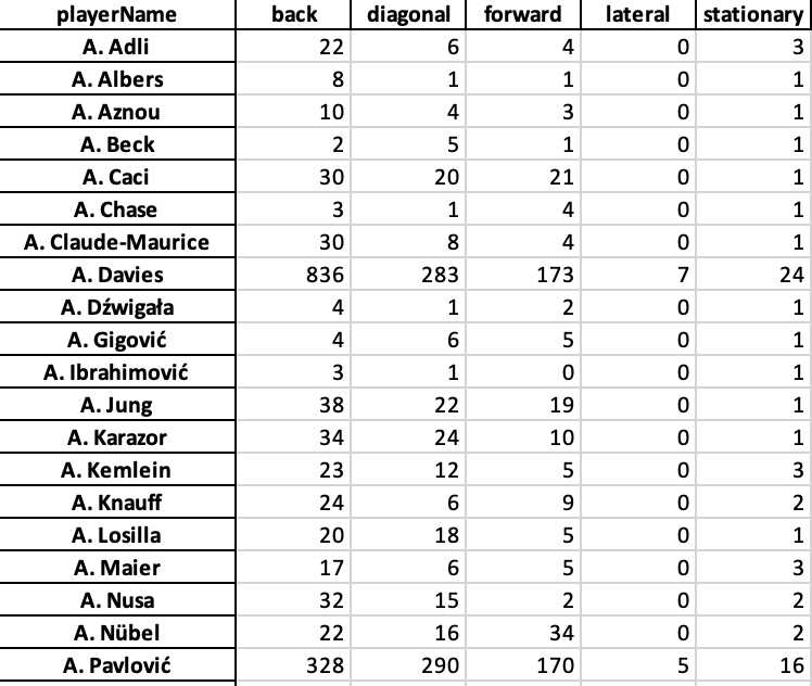
I have pulled a smaller sample size to only focus on one team. The specific team that we are going to focus on is Bayern München from the German Bundesliga, season 2024–2025 and is updated until the 10th of January 2025. I have included all players from Bayern Münched that have played in 5 or more games, to make the data more representative.

Methodology

There are a few things we need to do to get from the raw data to our desired metrics. First, we need to qualify each pass in our database and categorise them. Important for this is that we look at intention and so much to success, so the outcome doesn’t play a big role.

We have five different directions a pass can go:

  1. Forward: A pass where the ball moves predominantly in the positive vertical (y-axis) direction, i.e., toward the opponent’s goal in most contexts.
  2. Back: A pass where the ball moves predominantly in the negative vertical (y-axis) direction, i.e., toward the passer’s own goal.
  3. Lateral: A pass where the ball moves horizontally along the field, with minimal forward or backward movement.
  4. Diagonal: A pass where the ball moves both vertically and horizontally, creating a diagonal trajectory.
  5. Stationary: A pass where the ball does not move significantly or remains near the initial position.

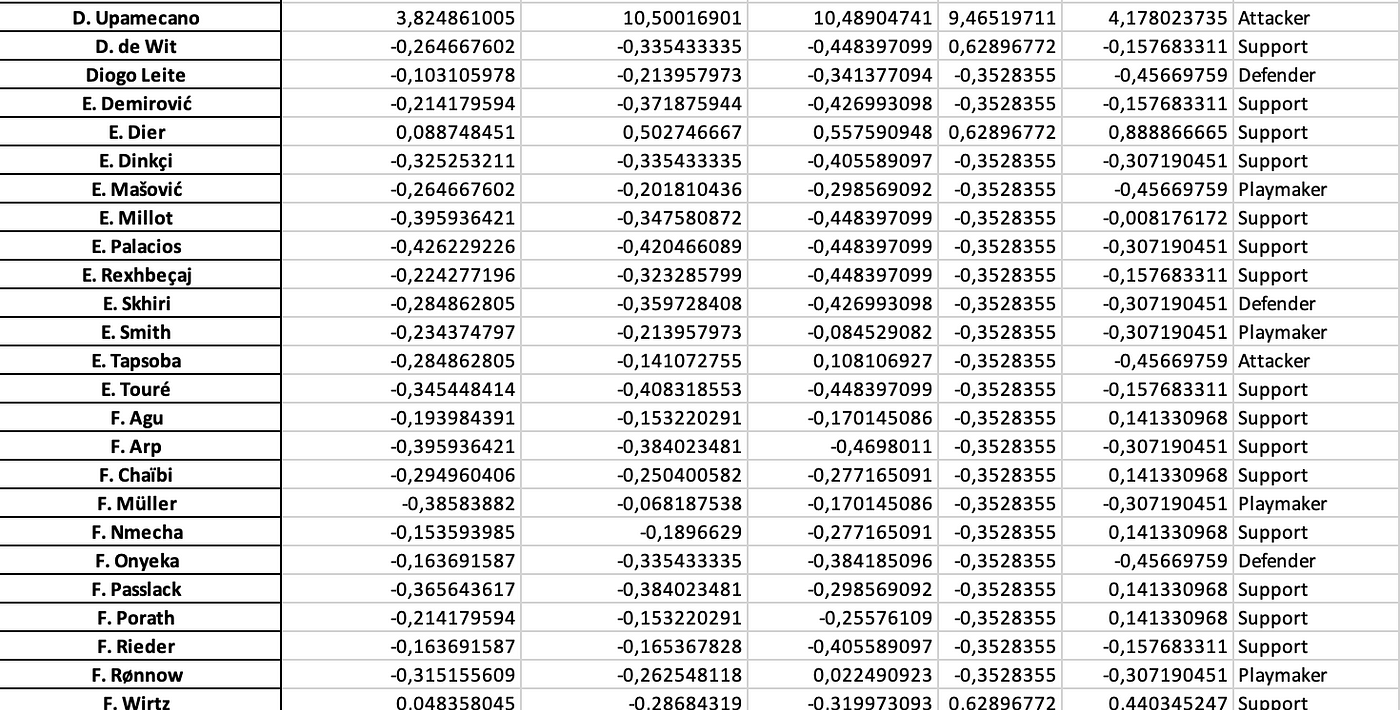
We run the code through Python and convert our initial raw event data into the new count. It will show us the players with the pass directions they have in the database, that will look something like this:

Now we have our pass directions, but the next step is to convert those pass directions into something more tangible, something more actionable. We chose to create new metrics or roles with these given metrics.

We have four different roles:

  • Attacker
  • Playmaker
  • Support
  • Defender

Each of these roles is made by looking at pass direction and assigning weights to the calculation of the z-scores. This you can see in the code below.# Calculate z-scores for each direction
z_scores = (direction_counts – direction_counts.mean()) / direction_counts.std()

# Define weights for each direction
weights = {
‘forward’: 1.5,
‘back’: 1.0,
‘lateral’: 1.2,
‘diagonal’: 1.3,
‘stationary’: 0.8
}

# Apply weights to z-scores
for direction, weight in weights.items():
if direction in z_scores.columns:
z_scores[direction] *= weight

# Assign roles based on weighted z-scores
roles = []
for _, row in z_scores.iterrows():
role_scores = {
‘Playmaker’: row.get(‘forward’, 0) + row.get(‘diagonal’, 0),
‘Defender’: row.get(‘back’, 0) + row.get(‘lateral’, 0),
‘Support’: row.get(‘stationary’, 0) + row.get(‘lateral’, 0),
‘Attacker’: row.get(‘forward’, 0) * 1.2 + row.get(‘diagonal’, 0) * 1.1
}
roles.append(max(role_scores, key=role_scores.get))

z_scores[‘role’] = roles

Now, if we run that code — we will not only get the players with their pass directions, but we will get roles too. Roles that will give intention and the numbers will show how close they are to the perfect role. We use z-scored to calculate that.

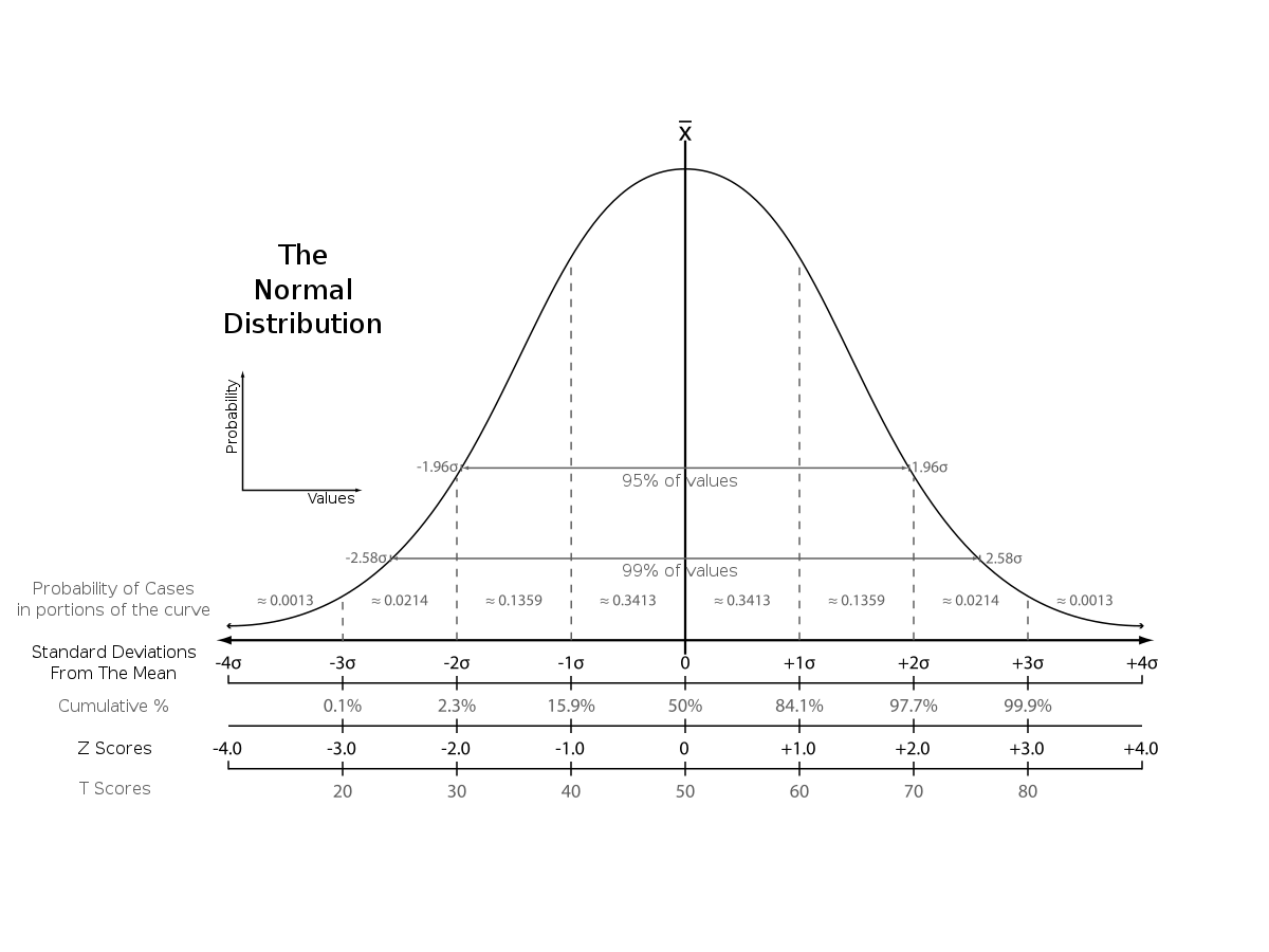
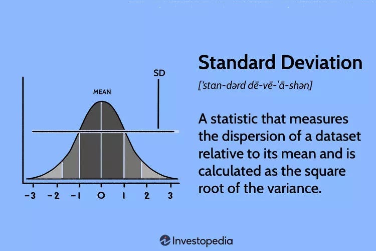
To create a score that goes from 0–1 or 0–100, I have to make sure all the variables are of the same type of value. In this, I was looking for ways to do that and figured mathematical deviation would be best. We often think about percentile ranks, but this isn’t the best in terms of what we are looking for because we don’t want outliers to have a big effect on total numbers.

I’ve taken z-scores because I think seeing how a player is compared to the mean instead of the average will help us better in processing the quality of said player and it gives a good tool to get every data metric in the right numerical outlet to calculate our score later on.

Z-scores vs other scores. Source: Wikipedia

We are looking for the mean, which is 0 and the deviations to the negative are players that score under the mean and the deviations are players that score above the mean. The latter are the players we are going to focus on in terms of wanting to see the quality. By calculating the z-scores for every metric, we have a solid ground to calculate our score.

The third step is to calculate the CTS. 

We talk about harmonic, arithmetic and geometric means when looking to create a score, but what are they?

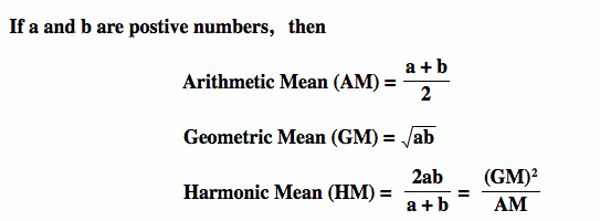
The difference between Arithmetic mean, Geometric mean and Harmonic Mean

As Ben describes, harmonic and arithmetic means are a good way of calculating an average mean for the metrics I’m using, but in my case, I want to look at something slightly different. The reason for that is that I want to weigh my metrics, as I think some are more important than others for the danger of the delivery.

So there are two different options for me. I either use filters and choose the harmonic mean as that’s the best way to do it, or I need to alter my complete calculation to find the mean. In this case, I’ve chosen to filter and then create the harmonic mean.

This leaves exactly what we want. Every pass direction has its z-scores and based on those intentions, we can give roles to the players which they are most likely to fit.

Analysis

Now that we have all the data we want, let’s look at the most common profiles/roles in these games:

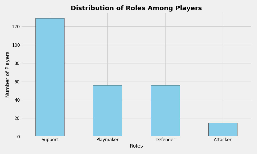
As you can see, most of the players have a support role, followed equally by playmaker and defender, while attacker is the lowest. When we look at the roles there are two more attacking roles and two more defensive roles

The next step is to combine the roles and create a scatterplot that shows us how good a player is in the defensive and attacking metrics:

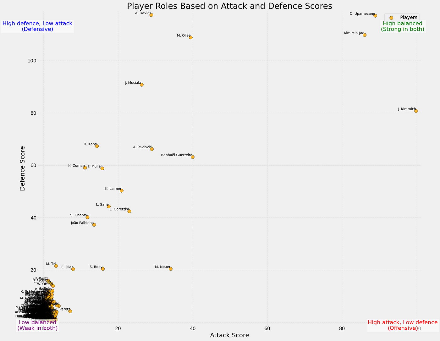
In the scatterplot above you can see how the players perform according do their attacking and defensive scores (0–100). You can also see the tendencies in the corners of the plot, showing what values are assigned to them.

What’s interesting in this case is that the players with the highest attacking score or contribution from their passing, are the defenders. It’s not surprising as they always will pass the ball up the pitch, while attackers will need to be more conservative in their passing as they are also tasked with maintaining possession.

Final thoughts

This framework provides a practical way to analyse player performance by turning pass directions and weighted metrics into clear roles like Playmaker, Attacker, Defender, and Support. It simplifies complex player behavior into easy-to-understand visuals, like scatterplots and bar charts, making it easier for coaches and analysts to see how players contribute. Plus, the flexibility of this system means it can be adapted to other sports or fine-tuned to fit specific strategies.

That said, there’s room to make it even better. The weights used are static and don’t adjust to changing game situations, and the roles might oversimplify players who excel in multiple areas. Adding more context, like player positions or game situations, could make the results even sharper. Overall, this framework is a great starting point for understanding player roles and opens up plenty of opportunities to refine and expand the analysis.

Goalplayer Value Added (GV+): measuring passing contribution in the build-up for goalkeepers

It has been a hot minute since we spoke about goalkeeper data did we not? Goalkeeper data is not as evolved as field players. The data that is commonly used in goalkeeper evaluation is the shot-stopping data. I can write about that here too, but other people have done that better and in more detail in other blogs or on websites. I prefer looking at data that does not look at shot-stopping, but on-ball metrics for goalkeepers. Specifically, data that deals with actions with the feet of goalkeepers.

There are numerous ways of giving value or worth to on-ball actions, but I wanted to see how much passing adds value to the build-up of a team. I want to categorise the passing length, locations and impact on build up to measure how active a goalkeeper contributes to that. In the fashion of my latest articles, I will approach this from a theoretical, data and mathematical approach.

How qualified am I to talk about goalkeeper data? I am not sure, but I have written some articles earlier about goalkeepers:

Contents

  1. Why this new metric?
  2. Data collection
  3. Methodology: Calculations
  4. Analysis: GV+
  5. Final thoughts

Why this new metric?

The Goalplayer Value Added (GV+) metric provides a quantitative evaluation of a goalkeeper’s contribution to their team’s build-up play and defensive organisation, extending beyond traditional shot-stopping measures. By incorporating weighted assessments of passing, claiming, and tackling actions, GV+ offers a comprehensive analysis of a goalkeeper’s influence on ball progression and defensive interventions.

Pass contributions are evaluated based on length (short, medium, long), accuracy, and spatial context (pitch thirds and half-spaces), capturing the risk and reward of distribution. Claims are assessed by type (e.g., high or low) and location, reflecting a goalkeeper’s ability to relieve pressure and initiate counter-attacks. Tackles are weighted by positional zones to account for their defensive significance.

This metric enables detailed comparisons of goalkeepers, highlighting their role as proactive playmakers and defenders. GV+ supports data-driven scouting, performance appraisal, and tactical planning by contextualising a goalkeeper’s impact across all phases of play.

Data collection

The data used in this analysis consists of different data sources. For the player-level data I used Wyscout and Statsperform/Opta. All data is based on goalkeepers in the Eredivisie 2024–2025 with at least 500 minutes played for their club. I will use this data to showcase which goalkeepers are the best in shot-stopping using the two different data sources.

For the event data I used Statsperform/Opta and there is no minutes played filter on it, but I have only focused it on the Eredivisie 2024–2025 season. This will be used to actually make the new metric by focusing on the passing.

Methodology

So how do we go about getting this specific metric? The first step is to look at the data we need for it:

  • Passes: just the raw passes and whether they are completed or not
  • PlayerId and TeamId
  • Start location and End location of the passes

With that data we first going to calculate three different forms of passes. Short passes, which will be shorter than 5 meters. Medium passes that will be between 5 and 15 meters. Long passes that will be more than 15 meters.

The next thing we need to is to look at the locations. A short pass starting higher up the pitch can mean something different than a medium passes starting deep, so we need to make these distinctions. We will divide the pitch into 18 zones as illustrated below.

What I want for our build-up by goalkeepers, is to see where the end location of the ball is going to be. I will only focus on goalkeepers’ passes that will end in either defensive third or in the middle third as it gives a better idea of progression from build-up, rather than a long ball.

All of these options need different weights. This means we have a lot of options to weigh.

As shown in the table above, by giving weights to the passes, we can add value to each pass made. However, we don’t only add passes to our calculations that are successful. The successful passes are added as +, but the unsuccessful passes, will be listed as -. These weights will be converted into a number.

Now we have all the weights and type of passes we are going to use, we can go over to the calculations.

In this formula, we calculate the sum of all actions. The weight of the pass is quite evident, as it is one of the weights we can have given above in the table. The pass value corresponds with a score divided by the total of passes. This score is either + or -, depending on the outcome of the pass. It’s worth mentioning that the + or -, will only be added in the final score, not in the weights. Every pass has the same weight, but the outcome dictates whether it’s positive or negative.

Before we calculate the GV+, I’m going to assess the threat of the pass as well with Expected Threat. The reason I’m doing this is to see how much attacking danger a goalkeeper can add with passing.

The basic idea behind xT is to divide the pitch into a grid, with each cell assigned a probability of an action initiated there to result in a goal in the next actions. This approach allows us to value not only parts of the pitch from which scoring directly is more likely, but also those from which an assist is most likely to happen. Actions that move the ball, such as passes and dribbles (also referred to as ball carries), can then be valued based solely on their start and end points, by taking the difference in xT between the start and end cell. Basically, this term tells us which option a player is most likely to choose when in a certain cell, and how valuable those options are. The latter term is the one that allows xT to credit valuable passes that enable further actions such as key passes and shots. (Soccerment)

So before we calculate GV+, let’s see what we have now:

  1. Pass types
  2. Pass locations
  3. Weights
  4. xT

Now we have to create a score, but there are different ways of doing that. We are going to use the mean. I’ve taken z-scores because I think seeing how a player is compared to the mean instead of the average will help us better in processing the quality of said player and it gives a good tool to get every data metric in the right numerical outlet to calculate our score later on.

Z-scores vs other scores. Source: Wikipedia

We are looking for the mean, which is 0 and the deviations to the negative are players that score under the mean and the deviations are players that score above the mean. The latter are the players we are going to focus on in terms of wanting to see the quality. By calculating the z-scores for every metric, we have a solid ground to calculate our score via means.

I’m going to use the weighted mean to create the GV+. GV and xT get a weight of 1, while the weight as shown in the table before gets a weight of 2:

By doing this, I get a new score that gives me the GV+, my new metric I have been looking for. After having done that, we can start with the analysis.

Analysis

We now have all the goalkeepers with their playing minutes and how much they contribute to build-up actions. In the scatterplot below you can see how they rank.

As we can see in the scatterplot we see the correlation between minutes played and the total of GV+ a player has. That’s only logical because more passes lead to more xT or more positive outcomes. We now have to fix two things:

  1. We need to have a minimum amount of minutes for representative analysis. I will set it at 500 minutes played in the current season.
  2. I want to calculate the per 90 metric, as it gives a closer idea of how a player does per game/90 minutes and adds value for future evaluation.

As you can see in the bar graph above, we now have all goalkeepers with at least 500 minutes played in the Eredivisie 2024–2025 with the per 90 values calculated. This gives a more complete idea of how much they contribute to the build-up per 90 minutes in the games and how much their passing adds value to it.

Final thoughts

Adding value to the passes in the build-up shows that a goalkeeper can be integral to possession phases with his/her feet. Goalkeeping is more than just shot-stopping and this value shows that.

There are challenges though I would like to tackle in version 2.0 of this metric. I want to include more quality in the index to assure it’s more quality-based and less quantity-based. I would also like to see where we can make better distinctions in zones rather than only thirds. Room for thought for sure, in 2025!

The complexity of outliers in data scouting in football

Slowly but surely, this medium account is turning into a more meta-analysis place where I discuss methodology, coding and analysis concerning data specifically used in football. And, honestly, I love that. I always try to be innovative, but that’s not always the right thing to do. Sometimes you need to look back at your process and see if there’s something you can optimise or improve.

That’s something I’m going to do today. I’m going to look at plain outliers in the data for specific metrics and what the case of outlier analysis tells us about the quality of the data analysis. Of course, there are a few problems that arise and I think it’s really good to take a moment and express worries about that.

In this article I will focus on a few things:

  1. What are outliers in data?
  2. Homogenous and heterogenous outliers
  3. Data
  4. Methodology
  5. Exploratory data visualisation
  6. Clustering
  7. Challenges
  8. Final thoughts

What are outliers in data?

I was triggered to look deeper into this when I read this blogpost by Andrew Rowlingson (Numberstorm on X)

https://andrewrowlinson.github.io/blog/football/2024-07-07-finding-unusual-football-players-update.html?source=post_page—–31e9fdca5171——————————–

I want to look at how different calculations influence our way of data scouting using outliers in data, but to do that it’s important to look at what outliers are.

Outliers are data points that significantly deviate from most of the dataset, such that they are considerably distant from the central cluster of values. They can be caused by data variability, errors during experimentation or simply uncommon phenomena which occur naturally within a set of data. Statistical measures based on interquartile range (IQR) or deviations from the mean i.e. standard deviation are used to identify outliers.

In a dataset, an outlier is defined as one lying outside either 1.5 times IQR away from either the first quartile or third quartile, or three standard deviations away from the mean. These extreme figures may distort analysis and produce false statistical conclusions thereby affecting the accuracy of machine learning models.

Outliers require careful treatment since they can indicate important anomalies worth further investigation or simply result from collecting incorrect data. Depending on context, these can be eliminated, altered or algorithmically handled using certain techniques to minimize their effects. In sum, outliers form part of the crucial components used in data analysis requiring an accurate identification and proper handling to make sure results obtained are strong and dependable.

Homogeneous and heterogeneous outliers

Homogeneous outliers are data points that deviate from the overall dataset but still resemble each other. They form a group with similar characteristics, indicating that they might represent a consistent pattern or trend that is distinct from the main data cluster. For example, in a dataset of human heights, a cluster of very tall basketball players would be homogeneous outliers. These outliers might suggest a subgroup within the data that follows a different distribution but is internally consistent.

Credit: Winning with Analytics, 2023

Heterogeneous outliers, on the other hand, are individual data points that stand out on their own, without any apparent pattern or similarity to other outliers. Each heterogeneous outlier is unique in its deviation from the dataset. Using the same height example, a single very tall individual in a general population dataset would be a heterogeneous outlier. These outliers might be due to data entry errors, measurement anomalies, or rare events.

Credit: Winning with Analytics, 2023

What I want to do in this article is to look at the outliers as described above and see whether using different calculations of deviations has an impact on how we analyse the outliers for the data-scouting process.

Data

The data I’m using for this part of data scouting comes from Wyscout/Hudl. It was collected after the 2023/2024 season and was downloaded on August 3rd, 2024. The data is downloaded with all stats, so we can have the most complete database.

I will filter for position as I’m only interested in wingers. Next to that, I will look at strikers who have played at least 500 minutes through the season, as that gives us a big enough sample over that particular season.

Methodology

To do make sure I can make the comparison and analyse the data in a scatterplot, we need two metrics to put against the x-axis and y-axis. As we want to know the outliers per age group, we will put age on the x-axis and we already have the metric for age.

For the y-axis, we need a performance score and for that we need to calculate the score using z-scores. I have written about using z-scores here:

https://marclamberts.medium.com/ranking-players-percentile-ranks-z-scores-and-similarities-618da750b79e?source=post_page—–31e9fdca5171——————————–

To calculate the z-scores I will use these attacking metrics available in the database:#Goalscoring Striker
metrics = [“xG per 90”, “Goal conversion, %”, “Received passes per 90”,
“Key passes per 90”, “xA per 90”, “Head goals per 90”,
“Aerial duels won, %”, “Touches in box per 90”, “Non-penalty goals per 90”]

# Adjust the weights for the new metrics as desired
weights = [5, 5, 3,
1, 1, 0.5,
0.5, 3, 1]

So as you can see I’m using Python code to calculate the z-scores and I’m using weighted z-scores to get a specific profile: a goalscoring striker role. In doing so I find the players most suitable for the role and see whether a player is close to the mean or has most deviations from it.

The core of this article is to explore whether the calculation of the deviation has an impact or influence on the outliers. Standard deviation and Mean Absolute Deviation.

Standard Deviation (SD)

Standard deviation is calculated by taking the square root of a value derived from comparing data points to a collective mean of a dataset. The formula is:

In terms of football, we are going to calculate the mean from the whole dataset with the mean being the most common value of the data metric of PsxG +/-. And with differences from the mean, we are calculating the deviations.

So by doing that, we can see in a more concise manner how a player comes close to the mean or deviates from it. So by using z-scores with standard deviation, it provides a more precise measure of relative position within a distribution compared to percentile ranks. A z-score of 1.5, for instance, indicates that a data point is 1.5 standard deviations above the mean, allowing for a more granular understanding of its position.

Mean Absolute Deviation

The mean absolute deviation (MAD) is a measure of variability that indicates the average distance between observations and their mean. MAD uses the original units of the data, which simplifies interpretation. Larger values signify that the data points spread out further from the average. Conversely, lower values correspond to data points bunching closer to it. The mean absolute deviation is also known as the mean deviation and average absolute deviation.

This definition of the mean absolute deviation sounds similar to the standard deviation (SD). While both measure variability, they have different calculations.

Data visualisations — Standard Deviation

Using a standard deviation we look at the best-scoring classic wingers in the Championship using the standard deviation and comparing them to the age. The outliers are calculated as being +2 from the mean and are marked in red.

As we can see in our scatterplot, we see Carvalho, Swift, Keane and Vardy as outliers in our calculation for the goalscoring striker role score. They all score above +2 above the mean — and this is done with the calculation for Standard Deviation.

Data visualisations — Mean Absolute Deviation

Using Mean Absolute Deviation we look at the best-scoring goalscoring strikers in the Championship and compare them to their age. The outliers are calculated as being +2 from the mean and are marked in red.

As we can see in our scatterplot, we see Carvalho, Osmajic, Riis, Swift, Tufan, Keane and Vardy as outliers in our calculation for the goalscoring striker role score. They all score above +2 above the mean — and this is done with the calculation for Mean Absolute Deviation. Using this calculation we get more players (3 more) that are further away from the mean.

Clustering — Standard deviation

We can also use our goalscoring striker role and apply clustering to it instead of looking for pure outliers. It has similarities but it is a different method of looking for high-scoring players.

In the graph above you can see the different interesting clusters and see the deviations. For us it is interesting to look at the cluster 3, because these are the ones that positively deviate from the mean.

For the clustering in cluster 3, we can see that 15 players are clustered together and might interested to look at. These are obviously clustered to the score calculated with Standard Deviation. The role score varies from +1,12 to 2,69 deviations from the mean.

Clustering — Mean Absolute Deviation

In the graph above you can see the different interesting clusters and see the deviations. For us, it is interesting to look at cluster 3, because these are the ones that positively deviate from the mean.

For the clustering in cluster 3, we can see that 15 players are clustered together and might interested to look at. These are clustered to the score calculated with Mean Absolute Deviation. The role score varies from +1,42 to 3,14 deviations from the mean.

We get a longer list than from the outliers, but via clustering, we can still find interesting players to track according to our goalscoring striker score.

Challenges

One of the challenges of this is that you use different ways of calculating the deviations, but have the same approach to it in terms of outliers. The heterogeneous outliers don’t apply to this as we approach the data in the same way: homogeneous.

I think it’s very interesting that different calculations can lead to fewer or more outliers, but that only has an effect if you focus on the outliers only. You need to be aware of it.

Clustering, however, is a little bit different. We cluster the players that most deviate from the mean together. It gives us a longer list than focusing subjectively on calculating outliers via a significant barrier.

Final thoughts

Most of all this is an interesting thought process. We can use different ways of finding outliers. We can use different calculations of means, using weights on our calculations, use clustering and much more — but these things are always the product of the choices we make when working with data. We must be aware of our own prejudices and biases as to which way we choose to work with data, but different ways can lead to a good scouting process when using data.

VVV-Venlo 2019/2020 season review

VVV-Venlo is a relatively small club in the Dutch professional game. Just a little bit too big for the Keuken Kampioen Divisie, but on the other hand also too small to be competing in the Eredivisie for decades. After the relegation in 2013 the club wanted to bounce back immediately, but this was very hard and financial difficulties made sure the club had to face hard truths: reform was needed. 

Continue reading “VVV-Venlo 2019/2020 season review”

Plymouth Argyle’s counter-attacking 3-5-2 vs Macclesfield

Plymouth Argyle has been promoted to the League One after a very strange end to the season, but it still is very much deserved. I will take a closer look at their 3-5-2 formation in their 3-0 win against Macclesfield, focusing on the counter-attacking style of play. I will do this using footage and stats from Wyscout.

Continue reading “Plymouth Argyle’s counter-attacking 3-5-2 vs Macclesfield”

Data analysis: looking for an attacking right-back in the Dutch Keuken Kampioen Divisie

Data can be pretty useful in football recruitment. I would say vital. In this post I’m going to look for a right-back in the Keuken Kampioen Divisie, the Dutch second tier. My aim is to find a right-back who could go on and act on Eredivisie level with clubs from place 10 to 18. This will be supported by data provided by Wyscout.

Continue reading “Data analysis: looking for an attacking right-back in the Dutch Keuken Kampioen Divisie”