

By writing regularly, I have concluded that I like discussing data from a sporting perspective: explaining data methodology through the lens of sport, football in particular. I have always set out to work in professional football, and I am very lucky to have reached that, but I want to keep creating, and that is why my content has become increasingly about how we use data rather than what players/teams are good/bad.
I spoke about the importance of looking at players who act differently. Well, the data behaves differently: they are outside of the average or the mean. Previously, I have spoken about outliers and anomalies; those were result-based articles. But what if we zoom in, into the methodology and look at the way we calculate those outliers or anomalies? Today, I want to talk about Interquartile Ranges in football data.
Data collection
Before I look into that, I want to shed light on the data that I am using. The data I am using focuses on the Brazilian Serie A 2025. Of course, I know that it is very early in the season and has limitations. But we can still draw meaningful insights from them.
The data comes from Opta/StatsPerform and was collected on April 22nd, 2025. The xg data comes from my model, which is generated through R. The expected goals values were generated on April 26th, 2025.
Interquartile Ranges
The interquartile range (IQR) is a key measure of statistical dispersion that describes the spread of the central 50% of a dataset. It is calculated by subtracting the first quartile (Q1) from the third quartile (Q3):
IQR = Q3 − Q1
To understand this, consider that when a dataset is ordered from smallest to largest, Q1 represents the 25th percentile (the value below which 25% of the data falls), and Q3 represents the 75th percentile (the value below which 75% of the data falls). The IQR therefore, captures the range in which the “middle half” of the data lies, excluding the extreme 25% on either end.
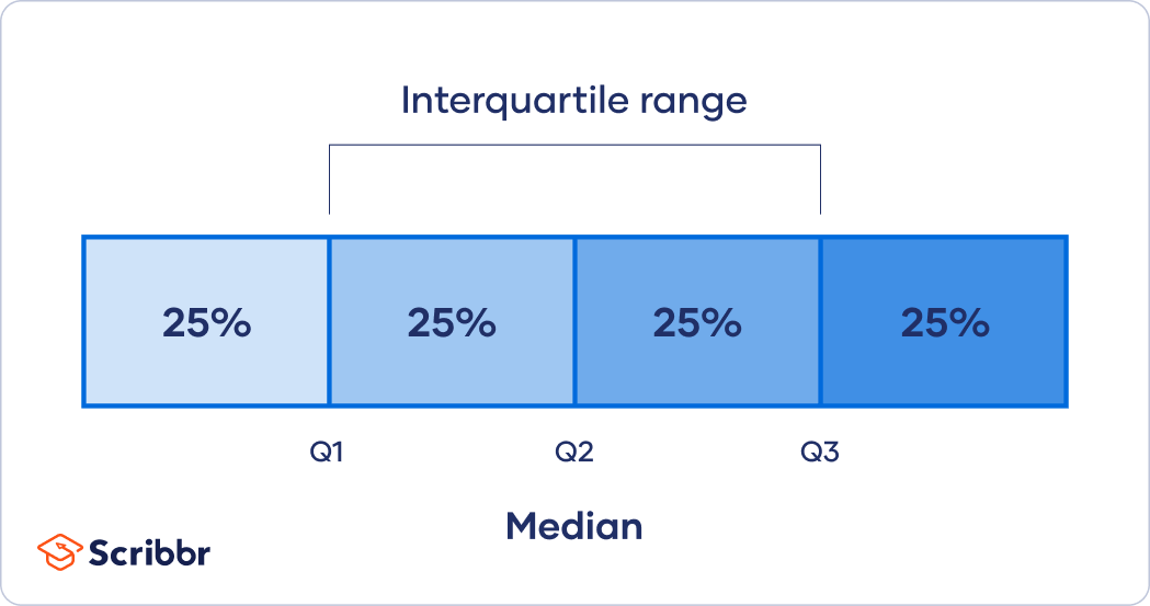
The IQR is widely used because it is resistant to outliers. Unlike the full range (maximum minus minimum), which can be skewed by one unusually high or low value, the IQR reflects the typical spread of the data. This makes it particularly useful in datasets where anomalies or extreme values are expected, such as football statistics, where a single match can significantly distort an average.
A small IQR indicates that the data is tightly clustered around the median, suggesting consistency or low variability. A large IQR implies more variation, indicating that values are more spread out. In data analysis, comparing IQRs across different groups helps identify where variability lies and whether certain segments are more stable or volatile than others.
Box plot
A boxplot (or box-and-whisker plot) is a compact, visual summary of a dataset’s distribution, built around five key statistics: the minimum, first quartile (Q1), median (Q2), third quartile (Q3), and maximum. It is one of the most efficient ways to display the central tendency, spread, and potential outliers in a single view.
At the core of a boxplot is the box, which spans from Q1 to Q3 — the interquartile range (IQR). This box contains the middle 50% of the data. A horizontal line inside the box represents the median (Q2), showing where the center of the data lies. The whiskers extend from the box to show the range of the data that falls within 1.5 times the IQR from Q1 and Q3. Any data points outside of that range are plotted as individual dots or asterisks, and are considered outliers.
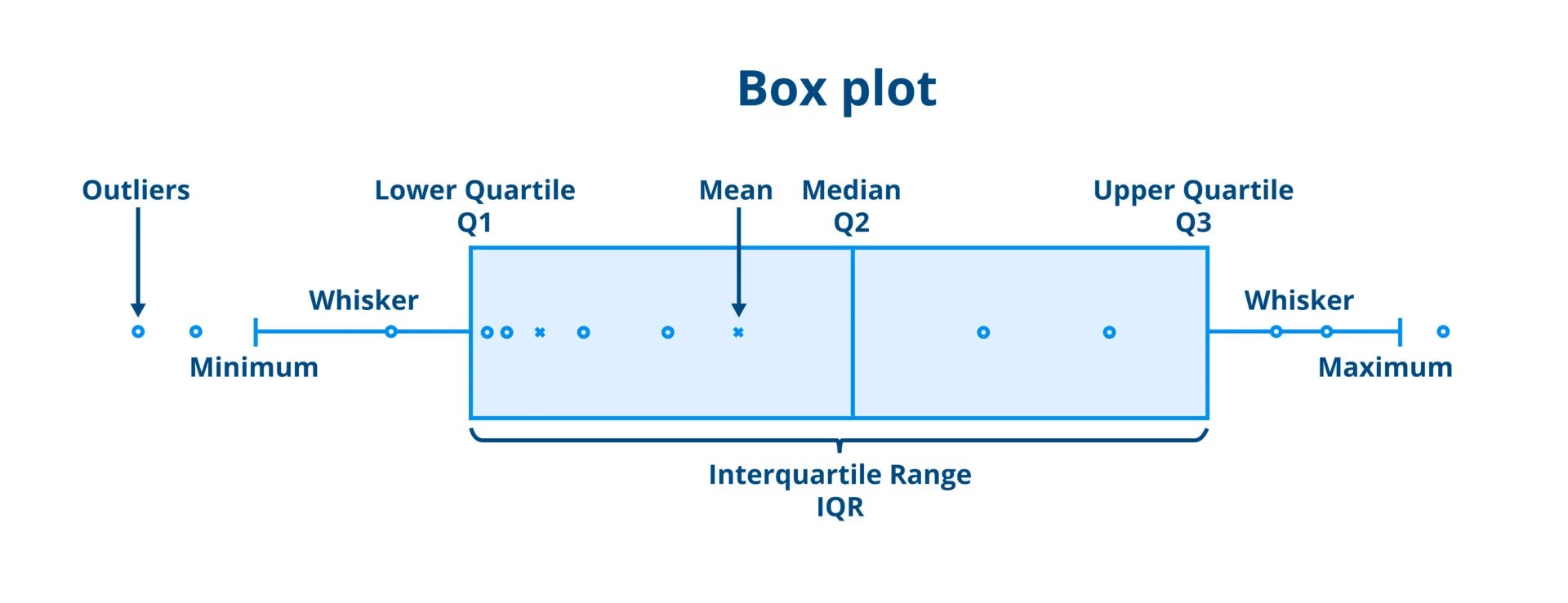
Boxplots are particularly useful for comparing distributions across multiple categories or groups. In football analytics, for example, you can use boxplots to compare metrics like interceptions, shot accuracy, or pass completion rates across different player roles or leagues. This makes it easy to identify players who consistently perform above or below the norm, assess the spread of values, and detect skewness.
An important advantage of boxplots is their resistance to distortion by extreme values, thanks to their reliance on medians and quartiles rather than means and standard deviations. However, boxplots do not reveal the full shape of a distribution (e.g., multimodality or subtle clusters), so they are best used alongside other tools when deeper analysis is needed.
Analysis
As described under the data section, I will use expected goals data from the Brazilian Serie A 2025. Using interquartile ranges, we can see which players are in the middle 50% of the selected metric.
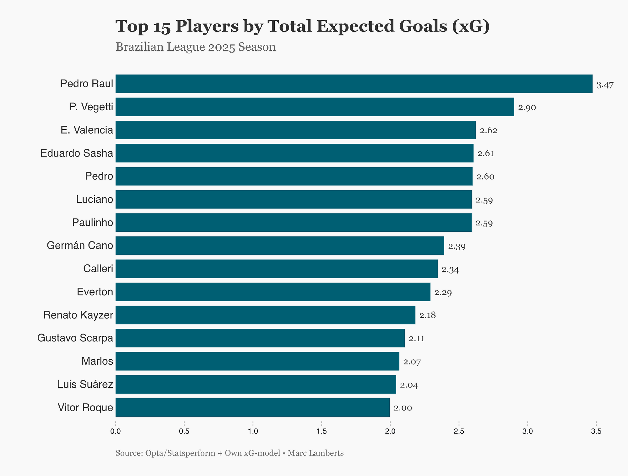
In short, this is what we can conclude: In the 2025 Brazilian league season, Pedro Raul stood out as the top player by expected goals (xG), showing his strong attacking threat. While there is a competitive cluster behind him, his advantage highlights his key role in creating high-quality scoring opportunities.
This shows us the top performers in expected goals accumulated of the begin of the season in Brazil. But if you want to delve deeper, you can look for outliers. We do that by using the interquartile range and finding the middle 50%. If there are deviations away from that middle 50%, we can can state that they are over-/underperforming. Or, in a more extreme form: they are outliers.
I’m quite interested in their distribution: do they have many shows of low xG-value? Or rather a few with high xG-values? I want to see whether they are part of outliers or that, in general just have more high xG-values per shot.
But how can we visualise that? By looking at box plots.
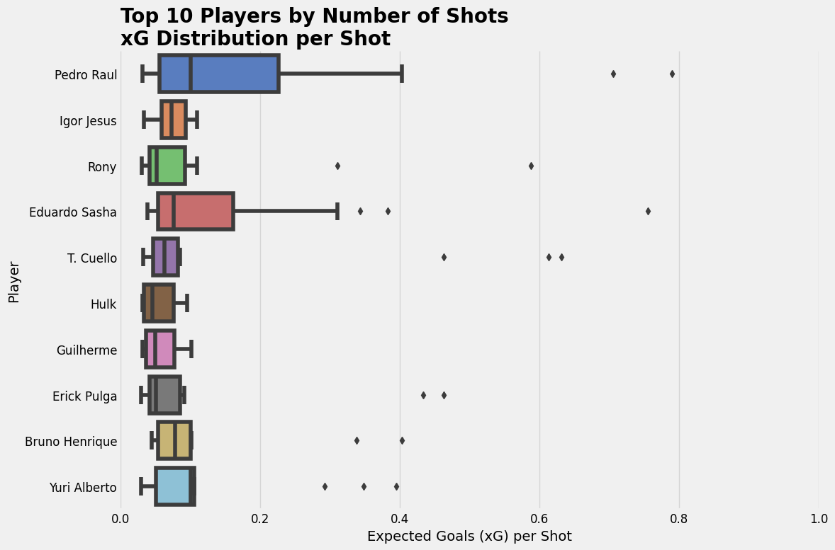
Each boxplot delineates the statistical spread of shot quality, with the median value indicating the central tendency of xG per attempt, while the interquartile range (IQR) represents the middle 50% of observations, effectively illustrating the consistency of shot selection.
The median xG value serves as a primary indicator of a player’s typical shot quality, with higher values suggesting systematic access to superior scoring opportunities, often from proximal locations to the goal or advantageous tactical positions. The width of the IQR provides insight into shot selection variability — narrower distributions indicate methodological consistency in opportunity type, while broader distributions suggest greater diversity in shot characteristics.
Final thoughts
Interquartile ranges and boxplots offer robust analytical tools for examining footballers’ shot quality distributions. These methods efficiently highlight the central 50% of data, filtering outliers whilst emphasising typical performance patterns.
Boxplot visualisations concisely present multiple statistical parameters — median values, quartile ranges, and outlier identification — enabling immediate cross-player comparison. This approach reveals crucial differences in shooting behaviours, including central tendency variations, distributional width differences, and asymmetric patterns that may reflect tactical specialisation.
Despite their utility, these visualisations possess inherent limitations. They necessarily obscure underlying distributional morphology and provide no indication of sample size adequacy — a critical consideration in sports analytics where performance metric reliability depends on observation volume. A player with minimal shot attempts may produce a boxplot visually similar to one with extensive data, despite significantly reduced statistical reliability.